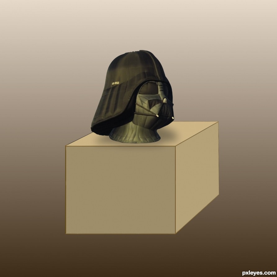
It Was Your Father's (5 years and 2549 days ago)
Serious Malfunction  1132 views | When Language Fails  1607 views | Vader Boy in Tomorrowland  2096 views |
Army  1758 views | Entry number 85825 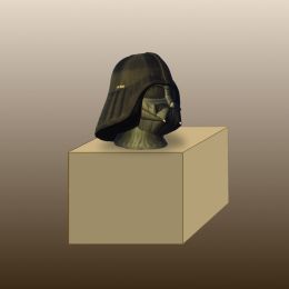 2129 views | Entry number 85787  1828 views |
Howdie Guest!
You need to be logged in to rate this entry and participate in the contests!
LOGIN HERE or REGISTER FOR FREE
The drop shadow shouldn't appear on the background, and it needs to be blurred. The sides of the cube should have different values of shading unless you're implying it's lit from inside.
Ok CMYK46 thanks I'll get on it but why when I put something on my desk and the light from above comes down it shows same shadow on front as the side. are you saying a shadow on front should be less than side?
Any cube that's normally lit will show 3 sides, as you have. Depending on the light source, each side would have a different value.
Ok! The way this cube is the shadow couldn't be like kcinsti is showing because only front add right side and top show. And his cube shows shadow on box and not under box on bottom? And if a light was shining from above why would his sample show the top and left side on box its self shadowed? Am I wrong?
Author here's an example of what CMYK46 is talking about.
http://clipartist.info/RSS/png/green_cube_13_8395_8-1979px.png
kcinst Thanks for sample but I am confused as the way shadow is shown on the box you showed if light source was from above?
Author, the example was just given to show how the values of the 3 sides would differ. The lighting is up to you. In your entry, the top would be lightest, and the front face (w/ Vader head) the darkest. The contrast doesn't need to be as dramatic as in the example, but it needs to be there.
Ok Thanks I will try that but totally different from way I thought shadow would have been. I may screw it up worse.
The top should be lightest. It's not. The front face with the Vader head should be darkest. It's not.
Author a handy thing to remember in these situations is to be guided by the light of the source image; in this case the light is from top left, so the front and top faces of the cube should be brightest.
I think you'd be better of not putting a second vader head on the front face because it confuses the eye.
Ok... What is this suppose to be?
Read title! It was your Father's....A Mask that was his father's
Thanks Guys!
Howdie stranger!
If you want to rate this picture or participate in this contest, just:
LOGIN HERE or REGISTER FOR FREE