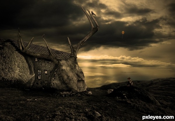
lightrays are made with lassotool, filled them with white, gaussian blur, lower opacity (5 years and 2595 days ago)
- 1: source1
- 2: thx to auroradreams
- 3: source3
- 4: source4
- 5: source5
- 6: thx to asifthebes

lightrays are made with lassotool, filled them with white, gaussian blur, lower opacity (5 years and 2595 days ago)
(5 years and 3216 days ago)
Author, sorry I am only getting around to all of these entries now, but here are a few tips for the future:
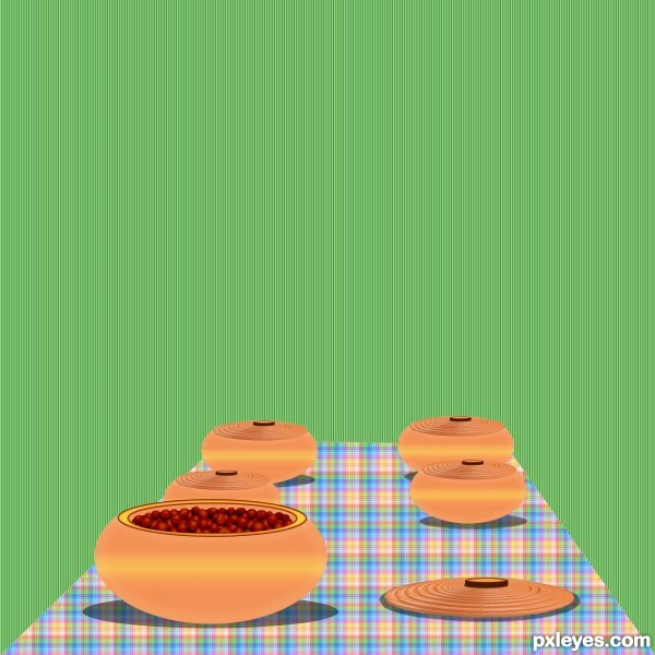
1. As the shape of the bowls are rounded, so the yellow stripe should bend. Try a radial gradient instead of a linear gradient.
2. With the light from above, the bowls would appear darker color at the bottom near the table. That's because the top half of the bowl (to its widest part) will block the light and cast some shadow on the bottom half.
3. You created a very nice illusion of depth with the edges of the table and the pots - wider / larger close to the viewer (bottom) and narrower / smaller farther away (toward center). To complete the illusion, the plaid pattern should also appear smaller and narrower at the end of the table farthest away. You can accomplish this by applying the pattern to a rectangle first, flatten, then apply Perspective - it will change both the shape and the pattern.
Hope this helps!
Howdie stranger!
If you want to rate this picture or participate in this contest, just:
LOGIN HERE or REGISTER FOR FREE
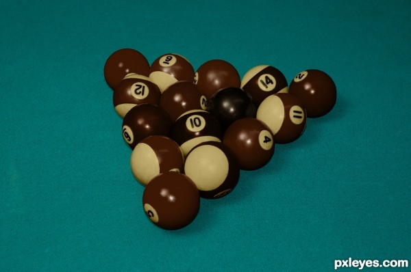
pool balls made into different chocolates.
The white on the striped balls and around the numbers are white chocolate.
The parts that were originally colored are now milk chocolate.
The numbers and the 8 are dark chocolate.
Constructive critique is encoraged. (5 years and 3474 days ago)
Good approach to get the chocolate texture, in HiRes the edges from the balls are maybe a bit too sharp (but that's a nitpick). Good luck!
Very attractive and convincent! 
@ wazowski thanks for the heads up. I went back and blended the edges of the balls together so the transition from chocolates wasn't so sharp. I also added a beveled edge to the numbers and white around the numbers so it appears that the milk chocolate was layered on top of the white chocolate. This can only be seen in HiRes though...
@erikuri Thank You!
good one
Howdie stranger!
If you want to rate this picture or participate in this contest, just:
LOGIN HERE or REGISTER FOR FREE
(5 years and 3514 days ago)
The background is a bit distracting for me, makes me dizzy  Maybe I partied too hard last night! lol
Giulia I changed wallpaper any better ?...Hey.. have a slice of cake...lol
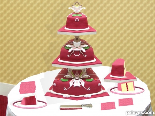
The perspective of the round plates and the cut cakes don't match the table. But I like the coloring of the slices.
Yes, this background works much better for me 
cool idea!
Thaks all for comments
GL to you!!
Howdie stranger!
If you want to rate this picture or participate in this contest, just:
LOGIN HERE or REGISTER FOR FREE
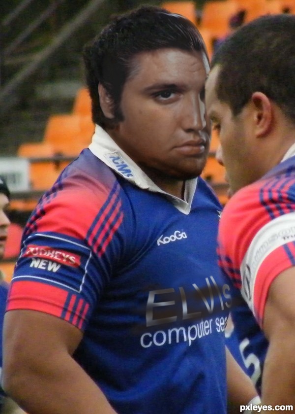
Thanks to Aine D for the image of Elvis and paddynapper for the image of the rugby player (also called Elvis) (5 years and 3518 days ago)
te body of the other player is before elvis bit his head behin? something wrong i gues?
Oooooh - very well spotted, thanks a lot, have rectified the image now!
Warp the letters to the folds of the shirt.
"Warp the letters to the folds of the shirt"
Tomorrow........
Thanks!.
looks extremely fake. something a noob would do.
CrystleClear, thank you for taking the time to comment, even though it is rather cruel and pointless. Is this site not for "noobs"? And as for being fake - well yes, of course it is! Comments like yours could hurt, and some people may take it to heart and cease entering their work here. Just one other point - looking at your recent efforts I don't think you're in any position to critisise the work of others.
Lol @ CrystleClear...I agree with author. 
Believe it or not - ammended version!!!!
Howdie stranger!
If you want to rate this picture or participate in this contest, just:
LOGIN HERE or REGISTER FOR FREE
nice author... love the colour, the feel and even that little balloon lol goodluck
Check the edge of the roof and the edge of the house to the right of the door. Needs a bit of tweaking.
Nicely done but so little of the source was used
I don't mind if little of the source was used, it's still an effective image, but will you PLEASE repair the defects I mentioned?
ok fixed it
Cozy house
Howdie stranger!
If you want to rate this picture or participate in this contest, just:
LOGIN HERE or REGISTER FOR FREE