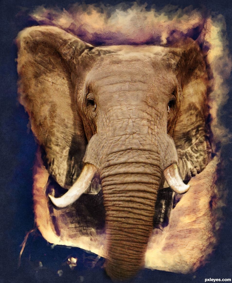
I changed the original tattoo source to sepia, deleted the side hand, filtered it in filter forge with HDRtist to get the artistic frame and make all the body hair less prominent.
I had to cut bits like tusks off the elephant to warp and transform them to fit the tattoo. I matched the eyes and ears to the original tattoo as close as I could. The original tat can be seen on the legs and lower ears of the animal. (5 years and 1179 days ago)
- 1: Elephant Tat
- 2: Elephant


 reminds me of Thread from the Pern Series
  very nicely done


Author.. I'm going to hold my vote until I can see exactly how this is a tattoo.. it really needs to be "IN A SCENE" to make sense to me. Not a bad thing, but I think the image should be "coming out" of a chest/arm/leg. Not a dig.. just a little confusing to me at moment.
The image is very well done, but I'm not sure how it fits into the theme of the contest.. good luck
Hi Ernest, take a look at the original source tat. It is coming out of the side of a very hairy body. I left the lower ears and legs of the animal as they are on the original tat, except for changing the color slightly to blend with the color of the elephant. I put the elephants trunk over the mans shorts. The art filter has just made the hairy stomach less hairy looking. The idea of the contest is to BLEND the tat into the real thing to make it appear as if the picture is coming alive. In my own opinion, I did a good job.
I agree. It would have been better if we could see the original tattoo coming to life but we can not see the tattoo
Thank you very much for your complimentary comment velkanx. If you cannot see the transition between the tattoo and the real elephant, then in my own opinion I succeeded in the challenge.
If you look carefully at the original source and compare my work to it, you will see the original tattoo on the lower ears and legs and also on the shadows of the ears. The only thing that has been changed is the color so it blends better with the color of the elephant. If the transition between tattoo and the real thing were too obvious, I do not think the blending would show the tattoo coming alive.
The problem IMHO is the original source with the tattoo. That image is not really clear to start with. That art filter you used was no good idea IMHO it made it even more unclear with fading the edges inwards. You could have made the original image bigger and fade outwards, leaving the body which holds the tattoo more intact, maybe even expand on it by adding for instance an arm.
Please don't take what I'm saying too harsh, you're mentally still to attached to the image. This happens to all of us. Take another look at this image and the comments in 6 months or so and you'll see what I, and others, are saying and you might see what we mean
The blending is well done, no critique there just a
Thank you for the critique and suggestions for improvement. I appreciate it.
Howdie stranger!
If you want to rate this picture or participate in this contest, just:
LOGIN HERE or REGISTER FOR FREE