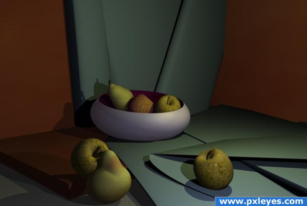
No meshes used simple primitives and the colour and texture editor for apples and pear skins.
Bryce prog used. (5 years and 3811 days ago)
breakfast  by ramananjv 13755 views - final score: 71.3% | vitamin D&C  by ramananjv 13617 views - final score: 65.8% | Bon Apetit!!!!  by genuine2009 11236 views - final score: 64.1% |
Still life with green paper 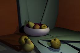 by whiteshade 16888 views - final score: 60.3% | Fooood !!!!!  by billyboy 8676 views - final score: 58.7% | Food for all  by billyboy 9973 views - final score: 56.9% |
Yum Yum  by whiteshade 4956 views - final score: 56.8% | HotDogs, Sauce and Water 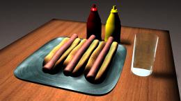 by Ory 7062 views - final score: 54.5% | summer gonna end 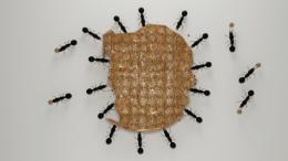 by ramananjv 8490 views - final score: 54.3% |
Cake and Icecream 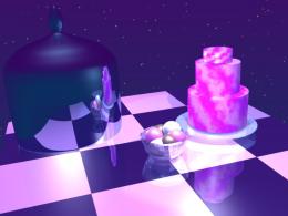 by downoffthedragon 11245 views - final score: 51.2% |
Howdie Guest!
You need to be logged in to rate this entry and participate in the contests!
LOGIN HERE or REGISTER FOR FREE
nice work
Beautiful! Looks almost real.
gud work
I really like the dimmer lighting here...good color choice too.
NICE
This looks really cool, but there's something about the shadows of the apple that's bugging me. Why would the shadows be different colors? One's kind of bluish while the other is greenish. Seems like different light intensity would change shade, not tint. And, if I imagine where one of the light sources is, the bluish one seems just a tiny bit big. I dunno. I could easily be wrong. It's still a cool picture. Good job!
Beautiful!
nice mood of light..gud work
nice choice of elements in this work. fruit and paper look great.
very nice
Howdie stranger!
If you want to rate this picture or participate in this contest, just:
LOGIN HERE or REGISTER FOR FREE