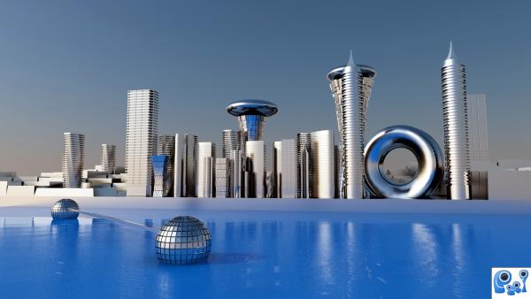
The idea is to create a cityscape in daylight mood.i rendered this with the 3ds max and vray.i have created some buildings.the creation process is explained in sbs.and used greeble modifier to create the background building and the default vray materials applied and no textures used in the scene and no reference images used.for the light source vray sun is used and a simple vray sky background.this is straight output from 3ds max and didn't use photo shop for this work.i have cleared the process in sbs. (5 years and 3794 days ago)

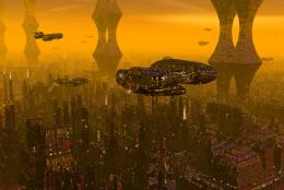
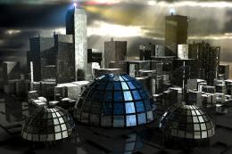
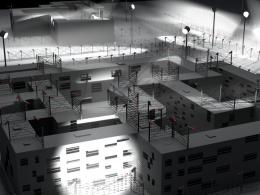
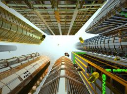
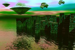


This image is stunning. But your reflections are a bit off. The reflection of the taller building to the left with the flat top is wrong! It has two disks! The reflections of the tall conal and cylindrical building with the point at the top are on an odd angle. So is the angle for the doughnut shaped building. But everything above the water is spectacular! See if you can fix it so I can rate it.
I liked the color and reflections in LO-Res, but not that much in HI-res.
The water looks weird - probably because it isn't flat. I also think you've ruined your nice looking buildings by cranking up the reflections way to much and using almost the same texture on all of them. You can do better than that.
Who knows, the future may be very reflective, but this one would look far better and more detailed with reasonable reflections and different textures.
Excellent image, really nicely done, i like the fact that you rely soelly on the shape of your buildings to let the viewer know that it's a futuristic cityscape.... very nice!
Wow, this is brilliant! Top 3 definitely! I just don't like that the buildings are way to shiny and reflective. I'd make them a little bit less reflective, and make the water a flat polygon with water bump/normal map and reflective, cause like this the reflection is to disorted. =) GL!
man , this is a master work , good job
thanx to downoff,dka and wlado.imade some corrections on the reflection and in the water. .
Reflections look better now. The composition of the city, however was better the last time. But anyway, high votes from me, since it's really brilliant any way you put it =)
The reflections are definitely better now! I don't remember how much different the buildings were before, but I still think that they're fantastic! High marks from me!
I love this...reflection is way better,whole mood is fabulous...gl author
great futuristic finish to your image. love the mirror balls in the water
thanks for ur comments
Nice!
very nice work machi...kalakita machi
great work,gl
i see you have very nice and complex comments in here..so, i just have to say bravo..and you seem to be a very creative and skilled graphic designer. congrats!
Now this is futuristic - it is nice to see at least one person thinks the future does not involve the world going to cr@p
Very clean...very good
congrats
Howdie stranger!
If you want to rate this picture or participate in this contest, just:
LOGIN HERE or REGISTER FOR FREE