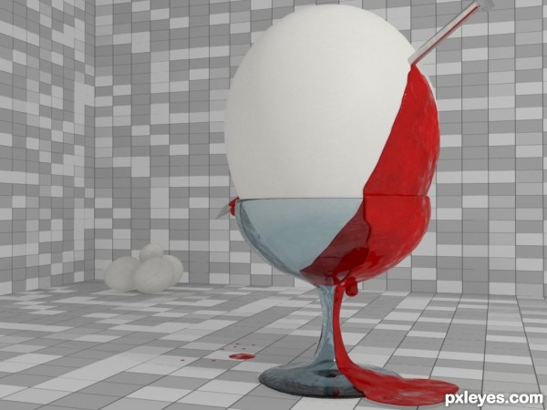
its an idea to stop killing child. Those go for abortion this idea for them....
I hope you like it... (5 years and 3645 days ago)
music box  by falkor 15787 views - final score: 71.9% | Water droplets  by Palaekman 14442 views - final score: 60.2% | To bet or not to bet  by qwertyzx 12800 views - final score: 59.1% |
Closest to Sim 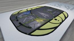 by dilsedosty 9350 views - final score: 59% | Elements of Logic 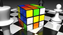 by qwertyzx 11903 views - final score: 58.6% | CPU 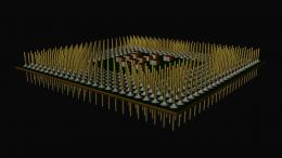 by Ory 6843 views - final score: 57.5% |
Stop Killing Child 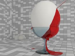 by vaiibhavjain 6875 views - final score: 56.4% | Microcosm 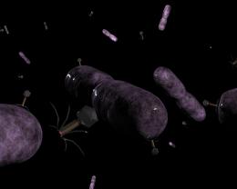 by itgik 6045 views - final score: 55.7% | Kiwi slices 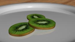 by Palaekman 5990 views - final score: 55.3% |
Checkmate - Fallen King 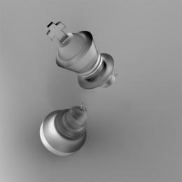 by Plastic 15654 views - final score: 55.3% |
Howdie Guest!
You need to be logged in to rate this entry and participate in the contests!
LOGIN HERE or REGISTER FOR FREE
We're getting political here, it seems. Pretty nice idea. The nail could maybe be a bit more shiny and there could be a slight fracture or something from where it goes in. The blood should be a few degrees darker and it looks a bit plastic where it meets the floor. You could add a shadow for the whole thing too and for the extra eggs on the corner. Nice thinking with the idea..
Hmm shouldn't it be "Stop killing children" but this won't affect my vote of course.

Widiar I agree with you about the lack of shadows and the fractures but I think the blood is nice. Blood exist in all kinds of tones depending on where it is in your body and we can't really tell how it would look when coming from an egg.
I think the blood texture is just a bit too 'bumpy' and especially on the lower part it should be thinner and with a bit more dribbles. I would go for some basic 3D max liquid tutorials first. I'm not in any way saying your blood texture bad, it's just a bit plastic looking into my eyes. With a bit of darker shade, a bit thinner and some dribbles on it, it could look pretty good. Maybe it's just a matter of finding a proper blood texture with a more flow like shadows instead. (So many nice ready to use plugins for 3D softwares, haven't never even tried myself).
If you can't tackle the blood problem, you could maybe add some other suggested enhancements, maybe it will make the whole picture look better and more 'realistic'.
Oh, I forgot to say. Be sure to check all those water 3D contest entries and SBS' for additional hints
Widiar I think you mean material and not texture. However this is a matter of taste so no offence.

Author if you want to improve the blood always try to look at a reference. If can't get the blood to look good enough with one material you can always render out multiple passes with different blood materials. This is one single image so you can do so much to it as you want without having to think about movements etc.
Besides the standard blood material pass I often render out things like a chrome pass, plastic pass, glass pass, matte surface (no specular) pass.
Chrome for example may not look like blood but when compositing it on top with a very low opacity and another blending mode it may just look right.
It's about experimenting
cool
nice idea
Howdie stranger!
If you want to rate this picture or participate in this contest, just:
LOGIN HERE or REGISTER FOR FREE