(5 years and 3445 days ago)
SteamPunk R2D2  by genuine2009 22449 views - final score: 64.3% | DYNETHIRI  by muthultech 17548 views - final score: 60.4% | gram-top  by mircea 23117 views - final score: 60.3% |
Red Moon  by CoyDog 17184 views - final score: 60% | Steampunk Socket Wrench  by roach 23461 views - final score: 59.6% | Steamy Bot 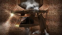 by bachoder 9772 views - final score: 58.9% |
CHOPTRON 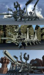 by muthultech 6265 views - final score: 58.6% | Steam Walker 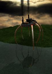 by Ory 6855 views - final score: 57.3% | GEAR UP-Helmet 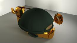 by UPGRADE 7666 views - final score: 54.7% |
Gatling Cannon 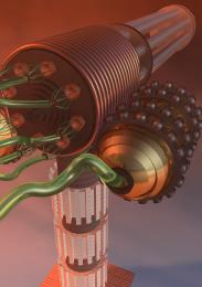 by Ory 7849 views - final score: 54.1% | USB 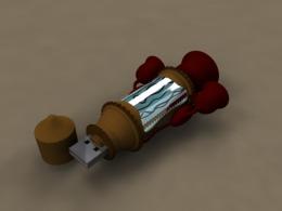 by mircea 4257 views - final score: 53.2% |
Howdie Guest!
You need to be logged in to rate this entry and participate in the contests!
LOGIN HERE or REGISTER FOR FREE
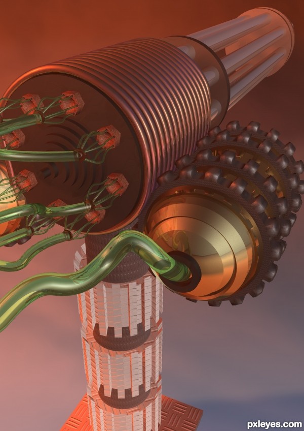
The base plate of this is too small, and doesn't show any form of mounting. It looks like the gun should fall over.
Really nice rendering of the wire and nuts!
@mircea What are you on about, did you read about steampunk, its about Victorian age steam powered machines which are applied to modern technology. Adding laser systems or LCD screens would just be taking away from the point of the task.
The Tubes which follow through valves from the cylinders to the back of the gun carry high pressure steam which fires the projectiles. This is certainly steampunk and no way off topic.
About the scene. I did like the two guns and the idea of having it on a fort, but when it came down to it, I could just not get that looking how I wanted so I went simple.
I think you're on the right track, author, and the brass look on the rightside element is good, the copper looking material is ok, I think, tho brass would be much better. However, try changing the material for the base vertical post to wood and brass, the 'bumpy' parts on the right to more recognizeable wood tone, and the color of the hoses to something more neutral, then you'll have that great look! I agree with MossyB, it could use a larger base. Don't give up on this, you've got a great design.
Howdie stranger!
If you want to rate this picture or participate in this contest, just:
LOGIN HERE or REGISTER FOR FREE