(5 years and 3436 days ago)
Outpost  by Aloisnin 17188 views - final score: 63.7% | Abandoned  by Missy 13683 views - final score: 63.4% | Evil House  by bachoder 17240 views - final score: 60.3% |
Scrap Lumber 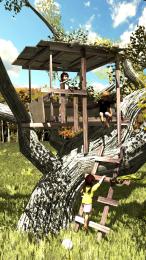 by CoyDog 11780 views - final score: 59% | Above The Lake, Above The Tree 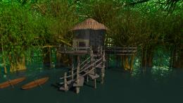 by muthultech 14166 views - final score: 58.1% | In the back garden 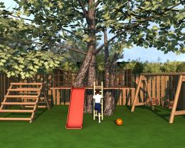 by Ory 8595 views - final score: 56.8% |
Rise From The Atlantis 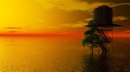 by Lamantine 14182 views - final score: 56.6% |
Howdie Guest!
You need to be logged in to rate this entry and participate in the contests!
LOGIN HERE or REGISTER FOR FREE
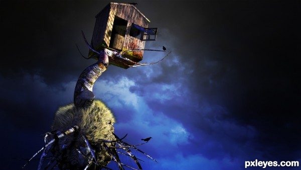
It's too dark, and there's too much wasted (empty) space on the RH side. You should crop it to better emphasize your focal point, and bring up the lighting so people can make out what they are looking at. It looks like some multi-legged creature with a house for a head.
Makes me think of Baba-Yaga.
pretty cool
well, kinda weird but cool... ravens are so fatal and so the house is... the raven can mean there is some life in the field of death contrastly therewith. i think the house means that as well. the composition is so complementary.
very nice idea...gl
thanks for all comments and votes
Howdie stranger!
If you want to rate this picture or participate in this contest, just:
LOGIN HERE or REGISTER FOR FREE