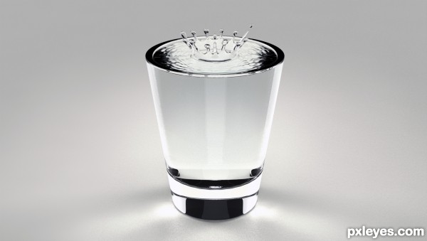
First time modeling a water drop. It's hard to mimic nature because of the randomness of everything in it. (5 years and 3398 days ago)
Twilight Breeze  by Missy 14328 views - final score: 60.7% | Ice cubes  by Palaekman 35040 views - final score: 60.5% | Fire and Ice  by Warlock 18533 views - final score: 58.2% |
Crystal clear 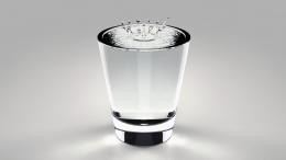 by secretsather 13469 views - final score: 56.9% | Earth...  by layerstack 13915 views - final score: 56.3% | Fighting the elements  by mircea 8553 views - final score: 55.8% |
Flying High  by Ory 6512 views - final score: 55.6% | Beautiful rainbow  by nishagandhi 14946 views - final score: 54.6% | AIR COOL  by layerstack 8214 views - final score: 54.4% |
Blowing in the wind.  by Ory 8721 views - final score: 54.2% | Charon on his way to Hades  by MFwaterman 9853 views - final score: 54.2% | Natural Elements  by lchappell 8790 views - final score: 53.4% |
Earth, Air, and Water  by secretsather 10540 views - final score: 52.4% | Fire, Water & Air  by Ory 10927 views - final score: 52.2% | H2O...  by layerstack 5305 views - final score: 51.9% |
Howdie Guest!
You need to be logged in to rate this entry and participate in the contests!
LOGIN HERE or REGISTER FOR FREE
love the clarity!
Cool idea but still needs a little work just to Increase the realism. The render is not bad but could be improved im guessing this is a HDR environment do you have any lights as well? If not then add one directional light not to strong to help reduce the noise with no shadow type and 250 samples to start with. The water drop is good but looks un-natural due to there are no ripples in the waters surface adding these will improve the realism.
I think ripples would add to the realism also, how about a wavy spline ~~~~ and rotate the same way as you made the glass.
@Warlock - Yes, I've been aware of the shadow noise, although it be ever so minimal. If you look at the high res, there is one ripple in the water right next to the drop, and perhaps a few more wouldn't hurt maybe added with some noise displacement.
*Edit - I went ahead and upped the samples and added a few ripples with a noise displacement on the top (to try and simulate the randomness of it all)
great job cool lighting and caustics
This has the potential to be outstanding. My problem is the caustics are wrong. This is the reason you are getting Black blocks on your glass and water. The easy way to rectify this is to change the environment to white. The caustics need extending, as all of the subject matter is transparent. and water bends light quite strongly. As for the shadows being noisy, I struggled with this for a long time. This is a combination of render settings and light settings. There is no easy fix for this. I know they're not as noisy as they were. What anti aliasing engine are you using. I would suggest Adaptive DMC. This is by far the better filter. Great job overall though. A bit more work on the caustics and shadows and this would be awesome!

@r1k3r - I disagree with you. The white and black were purposely put in there to give the object a dynamic look, otherwise everything would be a pale white. It's got nothing to do with caustics (look the word up).
Howdie stranger!
If you want to rate this picture or participate in this contest, just:
LOGIN HERE or REGISTER FOR FREE