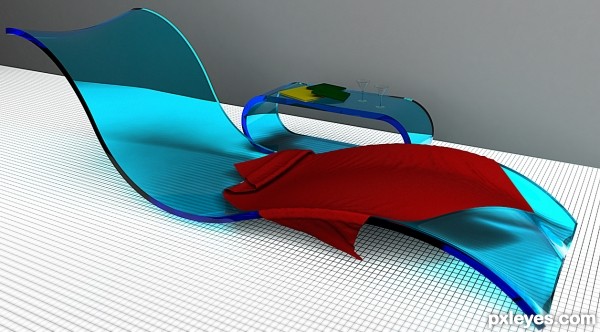
modelled in Maya, rendered in Mental Ray (5 years and 3326 days ago)
No. 334  by Rumi 11996 views - final score: 63.7% | Cloche  by Missy 11009 views - final score: 62% | art deco interior  by mircea 18642 views - final score: 61.3% |
Vintage 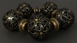 by Warlock 9730 views - final score: 61.1% | 2 O'Clock 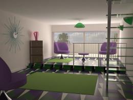 by r1k3r 9908 views - final score: 59.6% | living room 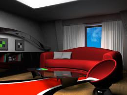 by mircea 9182 views - final score: 59.5% |
The White House 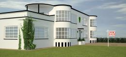 by r1k3r 13525 views - final score: 57.9% | ArtDeco Style Room 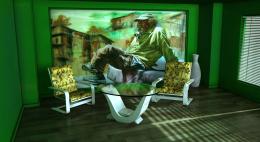 by genuine2009 10645 views - final score: 56.4% | pool chair 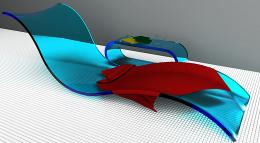 by mircea 7937 views - final score: 55.6% |
Tea at afternoon 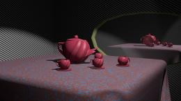 by tioilmo 5453 views - final score: 55.3% | AM/FM 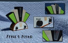 by farsite 3666 views - final score: 55.1% | Snake Sofa 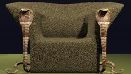 by tioilmo 8158 views - final score: 53% |
Howdie Guest!
You need to be logged in to rate this entry and participate in the contests!
LOGIN HERE or REGISTER FOR FREE
instant fave..this is gorgeous
Great work author...u used fantastic color for the chair and material look very fancy and comfortable....best of luck
in this picture, the proportions completely missing , which makes the picture just be nice colorful.....and just that!....for this picture I would score with the big big ZERO....enjoy! because i don't do this! ...IMHO sorry!....

This is really nicely done. This looks a bit more futuristic from today rather than art deco though.
Nice job with the shaping of the lounger. Maybe you could have done something with the caustics of the plastic though. This would have made it more realistic. The grey wall is a bit of a let down too, if you had added a tiled wall or some other texture it would have been nice. Is it an indoor pool? If it's outside where's the direct light, this would surely have cast some nice shadows, even inside this should have more than just the flat lighting there is now. The glasses are maybe just a tad too small as well, not quite in proportion to the lounger, considering an adult male would almost certainly nearly fill the lounger. The towel should be a little more flexible or creased, this would increase the shadow amount and added more realism, a nice toweling texture would have looked nice too. But overall a nice job, just little more attention to detail would have nailed this.
Howdie stranger!
If you want to rate this picture or participate in this contest, just:
LOGIN HERE or REGISTER FOR FREE