(5 years and 3275 days ago)
Attitude perfume 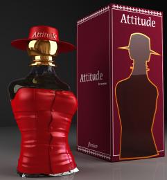 by Sandysanju 19074 views - final score: 68.2% | Tranquility 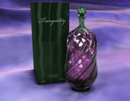 by RichieMB 19087 views - final score: 66.9% | Expensive 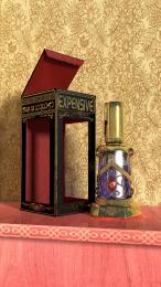 by CoyDog 14079 views - final score: 66.6% |
VITTORIO 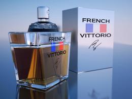 by randy 14610 views - final score: 65.9% | Little & Red 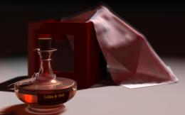 by spider3d 15667 views - final score: 65.7% | Autumn 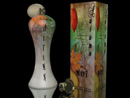 by Missy 5763 views - final score: 63.9% |
Attraction 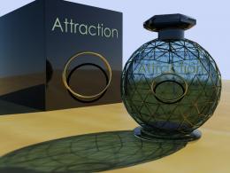 by layerstack 7731 views - final score: 63.8% | dimension METAL 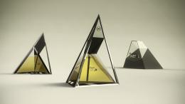 by amaf 19589 views - final score: 62.8% | Strinker 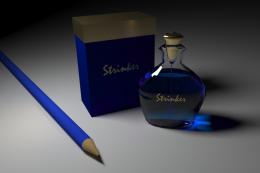 by tioilmo 7727 views - final score: 62.3% |
Mist 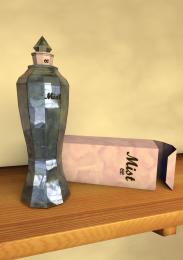 by Ory 5817 views - final score: 59.9% | Mask 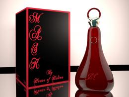 by Missy 7700 views - final score: 59.9% | $1500 an ounce is why 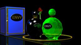 by lchappell 7265 views - final score: 57.8% |
Venom  by mircea 6656 views - final score: 57% | Voslin  by vosya 6728 views - final score: 55.5% | Perfume M 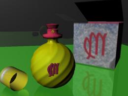 by vosya 7699 views - final score: 54.5% |
Howdie Guest!
You need to be logged in to rate this entry and participate in the contests!
LOGIN HERE or REGISTER FOR FREE
Photography and photoshop contests
We are a community of people with
a passion for photography, graphics and art in general.
Every day new photoshop
and photography contests are posted to compete in. We also have one weekly drawing contest
and one weekly 3D contest!
Participation is 100% free!
Just
register and get
started!
Good luck!
© 2015 Pxleyes.com. All rights reserved.


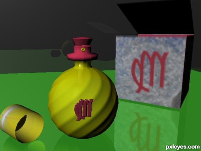
The color palette is kind of visually jarring, too much green, which is overpowering what should be your focal point, the bottle...The logo on the bottle is too small and blurry looking. The box looks somewhat blurry, as well, with what appears to be a "dent" in the lower RH corner, but does not correspond to the sharp edges.
I'd suggest cropping it down (or making your focal point occupy at least 1/2 of your picture plane), and change the tone of that green, perhaps darkening it at least.
Agree with MossyB, also the liquid should be visilbe within the bottle..
I hope it's better now
It's a good start. Note the work of other participants and study the features of transparency and shadow. The picture looks a little blurry. Go ahead
Howdie stranger!
If you want to rate this picture or participate in this contest, just:
LOGIN HERE or REGISTER FOR FREE