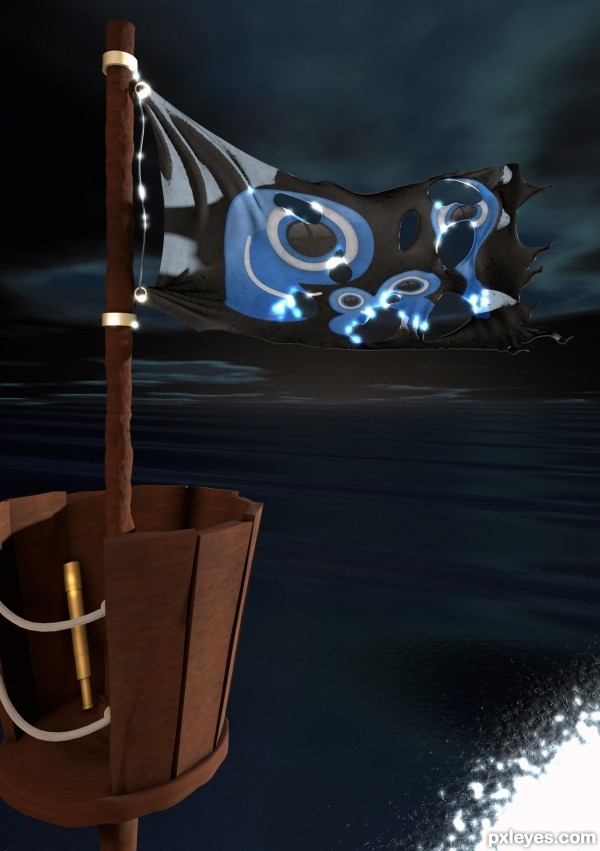
-How to Create a Tattered Cloth- (5 years and 3215 days ago)
1 Source:
Wood  by farsite 15313 views - final score: 71.3% | Spitfire  by mircea 11135 views - final score: 69.7% | Digital 430  by Warlock 8651 views - final score: 68.5% |
Papa Uniform Five Five Yankee  by lchappell 12322 views - final score: 65.3% | kitchen  by maozbd 14554 views - final score: 63.2% | Wooden toy lorry  by enblanco 10730 views - final score: 61.5% |
PXL Pirate  by Ory 7075 views - final score: 60.9% | Graffiti  by lobusdexter 6824 views - final score: 58.3% | Vase  by downoffthedragon 9259 views - final score: 57.9% |
Howdie Guest!
You need to be logged in to rate this entry and participate in the contests!
LOGIN HERE or REGISTER FOR FREE
The too-bright lights on the flag are very distracting and inconsistent with the rest of the image.
You additionally have the flag lit too strongly from the top, while the rest of your scene is being lit with a far softer light source from the RH side...The spyglass is placed within a shadow, and should not be showing any real highlights at all...
All the problems you found seem to be based on PhotoShop ideas. This scene is lit with infinite lights which determine light levels and shadows automatically. It's a very intelligent program which would not mess up the things you suggest. With the ambient moon light and a single background light, as if from the ships rear, this is accurate. The too bright highlights you talk about come from part of the tutorial which I kept in so as to show a new feature I learned in c4d.
The moon reflection doesn't seem so real to me, the rest looks great. I like the highlights on the flag, good luck!
Howdie stranger!
If you want to rate this picture or participate in this contest, just:
LOGIN HERE or REGISTER FOR FREE