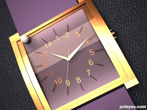
3ds Max (5 years and 3209 days ago)
Goldfish  by mircea 10608 views - final score: 66.5% | Super Match  by Bitmap 13877 views - final score: 66.5% | Marble Giants  by Warlock 9367 views - final score: 64.9% |
oversized pencil? 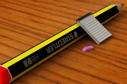 by enblanco 10447 views - final score: 64.1% | cups 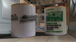 by farsite 11444 views - final score: 63.9% | Ducky  by mircea 4272 views - final score: 63.9% |
Cow Pasture Pool  by lchappell 8842 views - final score: 62.1% | How??? 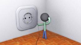 by zcolek 7739 views - final score: 62% | The big breakfast 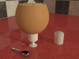 by r1k3r 6659 views - final score: 59.7% |
Oversized time 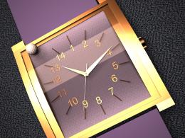 by enblanco 5212 views - final score: 59% | rajasthani footwear(mojari)  by rupa 8339 views - final score: 57.7% | Big Book  by hetsumani 8681 views - final score: 57% |
Howdie Guest!
You need to be logged in to rate this entry and participate in the contests!
LOGIN HERE or REGISTER FOR FREE
Nice...
I think you have to compare the watch with something else ... I didn't like the golf ball..
GL Author ......
Ok, time is an abstraction, it's not an object, I've overdimensioned time with a watch of 14 hours, then I thought that maybe moderators could reject my entry so I've rendered it with a golf ball in "real" size (I've placed it on an evironment)
without a golfer, the golf ball has no value... and it doesn't show the contrast enough

suggest
1) add golfer
2) surrounding grey, change to grass on a golf-course
Nice image and the idea is very creative. But the camera angle lets it down. Maybe more of a 45 degree angle with the watch laying on a table top with the golf ball beside the watch instead of on it would have given you a more believable and pleasing size comparison
Howdie stranger!
If you want to rate this picture or participate in this contest, just:
LOGIN HERE or REGISTER FOR FREE