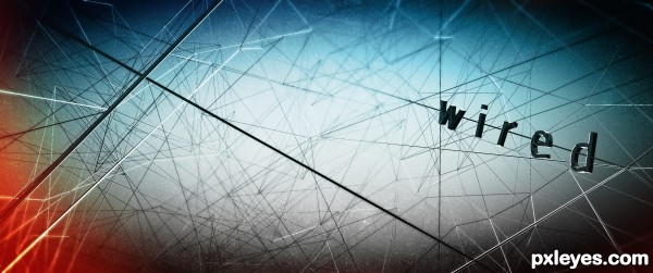
- - - - - - > Please View "HI-RES" version before VOTE =D
:: Using: Cinema 4D R12 + NoiseDeformer Plug-in+ Photoshop CS5 + Wacom Cintiq (5 years and 3179 days ago)
Chop  by mircea 11309 views - final score: 72% | Steam  by mircea 9047 views - final score: 66.7% | The corner of 'emo'  by HexaNode 13119 views - final score: 65.2% |
Skyscraper 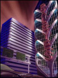 by Bitmap 10136 views - final score: 64.7% | Fish 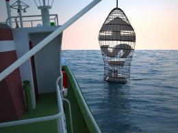 by enblanco 9917 views - final score: 64.5% | Green your Life  by Sandysanju 12236 views - final score: 64% |
Home is where...  by robvdn 11951 views - final score: 63.9% | The Violin  by genuine2009 8620 views - final score: 63% | Pxleyes  by Bitmap 6454 views - final score: 62.3% |
Typo 3D 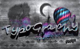 by genuine2009 6118 views - final score: 61.4% | wired~!  by HexaNode 5918 views - final score: 60.6% | Red Dawn 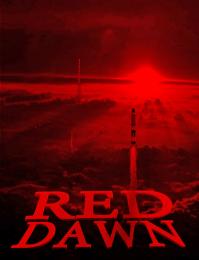 by lchappell 6432 views - final score: 59.8% |
Not Scared  by lchappell 8474 views - final score: 58.6% | Contemplata Aliis Tradere  by lchappell 6294 views - final score: 58.6% | Dead Man Clud  by Sandysanju 7589 views - final score: 58.4% |
Downtown  by enblanco 4622 views - final score: 57.6% | fencing  by happyme27 4685 views - final score: 56.3% | Just Another Brick In The Wall 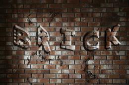 by sodoff 13212 views - final score: 54.4% |
nICE  by enblanco 4483 views - final score: 52.8% |
Howdie Guest!
You need to be logged in to rate this entry and participate in the contests!
LOGIN HERE or REGISTER FOR FREE
I think this would have been more effective if the type had been constructed from wire, instead of just mounting letters on wires...
The lighting of the text is also inconsistent with the rest of the image, showing strong lighting from the top and bottom, while the environment shows side lighting on some wires, and a weird bright spot with dark corners in the background. A clearly established light source, consistently applied to all elements in the image would have made this much stronger.
Howdie stranger!
If you want to rate this picture or participate in this contest, just:
LOGIN HERE or REGISTER FOR FREE