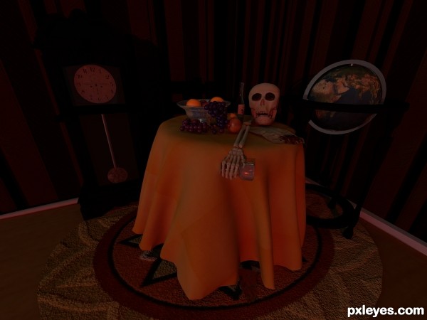
Done for a school assignment. Happy to find a contest to put it in. Please, after you vote, check out my old 3D entries! I have come a loooong way! (5 years and 2988 days ago)
- 1: Clock Face
- 2: Pendulum
- 3: Carpet
- 4: Apple Texture
- 5: Map
- 6: Wood Floor
- 7: Wall Paper
- 8: Table Cloth


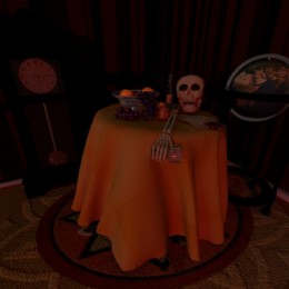


i like the way you put it all together but I think it would help if you increased the lighting in the corner and on the pendelum. Images project depth by progressing from light to dark or dark to light to depict increasing distance. The 3d effect is created by placing selected forground lighting to contrast in the background and selected backgroud lighting to highlight forground objects. If you increased the corner lighting then added a table shadow it would enhance the visibilty of the whole image. I would also add lighting to the pendelum and give it a shadow. and add shadows to the fruit on the table and to the table cloth on the carpet.
Great job.
Thank you for your feedback rob170. However, there are three lights in the scene. Plus an IBL. I can see 2 of them on my pendulum. There is even a little shadow on the pendulum from the clock. The grapes are casting a soft shadow on the table and plenty of shadows on the other fruit. I didn't want light in the corner. Its darkness, handless clock, the uneven lines and odd distortion of the overall picture give it the unnerving quality that I was looking for. But I do agree, that the table cloth could cast a better shadow on the floor! But can you honestly look at my image in high res and deny that the 3D affect has been achieved?
I was not implying there was no 3d affect,I was impressed with the affect from the table forward, beyond that the image was too dark and lacked any contrast. I don't know if it's the img. (860x645) or the settings on my monitor but with out any light contrast behind it the globe, rather than looking like a sphere, looks like a distorted circle, the same is true of the clock face. Another option would be to darken the edges of objects to contrast with the background. still a great job
I just found the hi res img. my pc opened it in a small window behind the main, the full size img. has a better background affect but you can only view part of the img. at one time and scaled to screen size it looses background clarity.
Update: I have resubmitted my image with legal source images. I have also fixed the table cloth. Its edges were below the carpet so that it mixed in with the carpet instead of casting a shadow from above it. The original original image did not have a carpet in it at all.
Hi, rob170. The assignment required the image to be 4000 x 3000 and then we looked at it on a projector that actually makes everything look a lot darker than it is! And this came across pretty well. It does kinda suck that you can't see the whole thing in hi res. But the detail is just too good at that res. I guess I could submit something a little less, but I don't want to. The linear work flow: gamma correction, sRGB makes the color more correct. Monitors brighten texture beyond their reality so when you print them they don't look the way you expect them to. We're going to make printed posters of our still lifes at the end of the semester.
And thank you, again, for your feedback. It is GREATLY appreciated.
Howdie stranger!
If you want to rate this picture or participate in this contest, just:
LOGIN HERE or REGISTER FOR FREE