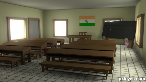
used default maya meterial, flag was painted in photoshop my self. its Indian flag. (5 years and 2610 days ago)
1 Source:
- 1: door
class room  by pikkar 36921 views - final score: 68% | Class before school  by trialboj 43683 views - final score: 66% | Presentation hall  by trialboj 51406 views - final score: 65.1% |
Chemistry station  by AzureDragon 7833 views - final score: 65% | my school  by pikkar 9478 views - final score: 64.5% | school lab.  by dan1307 3158 views - final score: 63.4% |
Teacher  by lchappell 3462 views - final score: 63.1% |
Howdie Guest!
You need to be logged in to rate this entry and participate in the contests!
LOGIN HERE or REGISTER FOR FREE
Nice job
thank you very much
Good One..
thank you very much
Nice!
thank you
I don't really think that your class is thick like this. In my opinion, if I explain your problems, and give some advices how to make better, you learn more, as if I make a comment like above, about how good is.
So I explain why isn't correct this scene, and you should remember my advises in the future.
The main problem is that everything is thick, this could be adjusted easily, just have to notice it.
The second problem is the sharp of the edges, use chamfer tool on every edges that are too close to camera.
Use texture on models, CGTtextures is full of textures of all the genres, and it's free. Nearly every texture has at least a minimal reflection, don't forget this, your floor will be much more realistic with a blurry reflection, under the right window.
Best wishes.
thank you very much. i will keep this in mind . but i didnt understand what you said about thikness!
Howdie stranger!
If you want to rate this picture or participate in this contest, just:
LOGIN HERE or REGISTER FOR FREE