(5 years and 3085 days ago)

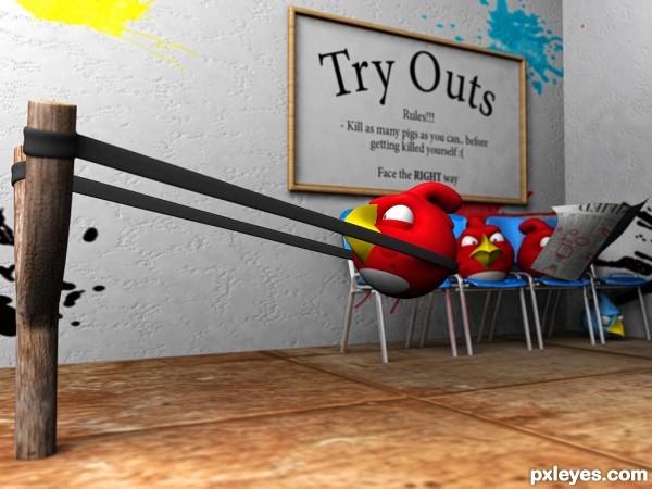
this is how they choose who is gonna compete (5 years and 3223 days ago)
ha ha  damn!!!!! awesommmm!!!! that is some creative stuff .. loved it
fav+high marks 
Howdie stranger!
If you want to rate this picture or participate in this contest, just:
LOGIN HERE or REGISTER FOR FREE

Similar to a scene from movie called "Scarface". (5 years and 3701 days ago)
yes fantastic 
Thanks 
Very creative I must say. I would never had come up with that idea.
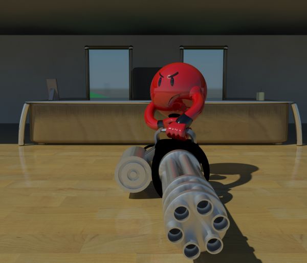
I like everything but the smileys texturing. That poor dude is so abused with reflections that he almost looks hollow. The lighting could also have been better, it makes old school ray traced sharp shadows. It may look better with softer, global illuminated shadows.
(The SBS on the other hand doesn't say very much. It doesn't really show how you modeled the objects and the work progress at all. It will probably not help very much if someone wants to learn from your entry)
The ligthings and reflections give smiley the plastic effect, witch I wanted to achieve, for the SBS, I don't ussualy make this good entries, so I always make short SBS tutorials, I'll fix that, I promise, and also, thanks for the advice with shadows!
very good idea! nice 
lol what?
Author, I see you point with the plastic effect. 
But if you want to imitate a plastic surface, you should probably make it less glossy, but make it equally specular and reflective.
With the current reflection and glossiness it looks more like porcelain. But porcelain looks good too of course (with lower reflections).
awesome
yeap, sorry to say it again after dka. the gun machine reflection on the red smiley look very bad for a good work like that. good luck and take it easy with reflections for the future.
Thanks for comments people, thanks for tips!
coooooooooooooooooooooooooool
haha nice, full of emotions
great
Author this is amazing creativity....Great expressions of the smiley......Great blend and composition....Everything in the image is beautiful....Superb....GL..
nice, but i'd like to see his 'face' a bit clearer
Very nice job Author......G/L.
Hey people, try taking a look of a picture in full view.. That makes it a lot better! Thanks for the comments and tips once again ^.^
Congrats for your third place, Toca!
Congrats!! 
Thanks again! I'm still young, so I hope I will make better works in the future! Peace 
Howdie stranger!
If you want to rate this picture or participate in this contest, just:
LOGIN HERE or REGISTER FOR FREE
The pumpkin needs to show a LOT more back light from that light source. It's too dark around the edges.
There is also no apparent light source for the interior glow. If it is being lit from the exterior light source, the lighter interior needs to better reflect the position of the sun.
Yeah! It has personality. Or maybe I should say "he".
Love it! One of my favorites author! Very clean work!
Howdie stranger!
If you want to rate this picture or participate in this contest, just:
LOGIN HERE or REGISTER FOR FREE