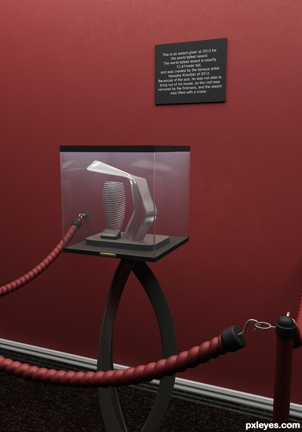
Created with 3ds max + vray + Ps, in about 6 hour +1 hour the final render. (5 years and 2601 days ago)

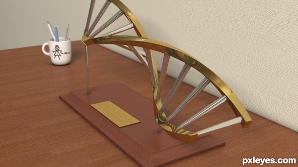
Created this in 3d studio max 2012 with the programs original materials. (5 years and 3077 days ago)
Looks more like a twisted ladder than a DNA strand. Perhaps if it showed more molecules than just bar shapes...
Thank you for your comment.
This is my interpretation of what an award resembling a dna strand would look like and I'd take this design over one where I used 'molecules'.
C C is always appreciated.
i liked the idea author, and the rendering is v. good
gd luck
Great interpretation and fantastic render....GL author
nice idea,good render.....
good luck.
Good work and the idea is very original. It quite stands out.
Nice Congrats
Howdie stranger!
If you want to rate this picture or participate in this contest, just:
LOGIN HERE or REGISTER FOR FREE

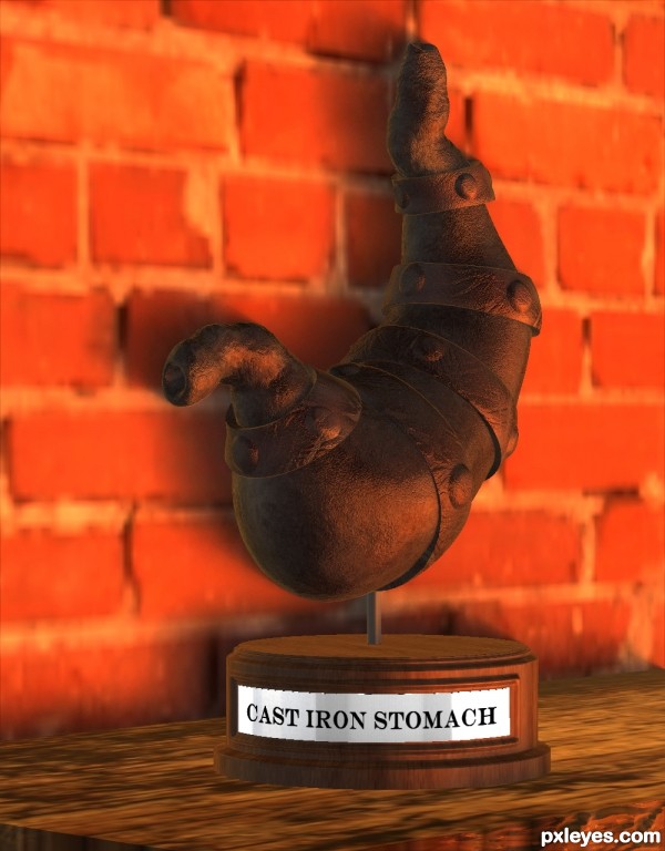
As the title and image implies... a cast iron stomach... atleast I tried to make it as metal looking at I could as cast iron looks fairly bland, black and rough I decided to give some warmth... sorry no background as it took my computer all day just to be able to compile the base to the bladder... But I hope it agrees with some of you :)
Oh all zbrush... rendered in zbrush too. (5 years and 3443 days ago)
The stomach is amazing!. Nice model and textures!. To make it even better, you could try doing something with the box it stands on
keep it up!
Not necessary the box needs to be taken care of, but the overral ambient. You could use some shadow on the ground and maybe a different ( warmer ) colour for the background.
The stomach has more light in the lower side and it's darker in the upper part, and by choosing a fade background that also has light in the lower part, it nullifies the contrast.
MO: use some orange dark clouds as background and make a foreground on which the box stands. You could use that trick with clouds and lighning effects for a BG textures. Keep it up! 
all very good points!... Aloisnin: I'm constucting a new base for the 'trophy'... so hopefully ill be able to upload revision soon.
I'm using zbrush's best render, and lighting which it's applying it to the entire model... I might also try to add a floor as you pretty much suggested greymval... but i's all becoming a huge drain on my system :S so ill have to see what I can feasibly add/render out...
I think the base could just use a tiny shadow right underneath it to 'ground' it to the table, but otherwise, very cool job on that anatomy! In your step 5 - I like both versions!There are lots of restaurants that should give those trophies!

Amazing work, high impressed by your modelling skills in ZBrush. To create all those masks in ZB...its very difficult.
But I dont understand why you use this mediocre render engine of ZBrush. Why dont you move your model into a decent 3D program with good lights and render ?
Once again my congratulations for using this crazy and fabulous ZBrush
Thanks billyboy...  The reason being is that I don't have any other 3D software like Max or Lightwave to render out with... so Zbrush it is...
  ... but I think it's pretty good for rendering out once you get the jist of it... this is my first attempt so..... LOL!.
Pearlie: True, I kind of agree, I did try to elevate it off the table slightly so one would render but unfortunately it didn't work, but thankfully it's not really the focus of the piece so... atleast that's my reasoning... I agree it would make it better as a whole though... 
Howdie stranger!
If you want to rate this picture or participate in this contest, just:
LOGIN HERE or REGISTER FOR FREE
You might want to check the spelling on the shield
Howdie stranger!
If you want to rate this picture or participate in this contest, just:
LOGIN HERE or REGISTER FOR FREE