3D Pictures: Blender


results 1 - 3 of 3

Macaroni - created by brektzar


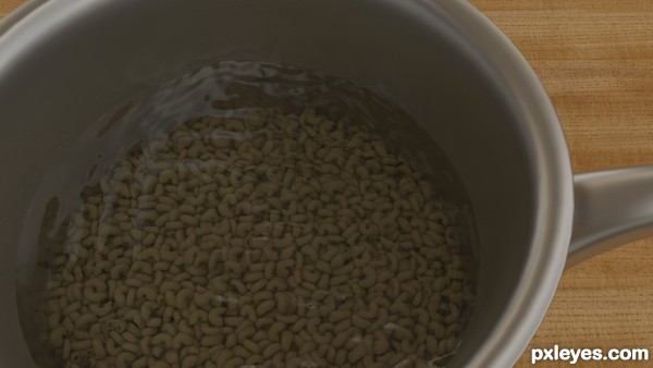
Macaroni
Favs: 0SBS: 11Hi-resRank: 3/5Score: 64.4% (25)33578 views

rushed render, but it will have to do :P

Modeled the macaroni and the dropped them using physics, this way its more realistic than if i were to use a texture.

Everything is made by me, except the HDR image and the wood texture. (5 years and 2578 days ago)

2 Sources:

No comments yet... Be the first!Macaroni, macaroini, pasta, blender

Howdie stranger!
If you want to rate this picture or participate in this contest, just:

LOGIN HERE or REGISTER FOR FREE


kitchen - created by maozbd


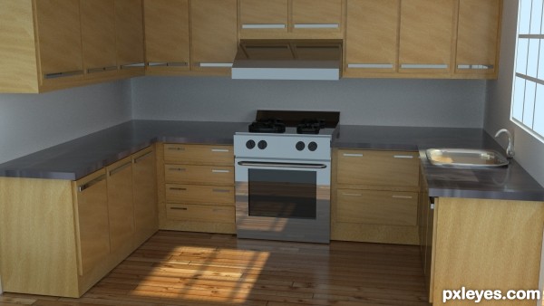
kitchen
Favs: 1SBS: 1Hi-resRank: 5/5Score: 63.2% (0)14152 views

(5 years and 3053 days ago)

4 Sources:

avatar MossyB
MossyB says:

The counters seem a bit short, since counter height is usually very close to stovetop height.

The top of the stove also looks a bit odd, as the contrast is so dim that it is hard to make out whether those are burners (which are WAY too thick if they are) or very thick pans on top of the stove.

Otherwise, this is very nicely rendered, I like the texture used for the cabinet doors and the floor.

no avatar

I did this tutorial a little while ago! I like yours better! I used to Blender, but in my classes I'm learning Maya. Mossyb said everything. GL author.

avatar lchappell
lchappell says:

Nice job on the stove...I like your texturing.

Howdie stranger!
If you want to rate this picture or participate in this contest, just:

LOGIN HERE or REGISTER FOR FREE


Blender - created by hetsumani


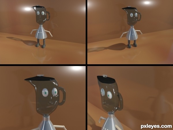
Blender
Favs: 0SBS: 5Hi-resRank: 5/5Score: 53.4% (0)4457 views

hope you like it. (5 years and 3331 days ago)

avatar MossyB
MossyB says:

Love the character, but his head should be more cylindrical. It's a bit flat. VERY cute, though!

author says:

It's on purpose that the head is flat, thought it would make it funny
and more stylized.

Howdie stranger!
If you want to rate this picture or participate in this contest, just:

LOGIN HERE or REGISTER FOR FREE