3Ds Max, I tried to explain how it's done in SBS (5 years and 3153 days ago)
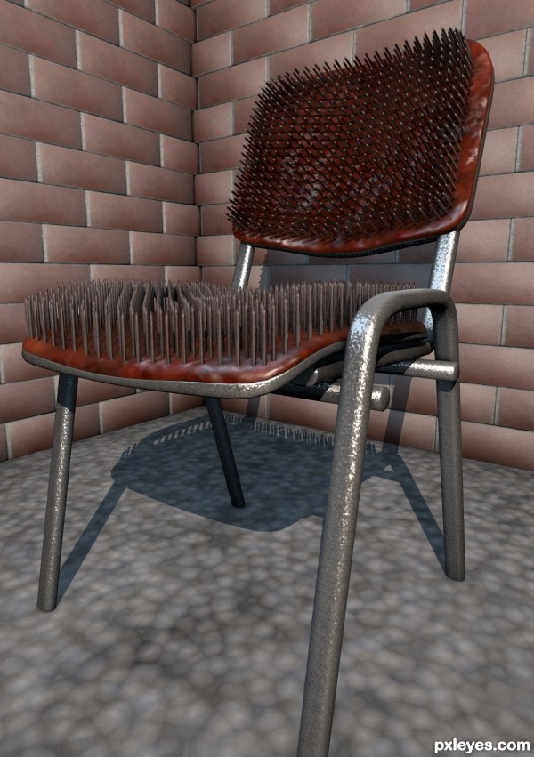
- 1: wood texture

3Ds Max, I tried to explain how it's done in SBS (5 years and 3153 days ago)

EDIT:
I decided to go with a hard shadow version. Tried out the types and this looked the best to me. (5 years and 3153 days ago)
OUCH!.....bad time for siting here!...btw nice ideea !
Look like something a Hindu mystic would sit in  I can just see a yoga master buying one...
I can just see a Hindu mystic sitting in it or maybe a yoga master buying one 
Thanks for the comments guys 
Thanks for the help Missy, your right. I will try and get a new render asap
fantastic job author, and the idea is top notch...well done
Ooo I bet that would smart. Nice work.
Howdie stranger!
If you want to rate this picture or participate in this contest, just:
LOGIN HERE or REGISTER FOR FREE

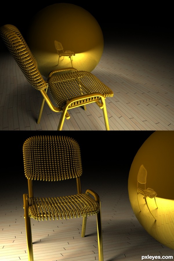
modelled in Maya, rendered in Mental Ray (5 years and 3256 days ago)
instant fave..this is gorgeous
Great work author...u used fantastic color for the chair and material look very fancy and comfortable....best of luck
in this picture, the proportions completely missing , which makes the picture just be nice colorful.....and just that!....for this picture I would score with the big big ZERO....enjoy! because i don't do this! ...IMHO sorry!....

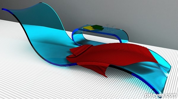
This is really nicely done. This looks a bit more futuristic from today rather than art deco though. 
Nice job with the shaping of the lounger. Maybe you could have done something with the caustics of the plastic though. This would have made it more realistic. The grey wall is a bit of a let down too, if you had added a tiled wall or some other texture it would have been nice. Is it an indoor pool? If it's outside where's the direct light, this would surely have cast some nice shadows, even inside this should have more than just the flat lighting there is now. The glasses are maybe just a tad too small as well, not quite in proportion to the lounger, considering an adult male would almost certainly nearly fill the lounger. The towel should be a little more flexible or creased, this would increase the shadow amount and added more realism, a nice toweling texture would have looked nice too. But overall a nice job, just little more attention to detail would have nailed this. 
Howdie stranger!
If you want to rate this picture or participate in this contest, just:
LOGIN HERE or REGISTER FOR FREE
nice ...nice ...nice .....(imho....I think it works much better with another metal texture, silver, or something in this range, or a mix. of textures..bla bla bla .........but this is just imho).....
Great...! best of luck....
very very nice piece of work author...GL
Howdie stranger!
If you want to rate this picture or participate in this contest, just:
LOGIN HERE or REGISTER FOR FREE