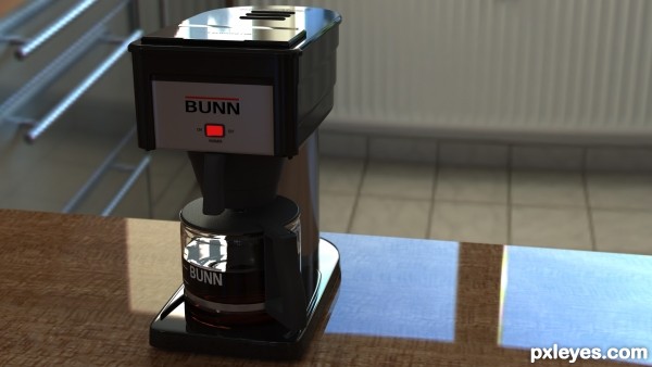
Modeled after my very own. (5 years and 3111 days ago)
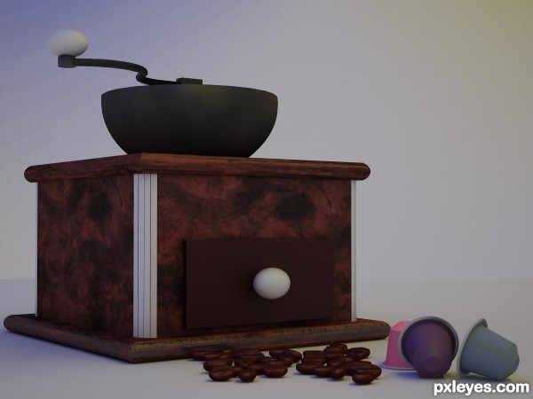
grinder vs. nespresso
(5 years and 3114 days ago)
Great job on this, author. Those beans look very realistic, as does the wood texture of the main box. 
Howdie stranger!
If you want to rate this picture or participate in this contest, just:
LOGIN HERE or REGISTER FOR FREE
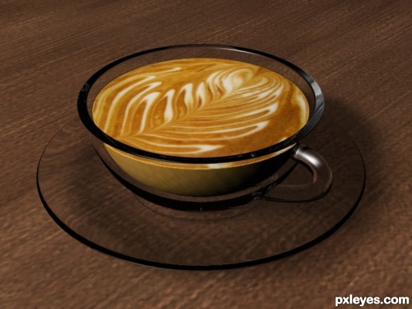
I made it in Autodesk 3DS Max 9.
(5 years and 3115 days ago)
i think the cup material is a bit thick, it wont be really pleasant to drink from a cup with such a thick border and the ear seems a bit small  other then that it looks good
I thought i allready commented but it seems not there so ill retype it. The material of the cup is too thick to really enjoy drinking from, the ear of the cup sems a bit small to me ) good render though, looks good to me 
My mom had these glass mugs, I forget what they're called. Had a nice floral pattern etched into them. I have a set now. But she always made our hot chocolate in them. That's what this reminds me of. Because I've never seen anyone else drink hot drinks out of a clear, glass cup before other than me and my mom. Nice render.
Howdie stranger!
If you want to rate this picture or participate in this contest, just:
LOGIN HERE or REGISTER FOR FREE
(5 years and 3116 days ago)
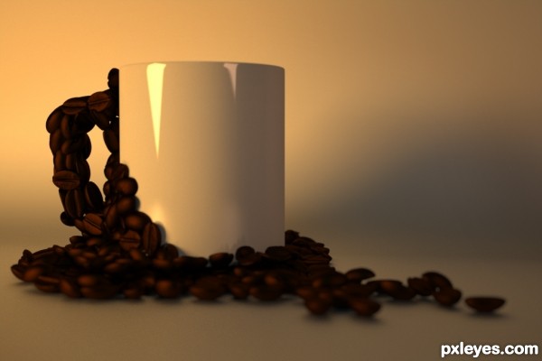
I love how you did the beans. It almost looks like I could reach in and pluck one up.
I like Your creativity, you used in it.
Your concept of the coffee beans 'crawling' up the handle and side of the cup is very odd, and the sbs leaves out a lot of info. IMHO, the beans are all very dark and out of focus, while the cup seems to be fairly sharp. No real definition between the surface that the cup and beans are on, and the wall behind. Also, there's a bright highlight on the cup, so I'm wondering why the beans are not lit as well. Interesting start, but could use some tweaks.
Sorry to disagree, author, but look at the light spot that you have low on the cup - and the beans that are right up against it - very big difference in the sharpness of the two, I'd say they have basically the same DOF. So again, if there is a light right there, why aren't at least those few beans up against the cup where the light is, also lit up?
Look again at the beans that are on the bottom surface/table, right in the horizontal center, the area is extremely dark, so much so that it is difficult to distinguish between the beans. I may not know how the 3D programs work, but I'm not blind, either. And even in a studio setup, a little definition would add visual interest, and a touch of reality. To say 'bean done' may mean something to those who work with these programs, but for those of us who check out these entries and do not, it leaves a lot of questions. I calls 'em like I sees 'em.
This is too blurry pearlie is right with her obsevations.
nice work... looks like the set u was put on a black to white gradient, like i use in my table top studio set up to give the impression of infinity... well done and congratulations on 3rd place.
Congrats 
Howdie stranger!
If you want to rate this picture or participate in this contest, just:
LOGIN HERE or REGISTER FOR FREE
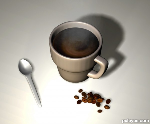
Fresh ground coffee - steamy and delicious! (5 years and 3119 days ago)
Howdie stranger!
If you want to rate this picture or participate in this contest, just:
LOGIN HERE or REGISTER FOR FREE
Really good!!
Thank you!
Very impressive that you can do all that just from some photos. A shame all the type/info can't be seen, wonder how it would look lit from the front instead of the back. Good work, author.
a great realistic render...... all the best
Thanks!
congrats very well deserved entry
congratulations on the victory
Nice Job Congrats
Howdie stranger!
If you want to rate this picture or participate in this contest, just:
LOGIN HERE or REGISTER FOR FREE