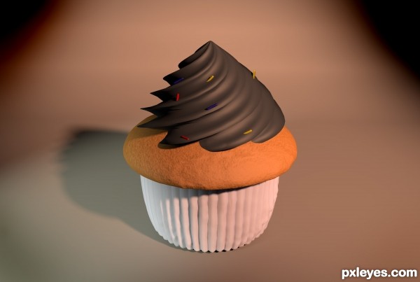
Created using CINEMA 4D and a little Ps. (5 years and 2743 days ago)
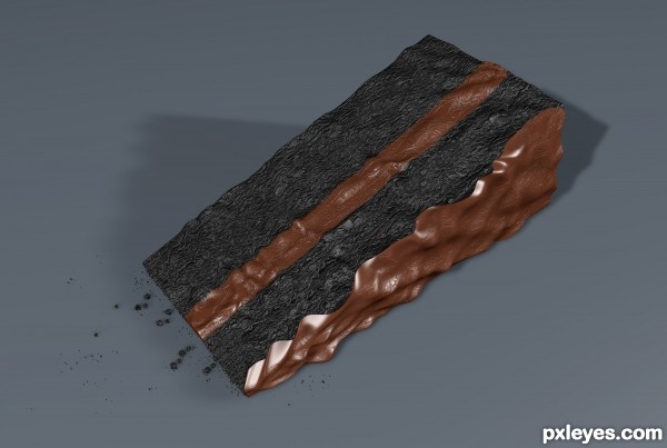
I created this using CINEMA 4D and Photoshop. (5 years and 2749 days ago)
texture of the icing looks fine -- but the cake does not really look like cake -- maybe another texture would look better
Howdie stranger!
If you want to rate this picture or participate in this contest, just:
LOGIN HERE or REGISTER FOR FREE
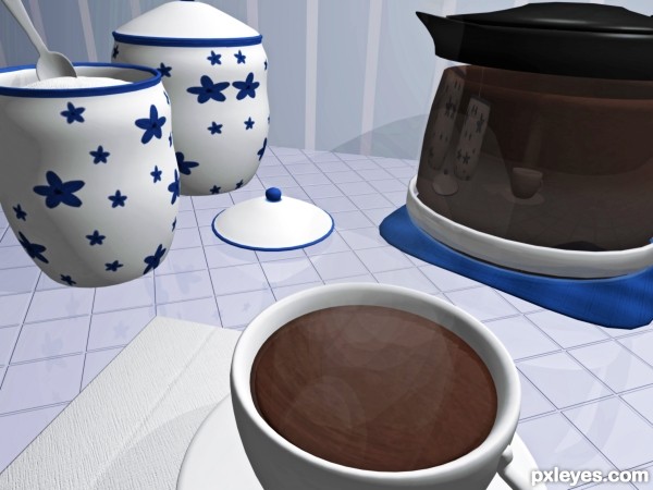
Help yourself to a cup.
Used both Wings 3d and 3ds(mostly for rendering and particle systems).
All textures created using the sources , whatever came with 3ds library, or drawn myself. (5 years and 3036 days ago)
The reflections are too deep. It looks like everything is sitting on a 1" deep piece of reflective glass, especially the coaster under the teapot. It shouldn't really have any reflection at all due to its proximity to the tiled counter.
Also, if the counter surface is so mirror reflective, why are the walls not reflecting anything at all?
The light source should be illuminating the top of the teapot, since it is above the pot and cups, but the top of the teapot is very hard to visually make out...
The overall composition of the components is nice, and the sugar bowl looks quite realistic.
The counter is shiney , i wanted it to look like a mirror and the walls are reflecting a little bit. Obviously they have the same texture but its not mirror like. There are two light sources. The pot is fine as is, i used my own pot as a reference and it looks like one single black thing in real life. Hard to see any detail, very neat from a distance. Thanks for the opinion.
Ok, thanks Mircea! Ill change the wall to something more normal and less distracting. Ill see what I can do about the objects. Rendering is new for me, but I have trouble redoing and redoing..cause it takes so long to render! I will try once more, but thats all I have patience for LOL! Thanks for the comments much appreciated!
Ok, Im willing to try anything once! Thanks for that. 
Howdie stranger!
If you want to rate this picture or participate in this contest, just:
LOGIN HERE or REGISTER FOR FREE
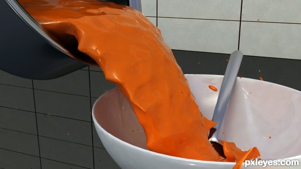
3DS Max 2010 x64.
Vray rendering with HDRi lighting.
(5 years and 3643 days ago)
Yeh... gloop is right, it's totally discusting... 
Great job author...well done
That is brilliant tomato soup. Love the splatter. I could go on to say that it is Souper
I love this one. You got high marks and a fav from me!
Looks very good 
This one is great, something for me to aspire to
great entry! GL author

Very nice entry author.good luck 
 .
.
nice soup..... how much for one cup....... ?.. great job author ...all the best...... 
nice
 good job
congrats on fifth place....
Nice site, thanks for sharing.but i was learing tutorial in only one site which is
http://www.tutorials99.com
New web designer try this.its really useful for you. Professional and top page rank tutorials
OMG.. I totally missed these contests... (I didn't realize that my settings defaulted to only the 2d contests.. I missed out on these contest totally... has been corrected... never let this happen again
ACK... by the way.. My mum and I's favorite soup (gloop) is tomato.. though she makes me add extra milk to make it super creamy... (as a 3D render this is excellent.. as a piece of art.. it's perfection) this would be catastrophic as an entryway image to a restaurant.. it would hard to get people to sit and eat.. they would be to busy staring at the image LOLOL
Howdie stranger!
If you want to rate this picture or participate in this contest, just:
LOGIN HERE or REGISTER FOR FREE
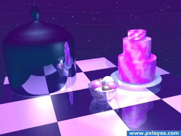
This is my first 3D render. Please be kind.
I had fun experimenting with ray tracing, lighting and nodes! (5 years and 3821 days ago)
Excellent!
Does it look blurry to you? Or smudgy? It didn't look like that in the render window! Thank you Ponti55!
Good. Blender is a difficult program and this is a fine beginning. Take it easy with reflections and things will improve for sure.
For being your first render you did a decent job! There's a lot of tweaking that needs to be done though. The glass isn't correct transparent and should refract (look for glass tutorials about that). As for the texturing you should smooth the surfaces and add bump maps.
Thank you dka120. There's still plenty of time left. Hopefully I will be able to learn how to fix it.
This looks great to me, it's your first 3D render and it's very impressive! The reflections are excellent and the materials look good. The cake does look a tad bit blurry, but not enough to worry about. You could do some post work in photoshop if you wanted to.
I made some adjustments to the Ray Transp Refract (IOR) bar, and others, on the cake cover. I also set it to fade to sky color.
GL
nice surreal athmosphere but need more work.
too bright
i have not worked with 3d, however visually and for a first time entry i think this is just FAB! Can not wait to see what you produce in the future.. GL
very nice 
Thanks everyone for the kind and constructive comments!
Howdie stranger!
If you want to rate this picture or participate in this contest, just:
LOGIN HERE or REGISTER FOR FREE
Looks very yummy, great work!
Howdie stranger!
If you want to rate this picture or participate in this contest, just:
LOGIN HERE or REGISTER FOR FREE