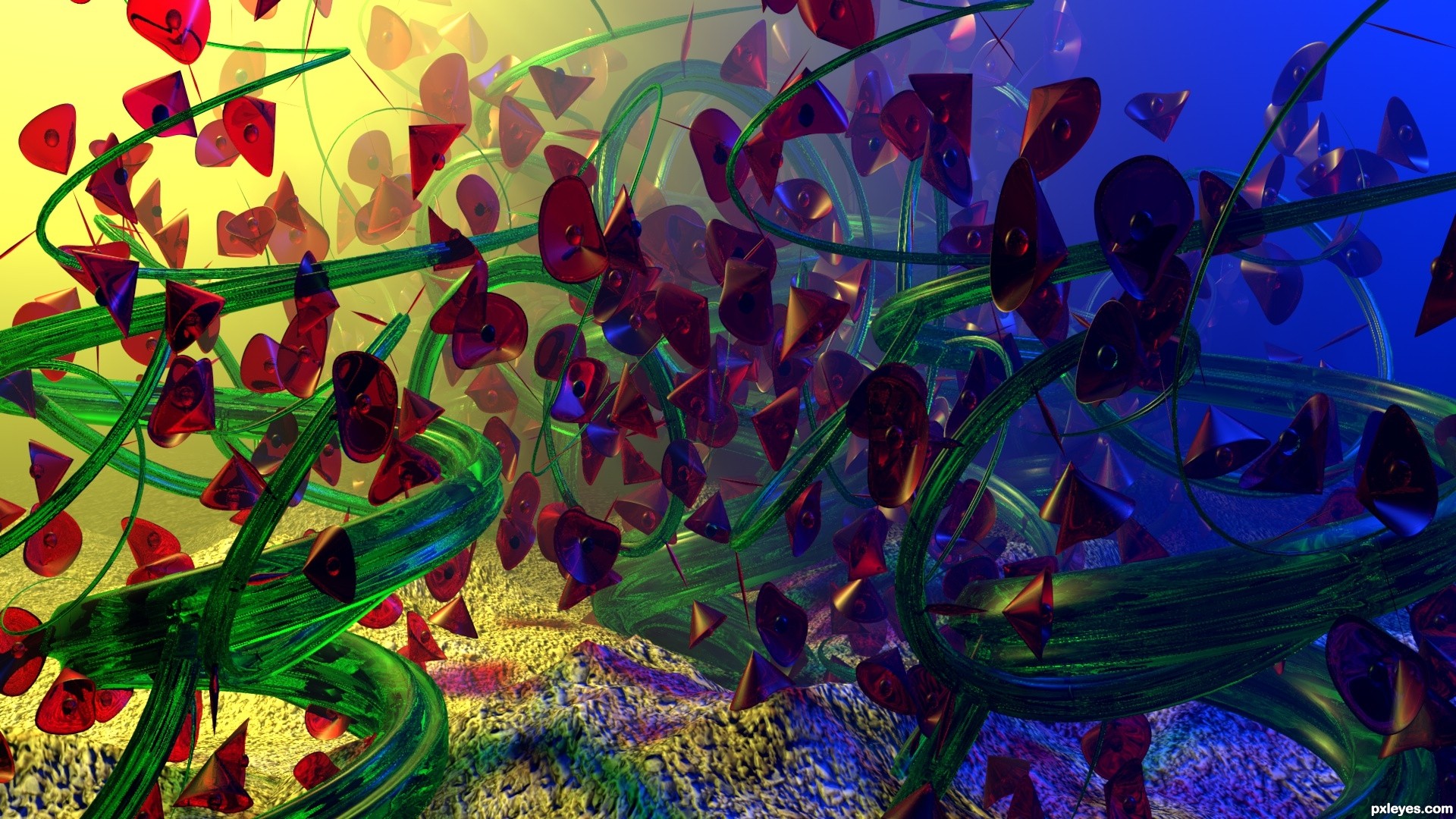
(5 years and 2775 days ago)
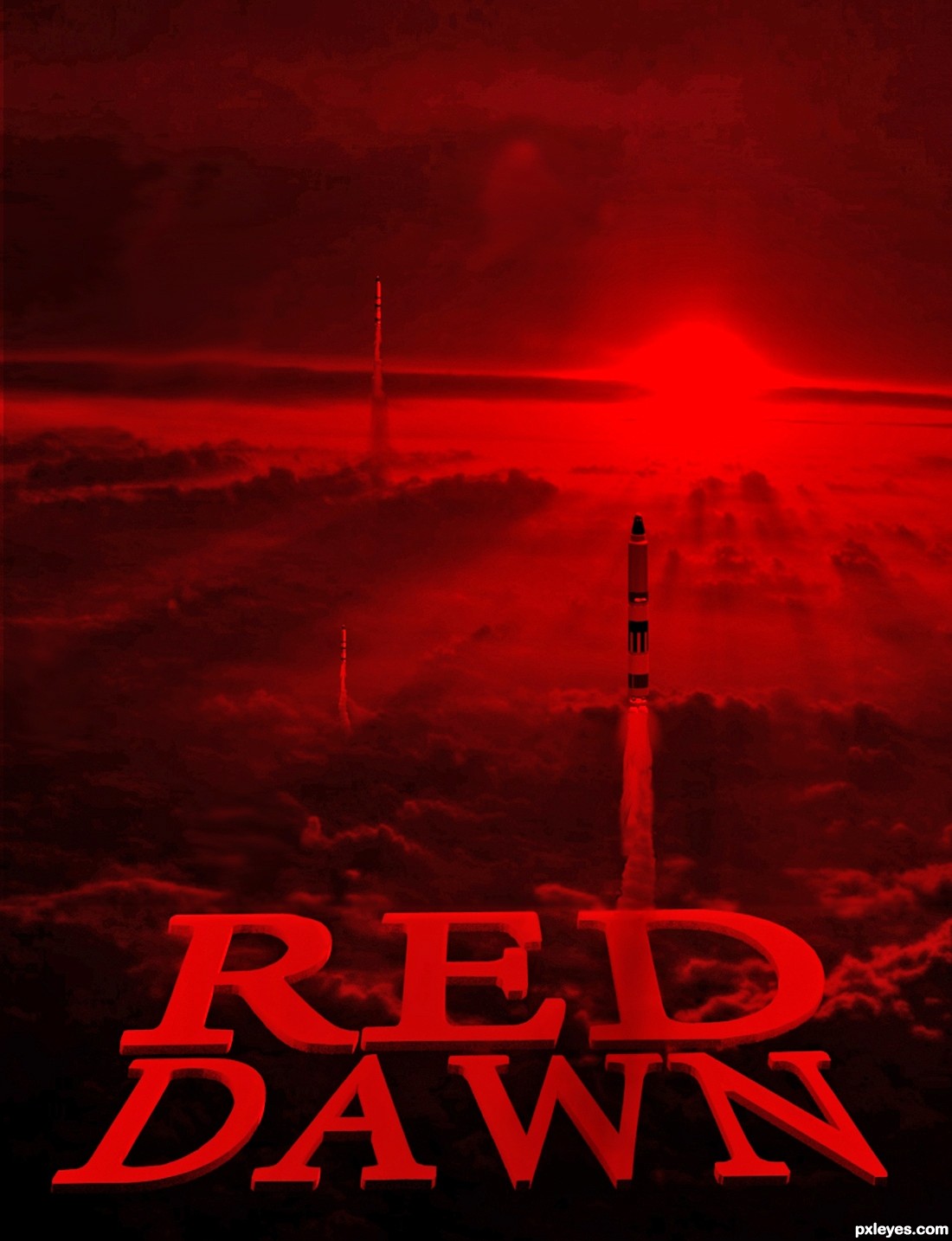
Credit to edmittance @ flickr (5 years and 3182 days ago)
The sun in the background does not correspond with the light shining down into the letters. The upper 'e' and 'd' are too light on the bottom and along the inside top, and the lower 'd' is too light on the RH outside (about halfway down) for as low a light source as your background.
MossyB, thanks for inspiring me to recreate this one. 
I like this incarnation much better.
Hi there, Author, did you able to add more (20% or 30% Opacity) highlights to edge of the word "RED"? It will definitely give the word more stand out (ofc a little, not too much) from the background. 
Good luck on your entry! 
Howdie stranger!
If you want to rate this picture or participate in this contest, just:
LOGIN HERE or REGISTER FOR FREE
Photography and photoshop contests
We are a community of people with
a passion for photography, graphics and art in general.
Every day new photoshop
and photography contests are posted to compete in. We also have one weekly drawing contest
and one weekly 3D contest!
Participation is 100% free!
Just
register and get
started!
Good luck!
© 2015 Pxleyes.com. All rights reserved.


very nice
Howdie stranger!
If you want to rate this picture or participate in this contest, just:
LOGIN HERE or REGISTER FOR FREE