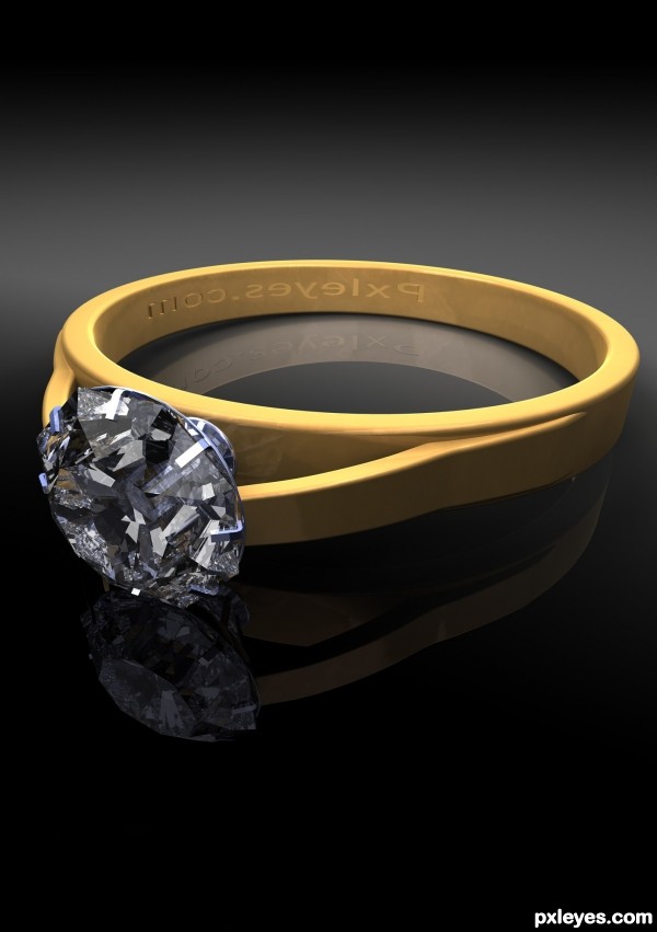
Please note, the item advertised has been reduced in price by 25% due to a manufacturing error causing the engraving to be backwards. :-p (5 years and 3255 days ago)

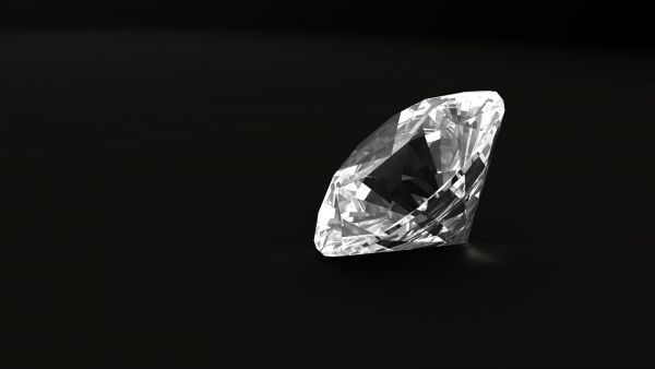
My last update: updated diamond mesh to better representate real gem, removed reflection from the floor, some changes in light setup, added better(hope so) caustics, changed angle of wiew.
Enjoy...
(5 years and 3690 days ago)
perfect one ! 
Nice work.....Reflection would have been even better if it would have been a darker background.....Beautiful...
very nice work...gl author
wow....never thought a diamond can just lie down a flat surface and still look cute!
This looks fab. I think you have greatly improved your diamond, it looks so much more punchier.
thanks much to you all, I am pleased about yours critique. I know, that it isn't perfect, but nobody is perfect. 
RichieMB, thanks to your post, my surface caustics settings are by now somewhere about 10M photons, and 500% light energy. I think, that the black matte is the key, why the caustics isn't so clearly visible. 
yup caustic is very hard on a black matte  a light color would show caustic more.
Very good job with this.
very nice
Congrats for your first place, Mires!
Congrats, this really is beautiful 
Congratulations for 1st
Thanks much once more. The other are pretty hard to beat. Thx.
Howdie stranger!
If you want to rate this picture or participate in this contest, just:
LOGIN HERE or REGISTER FOR FREE
The setting looks like yellow plastic. There are no highlights or color variations to make it look like gold metal...
Here is a tutorial that might help you.
http://www.gomediazine.com/tutorials/badass-bling-effect-in-photoshop/
Partially agree with Mos.
 (j/k).
Actually mossy, this is 3d, as I understood they arent allowed to post-process in PS.
Maybe increasing refraction setting , add a brighter light,or use PS but don't tell
Nice work on this, reflections could have been better on the gold mount your long luminous ploys directly above the ring would be the reason for this, try experimenting with HDRs for this sort of work.
Howdie stranger!
If you want to rate this picture or participate in this contest, just:
LOGIN HERE or REGISTER FOR FREE