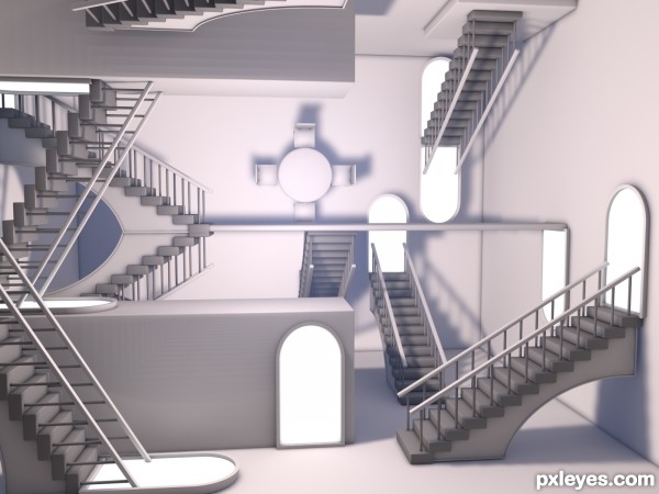
My version of the staircases picture by Esher.
Would have liked to really get this nailed down but I could not get my head around it to make it perfect with all the new and different angles, etc.
No texture on purpose to create a further feeling that any way could be up.
EDIT: Added some luminescence to the inside of door frames to show a through way. Just a quick fix. (5 years and 3215 days ago)


It would have looked better if the doorways were open or had handles. This way just looks like the staircases all run up to solid walls...
it's a very good idea ... but I guess you didn't look to the original picture first ...
but the over all design is good
Good Luck
@Mossy: Good idea. I might add that in, Thanks.
@Bitmap: I did look but at the same time wanted to put my own spin onto the image. I could have studied a picture of the original and slowly but surely replicated it as close as possible but that would not be an exercise in my creativity, rather just a copy and paste job.
nice blur, increase the distance perception, GL!
Nice one!
Howdie stranger!
If you want to rate this picture or participate in this contest, just:
LOGIN HERE or REGISTER FOR FREE