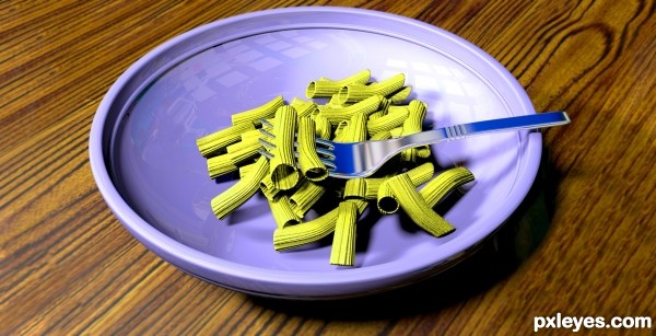
This was created using CINEMA 4D and a little Photoshop. (5 years and 2733 days ago)
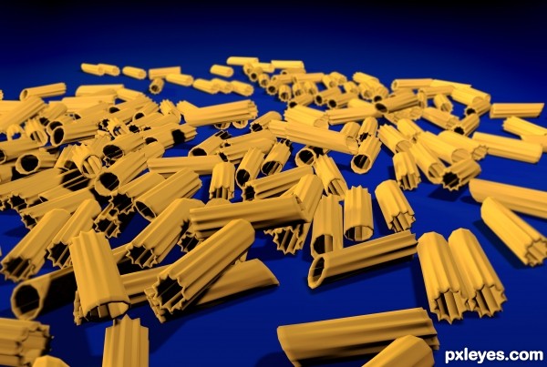
Created using CINEMA 4D and a little Photoshop... (5 years and 2742 days ago)
its good but its look like steel pasta
Howdie stranger!
If you want to rate this picture or participate in this contest, just:
LOGIN HERE or REGISTER FOR FREE

enjoy life with this chain (5 years and 2932 days ago)
like your idea what did u use to light the scene is it gi good one author and good luck
Howdie stranger!
If you want to rate this picture or participate in this contest, just:
LOGIN HERE or REGISTER FOR FREE
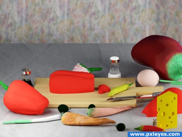
Most of the objects are created and painted with ZBrush.
Few objects are created with 3DS Max.
The mouse is create by his mother..oups.. I mean is a picture photoshopped.
Final render with mental ray.
Thanks to Rob Owen-Wahl for the mouse photo.
Wood texture from CG Texture.
Important edit only for 3D junkies :)
Not satisfied by the first mental ray render I' ve made a new one with V- Ray. See the old one in SBS step 12.
Change only the two mr omni with two planes v-ray light. UV maps made in ZBrush just changed from Arch& Design to V-Ray mtl. And the table texture , of course.
IMO V-Ray is much better for interiors scene. Or i dont manage the correct settings for MR. (5 years and 3821 days ago)
Made me hungry! Until I saw the mouse. : )
Certainly much better with V-ray nice work.
GL
i don't like the background and the cheese.
gud look..modeling not bad..uvmapping for the ground and background is not perfect..texturing part need to be improved..nice try ..gl
like your metal finishes, the wooden board and the egg would be my faves in this entry. over all it is visually colourful
very nice 
Howdie stranger!
If you want to rate this picture or participate in this contest, just:
LOGIN HERE or REGISTER FOR FREE
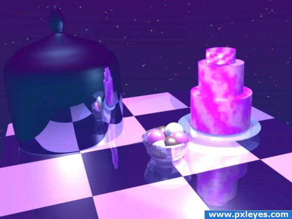
This is my first 3D render. Please be kind.
I had fun experimenting with ray tracing, lighting and nodes! (5 years and 3821 days ago)
Excellent!
Does it look blurry to you? Or smudgy? It didn't look like that in the render window! Thank you Ponti55!
Good. Blender is a difficult program and this is a fine beginning. Take it easy with reflections and things will improve for sure.
For being your first render you did a decent job! There's a lot of tweaking that needs to be done though. The glass isn't correct transparent and should refract (look for glass tutorials about that). As for the texturing you should smooth the surfaces and add bump maps.
Thank you dka120. There's still plenty of time left. Hopefully I will be able to learn how to fix it.
This looks great to me, it's your first 3D render and it's very impressive! The reflections are excellent and the materials look good. The cake does look a tad bit blurry, but not enough to worry about. You could do some post work in photoshop if you wanted to.
I made some adjustments to the Ray Transp Refract (IOR) bar, and others, on the cake cover. I also set it to fade to sky color.
GL
nice surreal athmosphere but need more work.
too bright
i have not worked with 3d, however visually and for a first time entry i think this is just FAB! Can not wait to see what you produce in the future.. GL
very nice 
Thanks everyone for the kind and constructive comments!
Howdie stranger!
If you want to rate this picture or participate in this contest, just:
LOGIN HERE or REGISTER FOR FREE
Howdie stranger!
If you want to rate this picture or participate in this contest, just:
LOGIN HERE or REGISTER FOR FREE