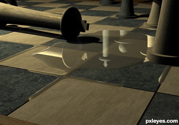
The queen wheeping over her fallen king.
Updated version, thanks to Warlock for the suggestions. (5 years and 3543 days ago)
- 1: marble image 2
- 2: marble image 1
- 3: marble
- 4: wood

The queen wheeping over her fallen king.
Updated version, thanks to Warlock for the suggestions. (5 years and 3543 days ago)
(5 years and 3654 days ago)
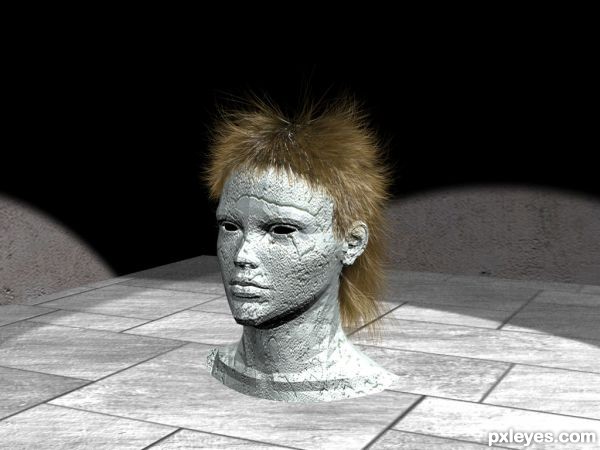
nice hair !
very good 
this hair is like the animes from japan, good job
congrats.. 
Howdie stranger!
If you want to rate this picture or participate in this contest, just:
LOGIN HERE or REGISTER FOR FREE
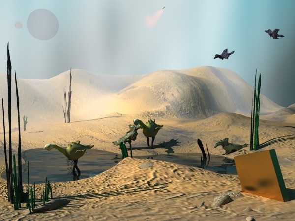
Somwhere, in Universe, an advanced civilization live a message on a planet where life is just beggining...
LOL, actually I had in mind â€2001- A Space Odysey†, my all time fav SF movie. If you didnt see it i cant explain what is the golden box on the ground.
3 DS Max, render with Mental Ray.
Organics are sculpted in ZBrush.
No 2 D graphic program, no external sources. (5 years and 3773 days ago)
It's great except the shadows, they look like squares. 
wlado, the ground is very bumped, very out of level. thats why the shadow is not uniform. is not made by me, like in photoshop, is a realistic mental ray shadow map.
I was reffering to the shadows of plants, animals and such, but i see that you have already correctd that, cause when I commented they were really low-detailed. I know what bumpmaps are. =)
Really like the water effect...perhaps soften the edge where the water meets sand...
Thanks, pixelkid, you're right. Blur tool from PS is forbiden on 3d contests.What can be done in 5 sec in PS suppose few hours to work on Max. Have to make selections, to assign different materials blured on Mat editor. Maybe I shall try.
I'd reduce the intensity of the shadows & blur them a bit, and give some dimension to the 2 moons. Otherwise it's a good image.
interesting
Howdie stranger!
If you want to rate this picture or participate in this contest, just:
LOGIN HERE or REGISTER FOR FREE
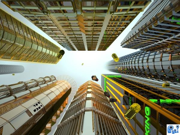
3 DS max, V-Ray render.
No 2D graphic program, all maps are procedural, no external sources.
(5 years and 3781 days ago)
It looks great, but, the image is supposed to be a cityscape. That means a view of the whole city or from bird perspective... So, just change the camera angle and do some tweaks. =) I'm holding my vote for now =)
LOL, wlado, I have not wings and my cat refuse to take the camera when she jump in trees. You can vote, man, i shall not change a single vertex.There is no camera to view ALL the buildings in a town. So, how many buildings form a cityscape ? 5, 6 maybe 10 or 100 ? And why strictly from the top or side ? To be sure we have nothing original in our works? Finally, a quote from Razor's comment which I love  (the comment, not Razor) â€I think some people need to remember that with art, and themes, we should use the theme as a starting point, not a finishing point,â€
Why from top or side? Because that is supposed to be a cityscape. =P A view of a city as a whole, or a part of it, not view of sky from the city. Your work looks cool, but really, I'm not gonna fall for few simple buildings that look good because of the camera angle. People here have made whole, structired and detailed cities, they designed them, arranged them.. Get what I'm aiming at? I know you don't have wings. But hey, guess what, you don't have a travelling mashine neither, but still you made something futuristic =P It's not a cityscape, but it's supposed to be.  So I suggest fixing =)
wlado, usually I'm very open-mind to any technical, compositional or any kind of artistic critic. But discussions about on/off theme are endless and waste of time. I hope you have the artistic knowlege to do a better critic comment than to hang on this problem like a dog on a dry bone. However, I shall keep in my mind that I found a good camera angle for cityscapes  , this is a good beginning for your future critics, GL
interesting change from the usual perspective -- nice work
OK, as you wish..... =)
I like the perspective chosen here. Nice job, author!
this reminds me of that movie called the 7 elements or something like that with bruce willis
right jaescoe, is The ffth element by Luc Besson,, I think of that movie
Good to see things from a different perspective. Good job
Great perspective
I love the 5th element.
Hey! I see Mila Jovovich falling from the sky!! Great job.
yay, something unique  You've done a good job author, i don't know how to do 3d but this is my fav in the contest... this is realistic
Howdie stranger!
If you want to rate this picture or participate in this contest, just:
LOGIN HERE or REGISTER FOR FREE
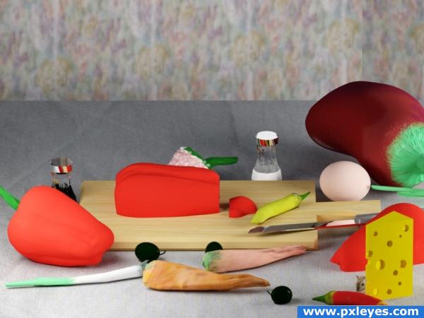
Most of the objects are created and painted with ZBrush.
Few objects are created with 3DS Max.
The mouse is create by his mother..oups.. I mean is a picture photoshopped.
Final render with mental ray.
Thanks to Rob Owen-Wahl for the mouse photo.
Wood texture from CG Texture.
Important edit only for 3D junkies :)
Not satisfied by the first mental ray render I' ve made a new one with V- Ray. See the old one in SBS step 12.
Change only the two mr omni with two planes v-ray light. UV maps made in ZBrush just changed from Arch& Design to V-Ray mtl. And the table texture , of course.
IMO V-Ray is much better for interiors scene. Or i dont manage the correct settings for MR. (5 years and 3800 days ago)
Made me hungry! Until I saw the mouse. : )
Certainly much better with V-ray nice work.
GL
i don't like the background and the cheese.
gud look..modeling not bad..uvmapping for the ground and background is not perfect..texturing part need to be improved..nice try ..gl
like your metal finishes, the wooden board and the egg would be my faves in this entry. over all it is visually colourful
very nice 
Howdie stranger!
If you want to rate this picture or participate in this contest, just:
LOGIN HERE or REGISTER FOR FREE
wow, very well done!
I don't really enjoy the material of the chess pieces, but the water, reflection and all the rest is very nice work.
Nice image I don’t mind the textures, more interested in the work as whole, there are a couple of things that are bothering me, the orange streak in the B.G. what is it and way is it there (not in the visible in the S.B.S) and the main chess piece should be vertical not leaning back as it is, I can see know reason for it. (Not unless it's just about to fall still looks odd)
@ Warlock: the leaning has to with the fact the camera is in a close-up position, the yellow streak is coming from light shining through a glass which stands there (look at SBS step 14).
The main thing was the chess piece and the reason I pointed It out was as far as i could remember, the softwear you are using has a fundamental problem with camera FOV (field of view) is not at all accurate, so setting a FOV of 90 makes a shot less than 90 degrees on the horizontal vertical axis in other words, the rendered view is incorrect....i may be wrong tho this may have been corrected in newer versions.no disrespect mean
Edit: sorry forgot to add that this can be corrected by using 112.5 degrees
Thanks so much Warlock for the help, adjusted some settings and rendered it again. Looks much better.
Your help has been very much appriciated!
Looks much better...and you're very welcome glad it helped!
awesome
sence they took mine down which was (water of earth) im putting my money on u man lol
Very good job. looks great
very nice work...good luck
Very nice, well done. Good luck
Good work.
Congrats great work!
Congrats Rob terrific work
Congrats on first place
Congrats for 1st
congrats Rob
Congrats for your first place, Honey!
Thanks for the congrats and favs
Howdie stranger!
If you want to rate this picture or participate in this contest, just:
LOGIN HERE or REGISTER FOR FREE