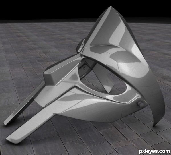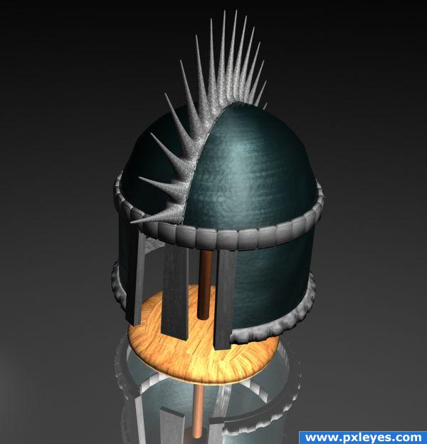
this is my first entry at this site and my first challenge.i updated full steps of my work from modeling to rendering full steps to follow easily.enjoy it guys (5 years and 3382 days ago)

Made in C4D entirely.
No references, no blueprints, just my imagination :-) (5 years and 3854 days ago)
Looks good. I especially like the wood and the spikes texturing. But you could however add some more bump to some parts of the helmet to make it look even better. A flat mirror ground is boring - maybe you could add some minor bump there as well to make it look less "perfect". Good job anyway.
Nice! I wish I knew how to do stuff like this.
The reflection of the wooden part would be closer to the surface...
congrat for the fourth ... 
congrats 
Howdie stranger!
If you want to rate this picture or participate in this contest, just:
LOGIN HERE or REGISTER FOR FREE
Looks good
this is corect author!!!!....excelent work!!!!
Very beautiful design, i think you should increase the lights
Crisp and well finished.
Fabulous piece author...One minor suggestion...Mask will pop up even more if u change color of the surface on which mask lay's...just an idea...best of luck
very cool!
gr8 work
nice work man, well done bro...
Congrats on second place
Howdie stranger!
If you want to rate this picture or participate in this contest, just:
LOGIN HERE or REGISTER FOR FREE