model pro (5 years and 3721 days ago)

Maya 3D (5 years and 3742 days ago)
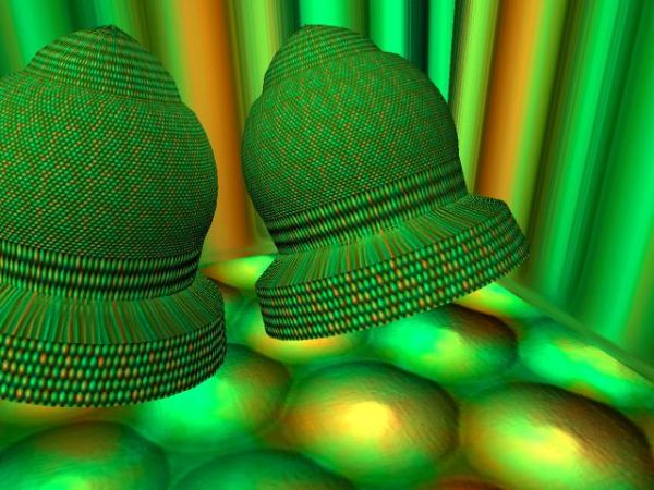
you should do the UVs so thew texture wont be streshed
Thanks for your comment foxymop...
I suppose you are a beginner? There's a lot of things things that could have been done, but here's some things you can experiment with: It's not that easy to make out how you have been texturing, but for learning you could try applying the bump map (the one available in your source url) to the bump channel and make it specular and slightly reflective.
dka120 : Yes I am a beginner. I used the bump map but it didn't pop-up well. I agree.
Ok, I see.. bump maps doesn't have much effect without specularity and/or reflections. Try experimenting with those values and you'll see the difference.
About the bump, thing is that, the bump only simulates bumpyness of what is pointi to the camera. If you want to see bumps on the side of the objects, you need to use displacement maps. Like the Strawberry jar in this contest.
nice job 
Thanx Chakra just trying 
Howdie stranger!
If you want to rate this picture or participate in this contest, just:
LOGIN HERE or REGISTER FOR FREE

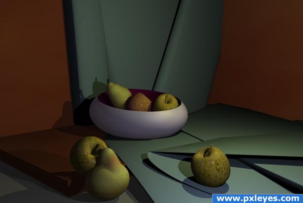
No meshes used simple primitives and the colour and texture editor for apples and pear skins.
Bryce prog used. (5 years and 3814 days ago)
nice work
Beautiful! Looks almost real.
gud work
I really like the dimmer lighting here...good color choice too. 
NICE
This looks really cool, but there's something about the shadows of the apple that's bugging me. Why would the shadows be different colors? One's kind of bluish while the other is greenish. Seems like different light intensity would change shade, not tint. And, if I imagine where one of the light sources is, the bluish one seems just a tiny bit big. I dunno. I could easily be wrong. It's still a cool picture. Good job!
Beautiful!
nice mood of light..gud work
nice choice of elements in this work. fruit and paper look great.
very nice 
Howdie stranger!
If you want to rate this picture or participate in this contest, just:
LOGIN HERE or REGISTER FOR FREE
Sweet
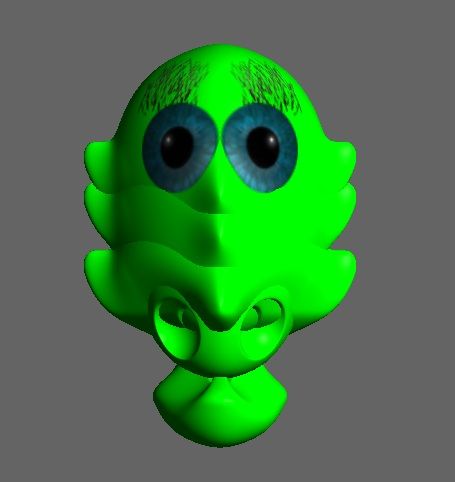
Nice character design.
Design is nice.....
Howdie stranger!
If you want to rate this picture or participate in this contest, just:
LOGIN HERE or REGISTER FOR FREE