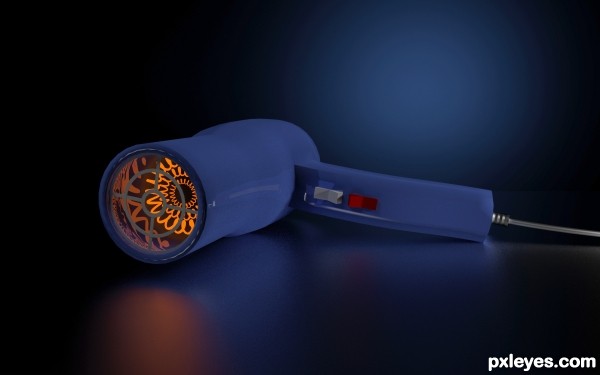
An standard hair dryer...
Made in Blender 3D (5 years and 2779 days ago)
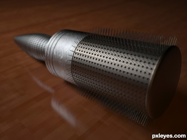
(5 years and 3193 days ago)
The handle doesn't look very functional, too short and looks hard to hold. The bristles also look a bit too fine for a hair styling brush...The reflection on the table looks cool, and the overall lighting is quite realistic, it's just the brush that leaves a bit to be visually desired.
Realistic lightning.. 
The wood planks in the floor/table, scaled, would be like 3mm wide... Either that or it's a monstrously large brush!
awsome work dude
nice work
Howdie stranger!
If you want to rate this picture or participate in this contest, just:
LOGIN HERE or REGISTER FOR FREE
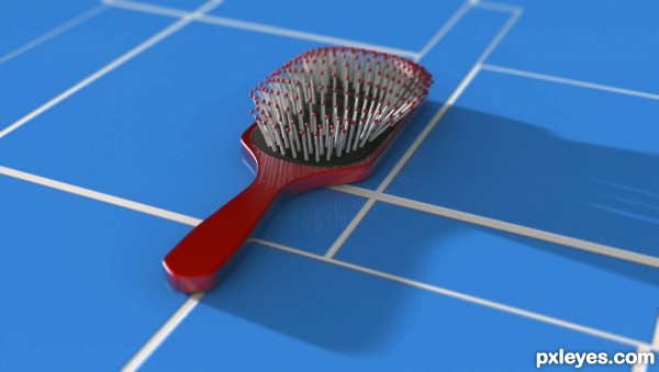
My take on a cushioned brush. *update - At the request of everyone, I've lightened up the shadow a bit. (5 years and 3195 days ago)
Excellent job on the bristles! The cast shadow is a bit too black and opaque,you can't see enough ambient light of the dark side of the brush (although you can slightly see the white grout), but overall, this is really well done.
Ya, it is funky. The shadow was actually to help the tile look more authentic, as you pointed out. I need to rework the lighting. Also, I'm not happy with the grout being reflective... I should get rid of that as well.
Yeah great job. The details are fantastic, but I agree with the shadow, should fade slightly near the end.
The shadow is too black.But a good thinking 
really nice thinking..
O.k., I lightened up the shadow. I agree it looks better. Thanks to all who suggested.
nice work
Wow, I didn't think this was that bad. Just goes to show...
It was not that bad Author 
Howdie stranger!
If you want to rate this picture or participate in this contest, just:
LOGIN HERE or REGISTER FOR FREE
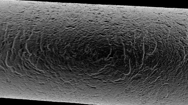
A piece of hair seen through a microscope. (5 years and 3751 days ago)
Very intelligent take on the theme.
interesting, try making just the tip, it will be more interesting
yea.. good thinking.. good luck.. the texture is very nice.. 
like the originality
 finally we've got this kind of entry i was expecting ! great entry author ! good luck !!


its an interesting approach of hair  )
)
Howdie stranger!
If you want to rate this picture or participate in this contest, just:
LOGIN HERE or REGISTER FOR FREE
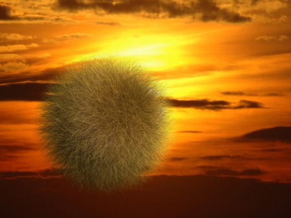
Hey, this was created and animated in C4D, to view the short 4 second animation please go to: http://www.youtube.com/watch?v=G13k7vThw1M
(5 years and 3760 days ago)
Your image will be judged on its content, composition and skill demonstrated. Words in the image generally detract from the image and unless they really improve the image, people usually vote lower because of them. I would suggest that you remove your sales pitch and put it in the description.
problem is that a lot of people will not read the description and as my entry is actually the youtube video and not this 1 frame I thought it important to mention that.
almost everybody reads the description author.. people here likes to know more about the entries, if you can remove that content and place it in the description that would be cool..
A lot of people read the comments, too. So if they miss it in the description, they'll know to look because of the comments!
NOW the image is beautiful!! And I really enjoyed the video. I would like to be able to do that soon.
well done author.. this looks really different without the distraction and I enjoyed the video too.. nice work..
Very nice work... The animation is pretty cool too !
congrats.. 
Howdie stranger!
If you want to rate this picture or participate in this contest, just:
LOGIN HERE or REGISTER FOR FREE
good lightning...
very nice presentation of the product.. all the best..
Thanx dilsedosty!
Howdie stranger!
If you want to rate this picture or participate in this contest, just:
LOGIN HERE or REGISTER FOR FREE