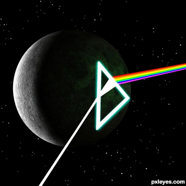
(5 years and 2905 days ago)
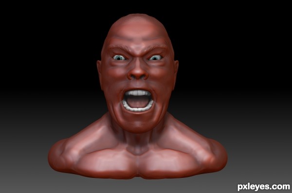
A Zbrush sketch of my little brother. Loaded a speedsculpt video check it out to see how i made it
http://www.youtube.com/watch?feature=player_detailpage&v=zFAsgFmnc1M (5 years and 3017 days ago)
good one author, you have very good modeling skills gl.
True its a sculpt the geometry is ridiculous on this one too, i think its over 8 million polygons. I know how to retopo so it would be considered a "model", making good edge loops for facial animations and such, but for the purposes of this contest it was not necessary. Thanks for the comments glad you like it.
Howdie stranger!
If you want to rate this picture or participate in this contest, just:
LOGIN HERE or REGISTER FOR FREE
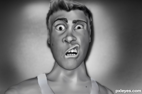
I took a series of pictures of myself about 6 years back to make an image to give my girlfriend at the time (now my wife) for valentines day as a joke. The reference of this model is one of those pictures. (5 years and 3022 days ago)
Wow, this is really good! Well done, I really need to learn Z-Brush for contests like this.
Its an amazingly powerful program. I recommend anyone with 3D talent to give classes or vid tutorials a try. I came from a Maya background and picked Zbrush up very quickly. Got to the point were I took classes at GNOMON in Hollywood too. I wouldn't be using it if it weren't for these contests so im really glad I found this site to brush (no pun intended) up on my skills.
very nice..my fav..
Thanks glad you like it.
Howdie stranger!
If you want to rate this picture or participate in this contest, just:
LOGIN HERE or REGISTER FOR FREE
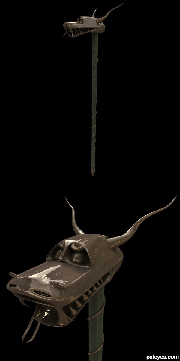
(5 years and 3137 days ago)
I love the gloss on the top of the head in the detail photo! The tongue looks a bit odd with the vertical alignment and the shape of it (a single tongue with a forked end would look more "natural" ), but this is a truly unique construction. Nice work!
Pretty cool, author. Nice details, just enough. 
Very well done model - artistic and realistic. Probably by including the usability as well, such as handle to hold the walking stick above the dragon head without diminishing the overall artistic value of it might be able to mass produce it in the future 
Nice concept, good luck!
Howdie stranger!
If you want to rate this picture or participate in this contest, just:
LOGIN HERE or REGISTER FOR FREE
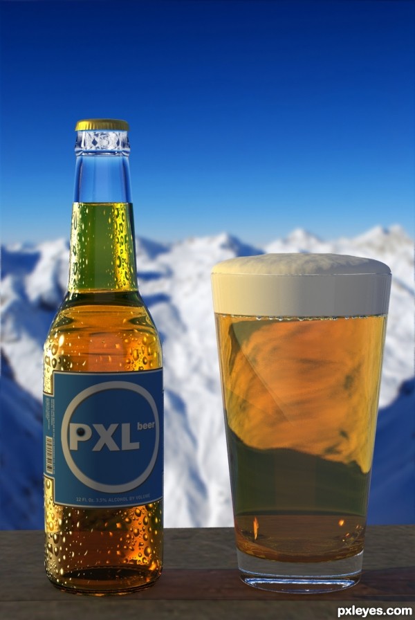
I didn't think condensation would be so hard. 2% of the time it took to create this was modeling it, the other 98% was trying to get it to look right. (5 years and 3405 days ago)
Very nice! I bet you could become very pixilated from drinking this beer...(ok, sorry for the bad pun :P )
I like the condensation overall, but nearing the neck of the bottle it gets to look a little less realistic. also, i would add more shadows underneath the bottle and glass, they look like they are floating.
Great job author! 
I completely agree - the condensation is extremely tough for me. It was the best I could do in the time I had.
Well done!! Great foam 
The light isn't same as in the background.
@qwertyzx - The shadows do match. Had I decided to alter the direction, the light would be facing the same direction as the camera. Perhaps they may be a few degrees off (less than 10 at the most)
i just startet in 3d art or whatever it's called
but i think the neck looks a bit weird as goobymook sed
maybe because the neck is really thin
remember that the glass is also a few mm thick
also you couls try to make the beer in the neck just a bit more the same colour as the neck
i'm not a pro or something trying to share some wissdom
it's just something i noticed
becides it looks very realistic
GL author
Fantastic work author...extra points for realism and imagination combined...foam look so realistic and delicious...best of luck
Awesome stuff.
very well done author.........GL 
wow amazing!
Congrats for your first place! 
Congrats! A honest first place! 
Thank you!
Howdie stranger!
If you want to rate this picture or participate in this contest, just:
LOGIN HERE or REGISTER FOR FREE
Dark side of the moon
I love the light of the triangle over the moon but the "rainbow rays" are unreal for the whole composition. Anyway, good entry, good luck!
cool author love the idea of the luminous triangle
Very cool looking, love the lights glowing onto the surface.
Howdie stranger!
If you want to rate this picture or participate in this contest, just:
LOGIN HERE or REGISTER FOR FREE