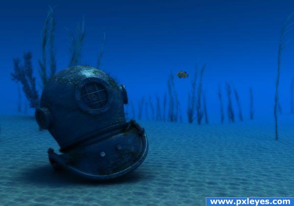
Done using MAYA with PS used to comp
Please view hi res to see (5 years and 3919 days ago)
- 1: fish
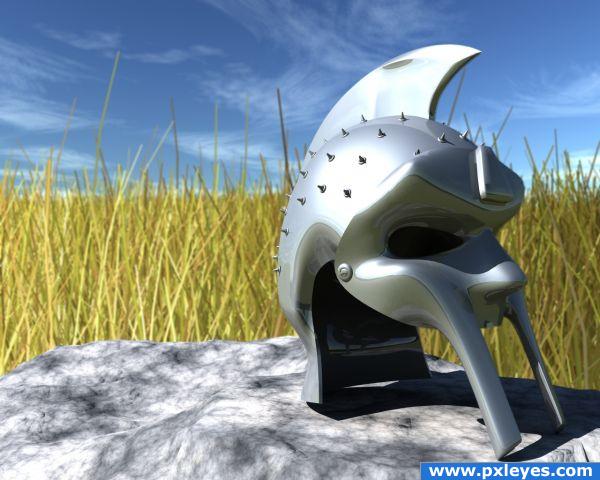
A tribute to the Mark Anthony helmet entry by *** :)
I wanted to make something looking like the helmet/mask in the movie Gladiator, (Ridley Scott 2000). I didn't find any blueprints or good pics for reference, so i improvised my own version. The helmet part is spline patched togheter and the mask is sub patched. No Photoshop post processing.
Edit: Added spikes as details to the helmet and modified the grass. (5 years and 3924 days ago)
Wow great job, i don;t think enough stalks of grass ar being shown contrasting the sky, but the helmet itself is stunning!
Thanks Ponti; maybe, the background are quickly done to get the Gladiator movie "crop field feeling" and get some natural reflections. It is however focal blured away somewhat to keep focus on the helmet.
Great entry! GL
GREAT!!!!!!

Congrats for your third place, dka
congrat dka... 
Congrats!!!!!!!! Great work!!!
congrats 
Congrats on your win
Howdie stranger!
If you want to rate this picture or participate in this contest, just:
LOGIN HERE or REGISTER FOR FREE
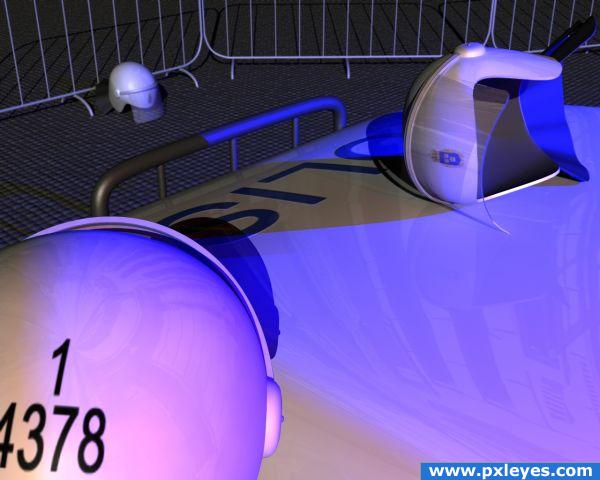
Couldn't find a good view to display this helmet, so I modeled and arranged it(them) into a scene instead.
As always - it's better viewed in Hi-Res.
(SBS coming up soon) (5 years and 3926 days ago)
Helmet modelling is super OK, fences look good, the far helmet is fine, something wrong with the mauve light. The helmet shadow on the car is from a light on the left, suppose is the key light with shadows on. But it seems the colour light is on right without shadow. For the rest high marks for me, a good mise en scene.
Thanks for pointing that out! That may be because the lights have different intensity and falloff (for variation and avoiding mixing the colors). The blue light on top off the car to the right has 50%, while the red to the right only has 25%. The main light (~100 meters behind the camera) has 100%. I'm not sure, but that may the answer.
Brilliant reflection work!
Howdie stranger!
If you want to rate this picture or participate in this contest, just:
LOGIN HERE or REGISTER FOR FREE
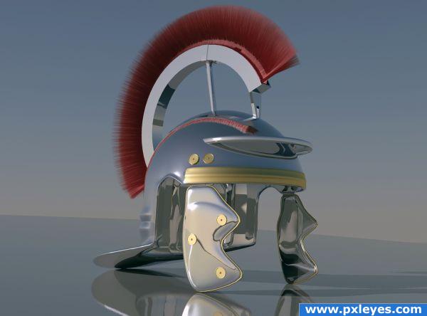
3ds Max 2010 and Mental Ray rendering.
I wanted to do a Roman helmet, so given what I know, i browsed around the web, looked in books, Anway I found this site: http://www.gunsandswords.com/roman-centurion-helmet.html.
This is where I got my inspiration. (5 years and 3929 days ago)
Now that is B.A.U.T.I.F.U.L !!!!! work author
Great image! Check the very front edge of the red bristles...
Wow....WOW!
VERY IMPRESSIVE 
very cool!! 
smart pic
nice
Author.. when you speak of this RENDER TIME.. (curious) how much time does it take to save once you've rendered the image.. very curious.. . the part that really makes the piece is the reflections INSIDE the Helmet..they are absolutely spell binding... ( I think CMYK is talking about that teenie tiny itsy bitsy pink and black triangle at the front of the base of the red feathers.. you can see it if you look under super duper high resolution) It could be photoshopped out in a milla second, but like you said.. to render it out sounds like a bEAAAACH... superb work
This is Superb Author!! 


very nice!
awesome!!
nice work on materials ....but shadows and lighting can be better.....GL....
I agree with the rest. It looks really good. Actually i was half way through modeling a helmet like that. But I now realize it wouldn't match yours.
People on this site seems too amazed of one of the most basic futures of 3D-rendering - reflections. I'm not. I'm more amazed about the modeling. You've done a really good job on the details and making it look smooth. And I love the use of fur/hair.
If you're planning to use it in another project,with other objects, you should however reduce the reflections and add some textures to the diffuse and reflection to make it look realistic. High marks from me! 
Fantastic job .......Good Luck Author.
Darn wish I had 3ds max well done
Pristine!
Excellent work!
Fantastic render..................do you give instructions? LOL really love this one!
nice Fur and modeling. to create a great helmet. I would suggest some simple dirt maps apllied to your various shaders to give a little real world variation to the specular, reflection and diffuse attributes. will make the image much more real. also conect an ambient occlosion node to the diffuse attribute of the floor and helmet shaders and it will ground the helmet better. All in all nice helmet though.
*
very nice entry, i agree, this is a top work for sure


Great work , proud with this.
great job 
Congrats Missy, amazing work 
Hey Congratulations Missy nice job
Congratz!! Excellent work as usual Missy 
Congrats for your first place, Missy
Congrat for the first Missy... 
Congrats!!!!!!!! Great work!!!
congrats 
Congrats 
Congratulations!
Congratulations.. this is one of the best 3D images i think i've ever seen!
Awesome work. Really fantastic entry. Love it. .
Howdie stranger!
If you want to rate this picture or participate in this contest, just:
LOGIN HERE or REGISTER FOR FREE
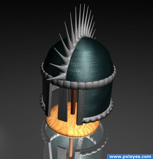
Made in C4D entirely.
No references, no blueprints, just my imagination :-) (5 years and 3931 days ago)
Looks good. I especially like the wood and the spikes texturing. But you could however add some more bump to some parts of the helmet to make it look even better. A flat mirror ground is boring - maybe you could add some minor bump there as well to make it look less "perfect". Good job anyway.
Nice! I wish I knew how to do stuff like this.
The reflection of the wooden part would be closer to the surface...
congrat for the fourth ... 
congrats 
Howdie stranger!
If you want to rate this picture or participate in this contest, just:
LOGIN HERE or REGISTER FOR FREE
SBS and Improvements to follow tommorow
Excellent render!! Wow!!!
Great render!(Maybe you could add a bit more bumps on the sand;just a thought though)
Really like this
Really nice work, here.
LOVE this entry............really beautifully done!
As usual great, good, best in this contest IMO, bla-bla... Lets get to work
1. I love the old aspect of the helmet. Is easy to make a new, perfect object in 3D but is difficult to make it look old. Maybe some redish color for a rusty look.
2. This was a just a detail. Sorry to tell that ( I tell you cause I appriciate your work ), the sand and water are disasters. So monotonous, so uniform. I know, is hard to work a 3D underwater landscape in 2 weeks but better you used a photoshop background than that. Good luck and congrats.
as I said SBS and hopefully some improvements. Thanks for all the comments.
Also as billy boy says I could have used a backplate image and got a better image, but we nead to clarify if that is allowed, I think we should, but am never good at following rules, so for this one I went simple.
Looks good! I like the fact that you dared to texture the helmets old and worn. I'm glad you didn't go the safe way, with the much too overrated simple reflections (= high votes), and went for realism instead.
Anyway, the only constructive things I can come up with is about the surrounding. I think the seabed looks to uniform (like Billyboy said), smooth and empty. More bump should do it. Also, the textured simulation of light projecting the waves on the seabed (caustic) doesn't seem to affect the helmet. I know Maya has possibilities for this though. Really good job anyway!
(I'll vote later in case of improvements)
EDIT: ...I forgot one thing. Great SBS!
nice!
Excellent work here.
very nice look here
Congrats for your second place, Dante
congrat Dante...
Congratulations!
congrats
Hey Congrats on your win
Howdie stranger!
If you want to rate this picture or participate in this contest, just:
LOGIN HERE or REGISTER FOR FREE