(5 years and 2837 days ago)

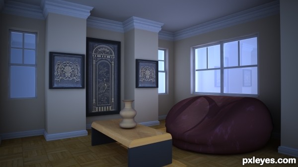
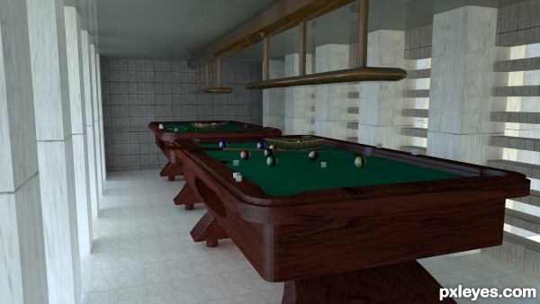
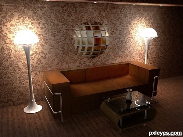
This was modelled in 3ds max and rendered with mental ray ...Your comments are welcome.... (5 years and 3258 days ago)
Nice render author...wooden parts on the wall and the ceiling looks a bit washed out...everything else is nice maintained...best of luck
Howdie stranger!
If you want to rate this picture or participate in this contest, just:
LOGIN HERE or REGISTER FOR FREE

got inspired from here
http://www.interior-design-tutor.net/art-deco-interior-design.html
the link is also in the source part. Hope i got close, altough my scene is darker (5 years and 3330 days ago)
The lighting is too inconsistent. For two lamps as bright as those, the center of the desk should be WELL illuminated, not dark and shadowy.
Good job, author. You could apply some imperfections in the part of sitting on the couch. This would make your image more realistic.
Really love the reflection on the table. Nice job!
Fantastic look scene author...As Pixelkid sad reflection on the table is perfect...well done
Nice image, shame it's not yours.  Good work on the modeling and lighting, but IMO you have copied someone's idea. Would have been nice to see your own interior image, and not a reproduction of a visualization from someone else.
Well , I think it's awesome work and I disagree with riker.
You're a 3d modeling artist, NOT a concept artist and NOT an architect or interior decorator. Why should you be one ? You're job is to realistically render a scene and you've done it 100%.That's enough for me.
Jack of all trades master of none is overrated.
Congrats
Howdie stranger!
If you want to rate this picture or participate in this contest, just:
LOGIN HERE or REGISTER FOR FREE
Well done author, great living room.
Thank you
Howdie stranger!
If you want to rate this picture or participate in this contest, just:
LOGIN HERE or REGISTER FOR FREE