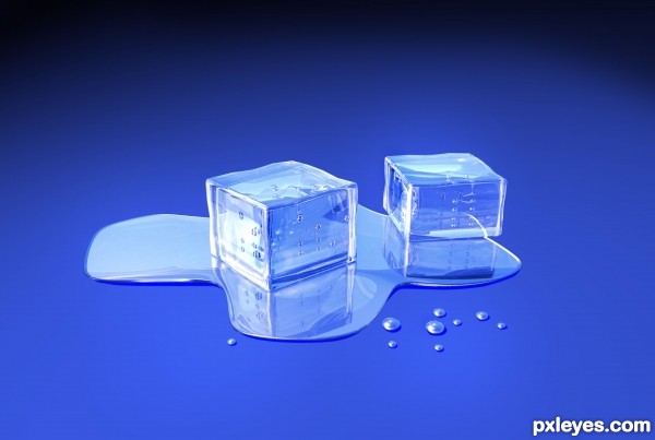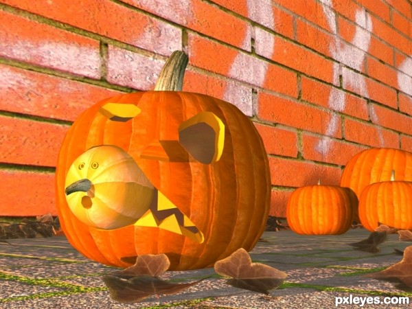
Created this using CINEMA 4D and Adobe Photoshop. (5 years and 2664 days ago)

This is what inspired me: http://www.extremepumpkins.com/canpum.html (5 years and 3091 days ago)
The mouth is wonky for the camera angle. The top looks flat, while the bottom shows depth, which is opposite the depth carved into the eye. Also, the wall being the exact same shade of orange as the pumpkins, which are all exactly the same color, is a bit flat and unrealistic looking. Great concept, though!
It really look old author! LOL, look at it, nicely done and best of luck!
Thank you! Thanx a lot.
Howdie stranger!
If you want to rate this picture or participate in this contest, just:
LOGIN HERE or REGISTER FOR FREE
this is nice, but IMHO it's looks more cartoon. the idea in this contest is to look real.
anyway GL
Howdie stranger!
If you want to rate this picture or participate in this contest, just:
LOGIN HERE or REGISTER FOR FREE