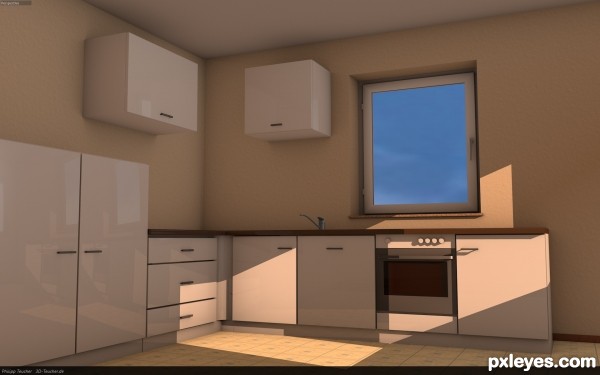
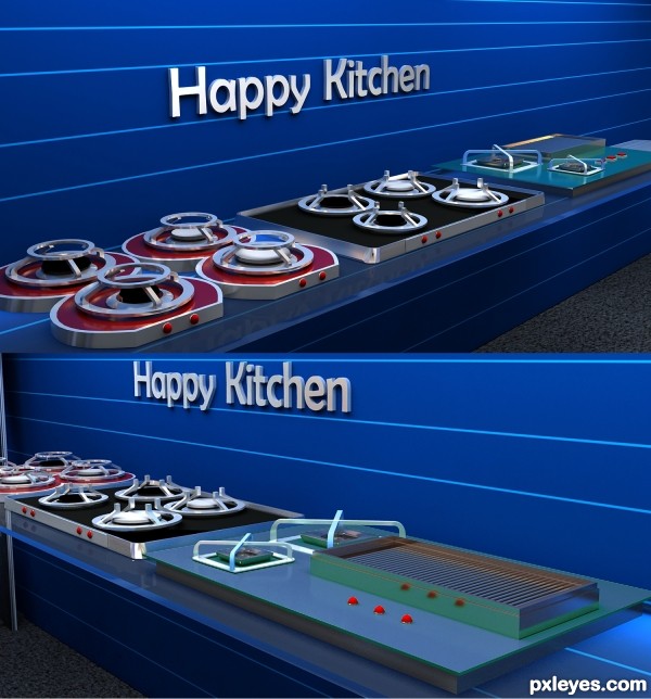
A visualization of a Kitchen (5 years and 2655 days ago)
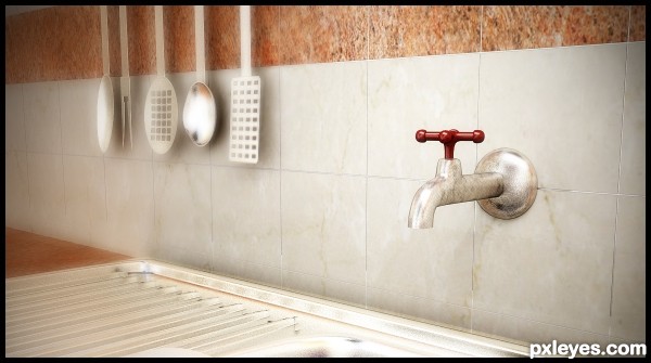
3dsMax 2012 + v-ray (5 years and 2888 days ago)
very good job author i like the depth of field and the glow around the spatulas
Howdie stranger!
If you want to rate this picture or participate in this contest, just:
LOGIN HERE or REGISTER FOR FREE
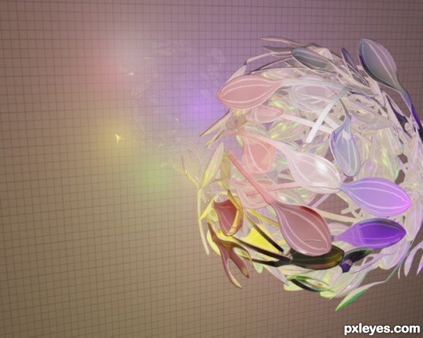
(5 years and 3055 days ago)
If they were all sliver and reflective, this would be a great take on the theme, but having them colored with those strange artificial colors doesn't make this look like a disco ball, just a bunch of utensils...
 LOL unique style good job
Howdie stranger!
If you want to rate this picture or participate in this contest, just:
LOGIN HERE or REGISTER FOR FREE
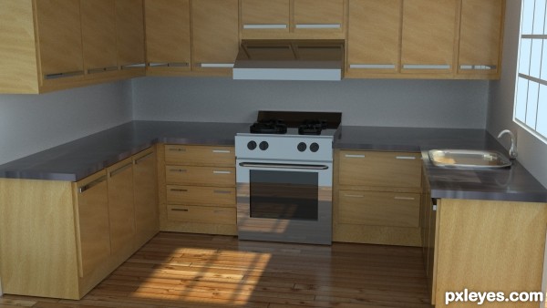
(5 years and 3202 days ago)
The counters seem a bit short, since counter height is usually very close to stovetop height.
The top of the stove also looks a bit odd, as the contrast is so dim that it is hard to make out whether those are burners (which are WAY too thick if they are) or very thick pans on top of the stove.
Otherwise, this is very nicely rendered, I like the texture used for the cabinet doors and the floor.
I did this tutorial a little while ago! I like yours better! I used to Blender, but in my classes I'm learning Maya. Mossyb said everything. GL author.
Nice job on the stove...I like your texturing.
Howdie stranger!
If you want to rate this picture or participate in this contest, just:
LOGIN HERE or REGISTER FOR FREE
working with sbs.. (5 years and 3244 days ago)
WAAAAAAAAAAAAAAAAHHHHHHHHHHH I want my gas burners back (new apartment.. all electric.. crud) very neat Idea author.. good luck
Interesting image.Good use of bold colours.
Howdie stranger!
If you want to rate this picture or participate in this contest, just:
LOGIN HERE or REGISTER FOR FREE
I'm sorry but a great amount of details is needed for this scene, it looks very poor.
Thanks for your comment!
Yeah, some more details wouldn't be bad. I'll add some after the Contest and I'm about to make a short animated movie in this environment.
Very nice, please make sure to show me the animation after it's done. good luck with that too.
Pretty cool.
Is it done with Photoshop ?
It's made with Cinema 4D without any image postprocessing. It didn´t seem Bad so I kept the un-photoshopped Version.
Howdie stranger!
If you want to rate this picture or participate in this contest, just:
LOGIN HERE or REGISTER FOR FREE