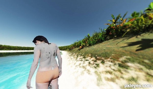
Done in Vue and add blur in Ps
This is my first scene in Vue so any suggestion is welcome. (5 years and 3187 days ago)

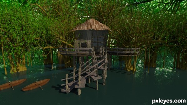
Hi this was modelled in Autodesk 3ds Max and rendered in mental ray daylight system.Detailed description is given in SBS.It took a lot of time for rendering (nearly 9 hours) as more foliages are included in the scene.Thanks.... (5 years and 3431 days ago)
Overall I love the setting of this and admire all the work you did. However, the vertical posts and steps of the staircase in the front look odd due to their 'ripples'. It would make more sense to use those as the reflections, and keep the posts more straight. This would be a great place to go hang out if it were real! 
Howdie stranger!
If you want to rate this picture or participate in this contest, just:
LOGIN HERE or REGISTER FOR FREE

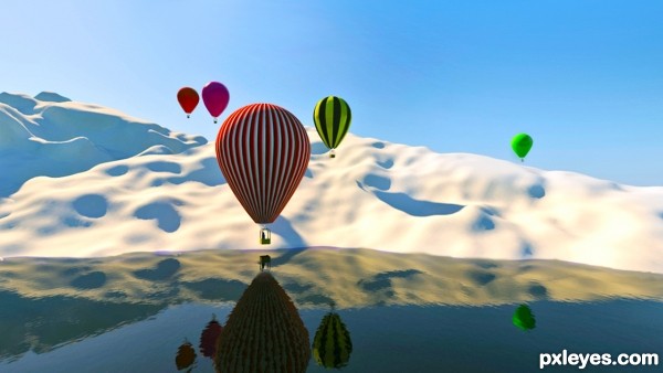
3d Max 2010 Mental Ray render.
The blue print used for modeling was a the "ZL Racer type" pdf downloaded from the Cameron Balloons website ( Media Gallery > Downloads )
http://cameronballoons.com/ (5 years and 3501 days ago)
Wow. this is such a serene image, I can almost 'hear the quiet' and feel the brisk air. Nicely done, author.
Great job author...very realistic creation...i like a lot how u did snow mountain...well done
wow, very realistic work author! fav from me!
Congrats for your second place, Loyd!
Congrats!
Congrats 
Congrats 

Howdie stranger!
If you want to rate this picture or participate in this contest, just:
LOGIN HERE or REGISTER FOR FREE

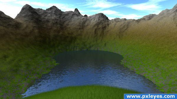
All made in one object. One 16644 poly subdivided/modified flat square for the landscape and a 1 poly flat square for water. The rest is just a whole lot of texture layers. The foreground grass is a displacement plugin that makes fur, modified to look more like grass.
No Photoshop post processing. No sources.
*Re-rendered with different lights/shadows settings. Thanks Akassa, you were right! (5 years and 3858 days ago)
Lacks shadows but it's fine ^^
nice 
using private comments while you seem to want to criticize others work...uhm your water needs work and the foreground lacks definition
Looks like you have been tweaking on this, added some definition to the foreground and the water is better  the mountains in background seem too jagged considering the rest of the picture is ...let me say soft looking, Good luck.
Howdie stranger!
If you want to rate this picture or participate in this contest, just:
LOGIN HERE or REGISTER FOR FREE
neeed to work on perspective...... u have place a wrong perspective image..... or u should change the angle of your seen as ur image...
and the edges of that lady had not cut properly... neeed to improve.
gud luck
@6tann this is my first scene in Vue so I don't know why the edges of the person are this way, in Ps are perfect, perhaps it was for scale the image, I don't know. Thank you for your comment
Howdie stranger!
If you want to rate this picture or participate in this contest, just:
LOGIN HERE or REGISTER FOR FREE