3ds max (5 years and 3091 days ago)

Working with SBS (5 years and 3187 days ago)
wow cool work you have there! really like it!
thanx ..
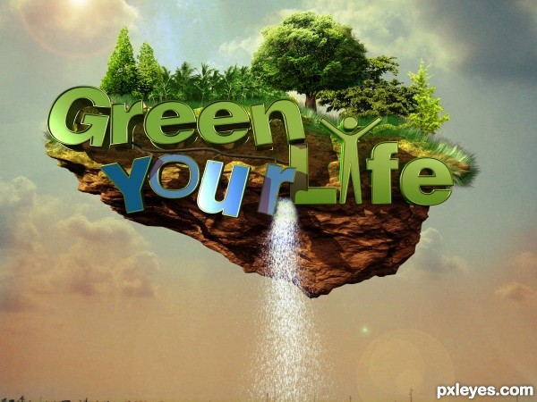
Great entry, IMHO the blue of "Your" focus the attention to it and eclipses the rest of the work.
Good Luck!

Howdie stranger!
If you want to rate this picture or participate in this contest, just:
LOGIN HERE or REGISTER FOR FREE

(5 years and 3425 days ago)
You will have to excuse the rudimentary S.B.S. if I have the opportunity I will update them.
source are on step 1
Nice! What soft is this?
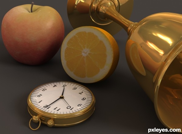
You even made the numbers 3d 
Very nice. The apple especially looks so realistic. 
not sure but perhaps the orange looks a little flat.
Hi falkor.
Yes you are correct in you observation. This is how it should be. As you can see from step 16 and 17 the orange is receiving most of the shadows plus its face is rotated away from the main light source.
The lighting is set up before any texture or materials are added to achieve the most realistic end result. Not after as all that happens is the light is manipulated to suit giving an inconsistent result.
Hi greymval
Answered by P.M.
fantastic work author...best of luck
Congrats  lovely work
Congrats for your first place, Warlock!
Wooow  Stunning!
 Congrats!!
Many thanks everyone for your comments and votes is very much appreciated!
Nice work Warlock, congrats.
Congrats on your first place - love the work on that watch!
wow congrats on ur win! its great!
Howdie stranger!
If you want to rate this picture or participate in this contest, just:
LOGIN HERE or REGISTER FOR FREE

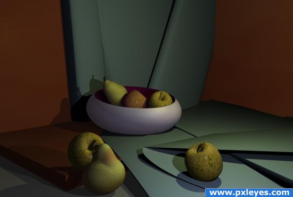
No meshes used simple primitives and the colour and texture editor for apples and pear skins.
Bryce prog used. (5 years and 3820 days ago)
nice work
Beautiful! Looks almost real.
gud work
I really like the dimmer lighting here...good color choice too. 
NICE
This looks really cool, but there's something about the shadows of the apple that's bugging me. Why would the shadows be different colors? One's kind of bluish while the other is greenish. Seems like different light intensity would change shade, not tint. And, if I imagine where one of the light sources is, the bluish one seems just a tiny bit big. I dunno. I could easily be wrong. It's still a cool picture. Good job!
Beautiful!
nice mood of light..gud work
nice choice of elements in this work. fruit and paper look great.
very nice 
Howdie stranger!
If you want to rate this picture or participate in this contest, just:
LOGIN HERE or REGISTER FOR FREE
very nice
u should make some realistic background...... something like table.....
Fantastic work author...best of luck
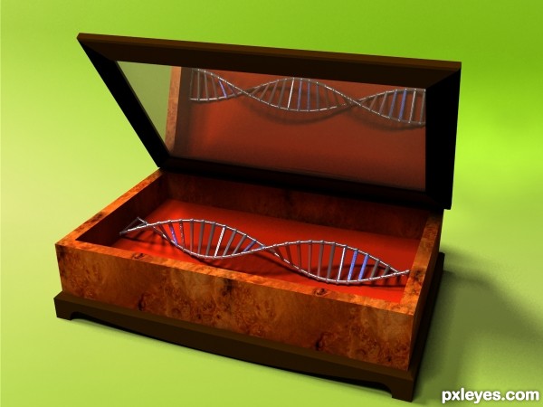
What a precious DNA Probably having an old map next to it to make it looks like a treasure hunt
Howdie stranger!
If you want to rate this picture or participate in this contest, just:
LOGIN HERE or REGISTER FOR FREE