(5 years and 3207 days ago)
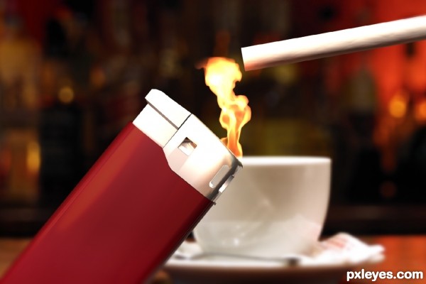
Modeled and rendered in Maya. (5 years and 3374 days ago)
wow, very realistic...great job!
very nice super realistic work...gl
I love the texture on the cigarette, but the flame looks disproportional to its size. Additionally, that is the only lighter I've ever seen that could light without the button being depressed. 
First of all congrats on a realistic image.
1. I realize that you're not a smoker so good for you
2.Every cigarette has lines on the paper so that it would burn uniformous - those lines are actually where the paper is thinner.
Check this: http://static2.bigstockphoto.com/thumbs/1/3/2/large2/231722.jpg or any google image.
3.Flame can have any size but it will have a continuous shape, even if the wind blows, it will just bend without loosing it's integrity. In that position you would burn your thumb
http://www.g-peopleland.com/Lighter%20Flame.jpg
4.There are lighters that don't need the button pressed to light up, but that is not one of them.
Anyways, it's one of the best renders around. You can still improve it, or use this info for another contest. 
Howdie stranger!
If you want to rate this picture or participate in this contest, just:
LOGIN HERE or REGISTER FOR FREE
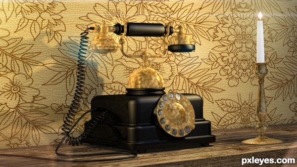
I modeled the Phone using Hexagon. The candle was something I modeled some time ago. After I have modeled the phone and its component, I exported it from Hexagon to Carrara which is used to composed the scene apply shaders and render the scene.
The wall texture come from a texture pack by Dozaloz.
I think the phone is as shown for the contest is actually missing the mouth piece. (5 years and 3451 days ago)
Really nice environment around the phone.
The gold color is a bit too saturated and orange, though. It's not golden, nor tarnished brass, it's just, well, orange. A bit less saturation and less red would give it a more natural tone.
Howdie stranger!
If you want to rate this picture or participate in this contest, just:
LOGIN HERE or REGISTER FOR FREE
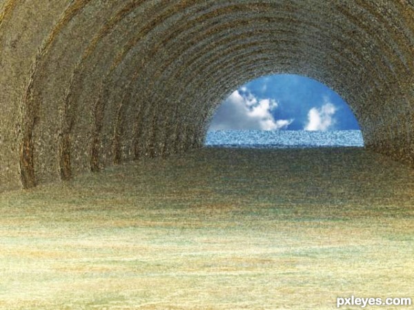
created & rendered in Carrara 8 Pro (5 years and 3468 days ago)
Not bad, a little noisy though.
Howdie stranger!
If you want to rate this picture or participate in this contest, just:
LOGIN HERE or REGISTER FOR FREE
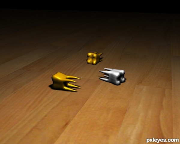
The map that is used as the ground surface in this image comes from the 3Ds Max Folder. (5 years and 3506 days ago)
very nice,best of luck author
nice, but I think it will be a better render if you use three point lighting, but good work.
Thanks for the advice and comments.. It has been taken on board 
hard luck ...better luck next time....atleast i loved ur entry as the focus was on the teeth in the winning entry everything except the toothbrush is highlighted while the contest was to focus on anything teeth related....
Howdie stranger!
If you want to rate this picture or participate in this contest, just:
LOGIN HERE or REGISTER FOR FREE
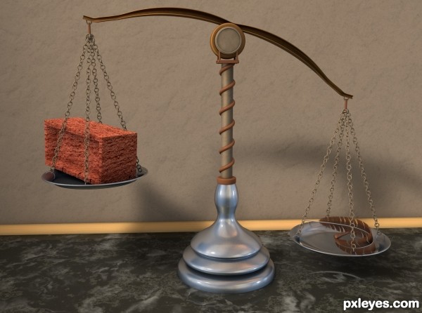
The texture on the brick is a bit too varigated in color. Combined with the indented face, it looks more like a brick shaped sponge than a heavy object.
Other than that, the image is quite nice. Good background, perspective, and lighting.
Thanks for the comment Mossy. Problem is, your criticism of the brick texture is odd since its actually a real picture of a brick that was applied. So, that's just what the brick would look like in real life.
I think your texture scaling combined with the odd shape may be why it looks so fake... I have an entire fireplace wall done with that type of brick, so I am familiar with the texture.
It's called "rake brick" because of the texture pattern.
Here are a couple of photoa of how the real thing looks:
http://hostedmedia.reimanpub.com/TFH/Step-By-Step/FH04FEB_POINTB_09.jpg
http://www.arch.mcgill.ca/prof/friedman/arch240/winter1998/lecture6/Mason23.jpg
Hrm Mossy. You might be right. It didnt look like that when I saw the texture flat so I made it up as I went along. I am just going to leave it as it is now tho. Thanks for your input.
Howdie stranger!
If you want to rate this picture or participate in this contest, just:
LOGIN HERE or REGISTER FOR FREE