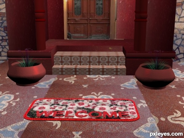
(5 years and 3091 days ago)
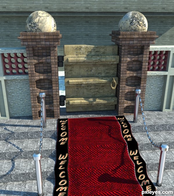
Hi this was done in 3ds max and vray..Simple modelling and simple daylight simulation with Vray sun.Thanks.... (5 years and 3093 days ago)
Great image, except for the closed gate at the top of the steps...Not very welcoming! Really nice work on the stone and brick sides.
Thanks for your comments MossyB. Actually i want to have a uniqueness in my work, so only i brought the old damaged door in between this modern compound wall and welcome mat.....
Superb render....How did you bring the natural look of the mat...?
Hi redgreenblue i applied a cloth modifier to a box with higher number of segments and simulated the animation and then converted the box into editable poly and then applied a shell modifier to give some thickness.The texture was hand painted in photoshop.
nicely done
nice work but its like carpet more then mat.
Nice Job Congrats on your Win
Howdie stranger!
If you want to rate this picture or participate in this contest, just:
LOGIN HERE or REGISTER FOR FREE
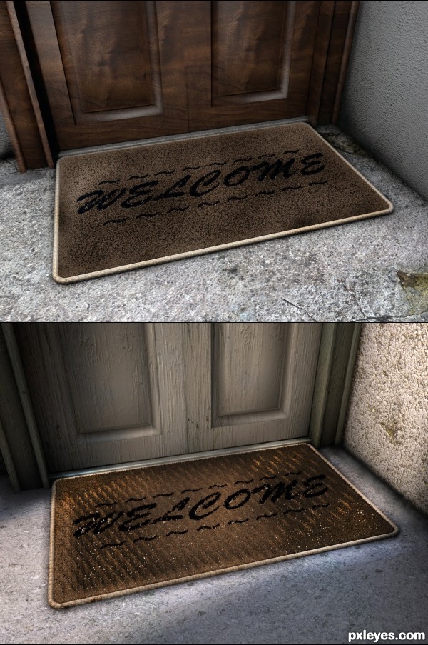
I am really trying to take my work to the next level by making renders which could be mistaken as photographs.
Full realism is what this entry is after.
As such, any constructive criticizes are welcomed.
Credit: Mayang has an excellent selection of textures available 5 of which I have used here and they are sourced.
EDIT: I have made another entry trying to change things according to the comments. I did not prefer it all that much so now I have both versions up. The top is the newer one. (5 years and 3101 days ago)
The heavy shading on the sides, with the center lighter makes the "Welcome" hard to read, and is somewhat contrary to the fact that generally, mats are dirtier in the center from foot traffic. Your light source is not clearly defined, as it looks like it is coming from the lower left, when logic would dictate it should be from the upper right, as a porch light.
The "dirt" is too light, and looks like dandruff.
The textures are beautiful, and the rendering itself is quite good. It is just a few visual inconsistencies that are impeding you.
Thanks for the detailed response MossyB. I don't agree with everything you said, for example the center is usually lighter because it is more worn and frayed. However I will take into consideration some of your points and make some changes. Thank You.
I love the texture and the panels on the door. Great work. I agree that the lighting is a bit weird, it almost looks as if the mat is glowing, but all-in-all it's not too bad imo.
p.s. - I'm not a big fan of the wall geometry going through each other. It would be nice if it were the inside of a cube, rather than 3 planes that intersect. 
Amazing, nice work with textures, good luck!
Secretsather, the new entry also is now a cube rather than 3 planes.
I preffer the textures the white door and the original mat but the floor and the wall looks more reallistic in the new entry. Both are great.
Howdie stranger!
If you want to rate this picture or participate in this contest, just:
LOGIN HERE or REGISTER FOR FREE
(5 years and 3104 days ago)
Howdie stranger!
If you want to rate this picture or participate in this contest, just:
LOGIN HERE or REGISTER FOR FREE
(5 years and 3427 days ago)
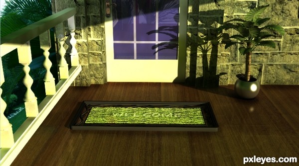
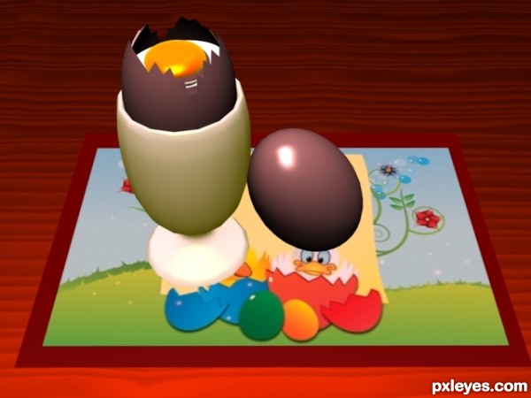
I would say that you should take the texture that you've used on the table may and make it 1 tile rather than the 9 you have here, It would look more realistic.
thanx for ur comment..
Howdie stranger!
If you want to rate this picture or participate in this contest, just:
LOGIN HERE or REGISTER FOR FREE
Hi author, what happened with the floor tiling?
Howdie stranger!
If you want to rate this picture or participate in this contest, just:
LOGIN HERE or REGISTER FOR FREE