(5 years and 3262 days ago)
Photography and photoshop contests
We are a community of people with
a passion for photography, graphics and art in general.
Every day new photoshop
and photography contests are posted to compete in. We also have one weekly drawing contest
and one weekly 3D contest!
Participation is 100% free!
Just
register and get
started!
Good luck!
© 2015 Pxleyes.com. All rights reserved.

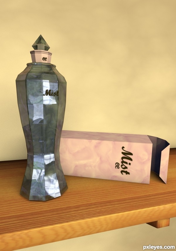
Be nice to see more of the perfume in the bottle... apart from that good work..GL
Nice work author...best of luck
Have you tried adding a sky object to the scene and adding a hdri material to it and render with global illumination? Have you tried Ambient Occlusion?
Check this out you might find it useful.
http://www.amateurmedia.net/create-hdri-in-cinema-4d/
and this
http://greyscalegorilla.com/blog/2010/11/what-is-linear-workflow-and-how-can-it-help-your-renders-look-better/
and this
http://greyscalegorilla.com/blog/2011/03/how-to-optimize-your-scene-to-render-faster-in-cinema-4d/
Oh and one nitpick, your logo on the bottle doesn't match the logo on the packaging
Mircea and RichieMB. I do really appreciate the big long comments with improvements, thats how I get better. However I am a bit bemused by these.
You see, this render did have caustics applied, the glass materials are at 1.33 refraction and the liquid 1.4. The facets are completely even, since I used a 10 sided cylinder to create the main object and did not change the X/Z sizes.
I did also render with global illumination on with medium settings and with ambient occlusion.
Now looking at my entry it does not look right, I know that, I knew it when I submitted it, but I wanted feedback.
But thats just the problem, I have actually does most of those things suggested in this piece but it still looks wrong... hrm. I may have to rethink a lot of the composition.
Thanks Anyway guys.
Author, I didn't mean to offend, your bottle is a great design and sorry I didn't realise that you were using GI and AO. I mentioned lighting with hdri material as you can get a really good effect with GI. Regarding the logo, why not use the same item from the bottle on the box.
This is really great and would look fantastic with the right lighting. Cinema has lighting presets preloaded and plenty of hdri materials if you would like to use them.
Regarding the caustics I don't have a clue but have you seen this tutorial.
http://cg.tutsplus.com/tutorials/maxon-cinema-4d/an-introduction-to-caustic
Thanks guys, and dont worry i was not offended at all, sorry if I came off that way.

Its just that you are both right and it does not look nearly as good as I know it could but as I said, I have used those techniques... I really dont know why it is not working like I want it to.
I think I will try adding a surround using a HDRI image, maybe made more of a scene for it also, put it on a shelf or something. Then the shadows and lights will have more to work off.
Expect a new entry later today with a bunch of changes
Maybe be I can help,reading through your setting author I would say that the Refraction Index are not correct, you have your glass set at 1.33 this the Refraction Index of water?
Class crown (common) is 1.52, class flint 29% lead is 1.569 and glass class flint 55% lead is 1.669. Most perfumes are made of many components but a large contributor to this is Ethyl acetate it is present in confectionery, perfumes, and fruits. In perfumes, it evaporates quickly, leaving only the scent of the perfume on the skin the Refraction Index of this is 1.3720 hope this was some help to you.
As for lighting, you can try an HDRI but I would go with luminous polygons as sources of illumination.
This is a must read for anyone working with in the world of 3D.
http://en.wikipedia.org/wiki/Snell's_law
From what Warlock says about refractions, I came across a chart once, this is similar.
http://www.robinwood.com/Catalog/Technical/Gen3DTuts/Gen3DPages/RefractionIndexList.html
Yep they are pretty good, but remember these are just a guide. Its better to work it out for your self, plus critical angle plays a big part as well...........
Made a number of adjustments, I think it is a lot better than it was, but now unfortunately I already have 338 votes so the lower score will carry on
I noticed a connection between the lid of the bottle and packaging. Good idea! What can commit is the poor visibility of the liquid inside the bottle.
This is a good site that any member are free to drop a comment or two to any entry whether positive or negative in nature and we have many humble members like you author that takes those nitpickings the positive way. Hooray...to this site and to all its member. It's so nice to be here. Goodluck to your entry author. Longing to see more of your work soon.
Howdie stranger!
If you want to rate this picture or participate in this contest, just:
LOGIN HERE or REGISTER FOR FREE