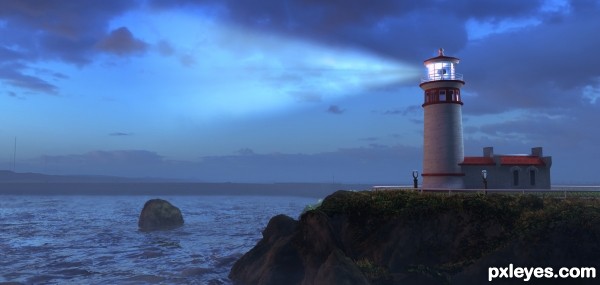
Originally made for, but not entered into the tutorials 3D contest. Link given - not much of a tut. (5 years and 2900 days ago)
- 1: source1
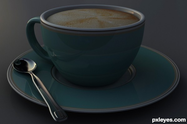
This is an old mesh of mine that I decided to revamp (give it a little love:) (5 years and 3336 days ago)
Really nice work! It has a wonderful "early quiet" feel to it, and the coffee looks yummy. Well done.
this is a really nice render, but I'm struggling to see where the theme comes in.
Thanks for your comment farsite. I disagree. I think it is on theme, really dose depend on the author’s interpretation of the goal: “This contest is about an “object†emerging from the darkness, the model should only be partially shown with the rest in the shadows Lighting is very important†I think I have done this, for me it’s not about monsters emerging.........
"the model should only be partially shown with the rest in the shadows" hmmmm.
its a great pic though, would be nice if the crema on top of the coffee had a heart in it maybe like those clever barista's do in Barca.
I started work on a scene for this contest but abandoned it (too busy) but it was more along the lines of your interpretation than the "monsters" idea.
anyway good luck with it, and I'm only gonna knock 1% off my vote for it 
COOL.....BUT IS A LTB OUT OF THEME FOR ME..............BUT I DO ABSTRACTION FOR THAT!...
very very nice realistic work...gl author
Very nicely lit, and rendered. Looks like the cup is emerging from the darkness. Well done author. 
Very nice work but dont really get what it is emerging from. IMO it looks like it is just sitting on a table.
Very well done.
Congrats, beautifully done... I need a cup right now 
Congrats!
Many thanks everyone for all the comments votes and favorites, very much appreciated.
Congratulations, well deserved win, this is a great piece!
Congrats ! Nice Job
Congrats! Fantastic work!
Howdie stranger!
If you want to rate this picture or participate in this contest, just:
LOGIN HERE or REGISTER FOR FREE
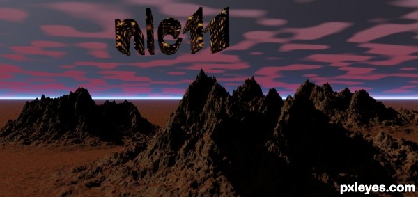
I know its weird with the username being building like and the clouds being purple but that's the way i like my art (5 years and 3404 days ago)
Howdie stranger!
If you want to rate this picture or participate in this contest, just:
LOGIN HERE or REGISTER FOR FREE
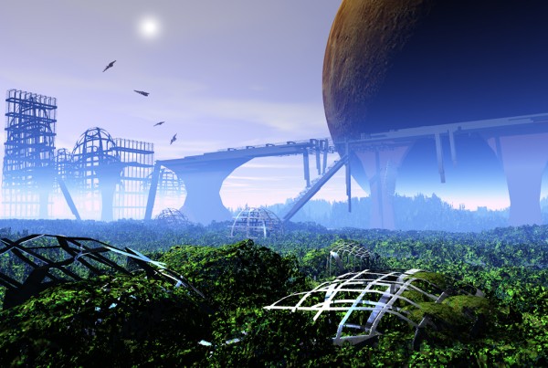
Once a great city, nature encroaches and all that is left is the bones of a city.
all bryce. (5 years and 3784 days ago)
Hmmmm, interesting. Very nice! =)
I love the decay of the civilization and the haze that rizes above the plants. Looks as if the pollution is pushed away by the nature.
I like the depth in the picture and how you have a feeling of decay like marina08 stated.
good entry.gl.
Great concept, nice angle and good result in low resolution. I miss a proper high resolution version though. I also miss a proper SBS. It only shows the cages. What about the bridge and the bushes?
Nice Work
Very cool , love it
like this . well done
Nice work, congrats, I just hope it's fair, since you didn't show how you made the bridge, plants and the background stuff in SBS.... But congrats anyway!!! =)
Congrats for your first place, Whiteshade!
Congratulations for 1st
Congratulations!
nice job. I hate nitpicking but i get the impression that the planet on the right is inside the atmosphere...
Beautifully done. Very inspiring too.
Howdie stranger!
If you want to rate this picture or participate in this contest, just:
LOGIN HERE or REGISTER FOR FREE
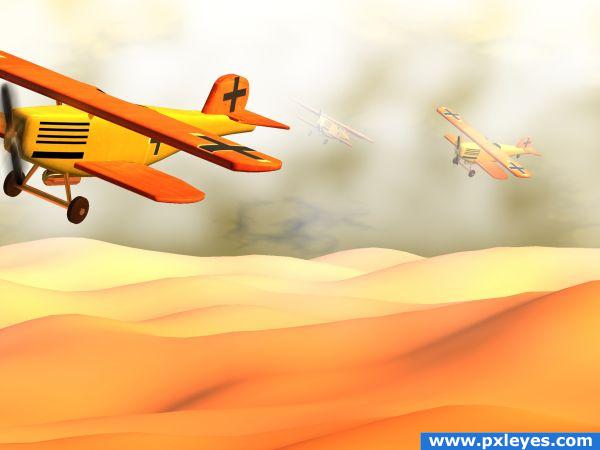
3 DS Max
Mapping with Photoshop
Render with mental ray
Thanks to Nathan Job for his excelent Dornier airplane blueprint from The blueprints.com , see SBS (5 years and 3846 days ago)
I like the background.. hard work here, good luck!
Congrats Billyboy!
Congratulations for 3rd
congrats
Howdie stranger!
If you want to rate this picture or participate in this contest, just:
LOGIN HERE or REGISTER FOR FREE
Howdie stranger!
If you want to rate this picture or participate in this contest, just:
LOGIN HERE or REGISTER FOR FREE