3D Pictures: Out


results 1 - 5 of 5

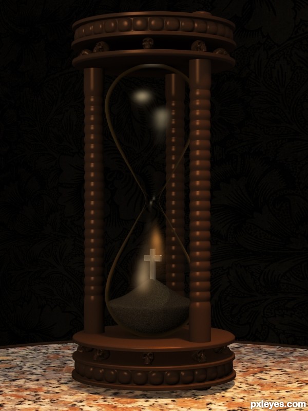
Time Out - created by Staccato


Time Out
Favs: 0SBS: 4Hi-resRank: 9/9Score: 62.5% (0)7138 views

Modeling, materials, lightning and render in Blender.
Only import is the skull from Renderosity (see source 1) and the wallpaper texture from deviantArt (source 2).

Minimal postwork to smooth the image a little with a minimun amount of blur.

Ok, my last try to get a decent lightning. This time I watched at it in two different screens before posting. Thanks to all for your comments. (5 years and 2712 days ago)

2 Sources:

avatar robvdn
robvdn says:

"Hope it looks better now" it is still pretty dark to me...

author says:

Yes it is. You all are right; strangely I see it Ok in the computer where I use to work and this bad when I check it in my laptop. Maybe I´ll try to edit the post again with a new render.
Thanks to all the comments.

(5 years and 2711 days ago)


avatar CoyDog
CoyDog says:

This picture needs GI.... I did not realize there was skulls on the frame until i looked at the SBS. The render just destroy most of the detail visible in the SBS..

avatar Cino
Cino says:

I looked at the SBS, the skulls are really cool, your model deserve it to be more visible.

avatar lchappell
lchappell says:

This is some great modeling, for sure. Your SBS shows that. The lighting or it's brightness could be higher IMO, can you change the light's brightness?

author says:

Many thanks for your comment. I´ve tried to give more energy to the lights, but then the image loses the dark mood that I imagined for it; it have to be compensated with a much higher contrast and the the background gets completely black.
I have a lot to learn about Blender lighting

(5 years and 2711 days ago)


avatar pearlie
pearlie says:

A bit dark, but cool image, love the skulls.

Howdie stranger!
If you want to rate this picture or participate in this contest, just:

LOGIN HERE or REGISTER FOR FREE


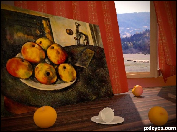
(Apple)ing out - created by Bitmap


(Apple)ing out
Favs: 1SBS: 13Hi-resRank: 4/9Score: 63.2% (20)13650 views

(5 years and 3024 days ago)

avatar MossyB
MossyB says:

The apples are too yellow and "perfect." The ones in the painting have a lot of red splotches, some green, and a few bruises.

author says:

Well Thnx for ur comment .... I've tried hard to make the apples just like the painting.... but frankly...... I failed .

I didn't find a picture to texture my apples so I created a gradient map for this porpuse ... and posted the best resultes that I've got .....

But you have to notice that the painting was made by oil colors .. which I didn't use in my render

avatar Rumi
Rumi says:

try using some dirt maps in alpha or generate some layers of noise some large and some small and put it in bump as well gl.

avatar MossyB
MossyB says:

Author, the contest rules state: "...let one (or more) of the elements in this painting come to life." Not using the oil colors in your render doesn't negate the fact that your elements don't match.

I'm sure that you could create a small "freeform" blotch texture that you could overlay onto the apples, slightly warping it for variation, but I am not a 3d user - there are some excellent 3d artists here who may have a suggestion.

Your apples are lovely, they just don't look like they came out of the picture, they look like someone went shopping and bought some huge yellow apples...

avatar mazanda
mazanda says:

I like Cezanne...........I like your work!

avatar JoeCacia
JoeCacia says:

Cool idea! I am not sure but the apples out of the painting should look this way "alife" because they are out of the painting right?! This is just my opinion tho! I love it, truly lovely work!

Howdie stranger!
If you want to rate this picture or participate in this contest, just:

LOGIN HERE or REGISTER FOR FREE


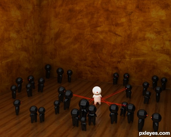
Ever felt out of place? - created by rohith


Ever felt out of place?
Favs: 1SBS: 4Hi-resRank: 4/9Score: 59.1% (20)14439 views

Inspired from a sketch. Created in 3ds max and renderd in Vray. (5 years and 3215 days ago)

2 Sources:

avatar ponti55
ponti55 says:

Really nice concept

avatar Ory
Ory says:

Very cute little man, I like the inspiration too. If you want my opinion on some improvements, I would suggest getting a better wooden texture for the floor, perhaps the one you have but with increased titles would work,.

author says:

Thanks Ponti55 & Ory.
@Ory: yup i should try that, actually i used the default texture from 3dsmax so couldn't help the tiling.

avatar erathion
erathion says:

Fantastic idea and great work author...ahhhhhhh small Darth Vader's attack Michelin mascot...just a joke...

Howdie stranger!
If you want to rate this picture or participate in this contest, just:

LOGIN HERE or REGISTER FOR FREE


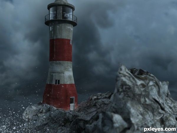
Lights out - created by r1k3r


Lights out
Favs: 0SBS: 12Hi-resRank: 2/9Score: 59.6% (30)12196 views

Modeled in 3DS Max 2010, rendered with Vray 1.5

Concrete, Rock and Sky from CGtextures.com (See links)

Maxscript for the rocks (see Link)

(5 years and 3397 days ago)

4 Sources:

avatar satire
satire says:

great work, really like how you add this all together

avatar skeletor
skeletor says:

This...... is cool!.....nice work!

avatar Warlock
Warlock [banned] says:

It’s a good idea and not a bad render, but to me your lighthouse looks to be leaning over slightly, and what are the uniform marks on the rocks in the foreground looks like a hessian texture overlaid on top?.

author says:

Thanks Warlock. The hessian thingy is an artifact from the DOF on the camera, but then I thought you'd know that. I didn't use a Vray physical cam. So the leany thing is just a camera distortion. I know, coz I had the rotate gizmo set with angle snap and it was perfectly set to 90 degrees on both the camera and Lighthouse. I did however use fairly low render settings due to my poor machine. Subdivs@500 Irradiance map@ Medium.
So you can see that it's not the best render. You've not put an entry up for a while Warlock. Are we going to see one sometime? Maybe I could learn some stuff from you I'm always looking to improve. The more I learn the better I will get. (3DS Max is HUGE, with a very steep learning curve. Maybe you could stick some tuts up for PXLeyes?)

avatar Warlock
Warlock [banned] says:

Sorry I don’t use vray, and for good reason......only Brazil Rendering System or Octane Render GPU Unbiased Render Engine and Maxwell render. I have 3D max but gave up on it a long time ago in version 4,obnoxious and gimmicky to much clicking around the screen for just the most simples process, it may be industry stranded dose not mean that it is the best, there are a lot more capable application out there that do the job better and quicker.

As for entry’s when they become more creative and challenging I will, I put up three or four suggestion but they got passed over.

If you have any question just P.M me and I will see if I can help.

avatar erathion
erathion says:

Really nice work author...best of luck

avatar RichieMB
RichieMB says:

Congratulations for 2nd, looks really good.

avatar dilsedosty

thank you guys.........

avatar chakra1985

Congrats!!!

Howdie stranger!
If you want to rate this picture or participate in this contest, just:

LOGIN HERE or REGISTER FOR FREE


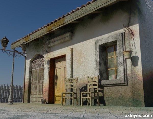
The Out House - created by dilsedosty


The Out House
Favs: 1SBS: 16Hi-resRank: 1/9Score: 61.5% (35)11142 views

(5 years and 3408 days ago)

avatar Tuckinator

wow, this is awesome!

avatar r1k3r
r1k3r says:

I really like the modeling here, nice work. I'm interested in the render engine you used? It looks like mental ray? Or perhaps Vray sun? But really good modeling

avatar 04mehul
04mehul says:

Nice work author.Good luck.

author says:

thnx......
well I have used mental ray with day light and sky light

no avatar
Widiar says:

A lot of work here and definitely not in vain.. very nice image and textures. (And a good SBS too). I would love to see some trees or street view or something behind the fence, but it's just a minor detail really... add a flower to the vase(s) and a candle or bulb inside the lamps and I'm all sold. (Well, I am already..) Great job, author..

avatar erathion
erathion says:

Great work author...well done

avatar neeraj55
neeraj55 says:

nicely done ! good luck

avatar skeletor
skeletor says:

This is done very well.... good work!

avatar Warlock
Warlock [banned] says:

Some pretty nice modeling but to me it looks as tho you have used the same texture for 85% of the image?

author says:

thanks warlock......
well in flower pot i did some variation in texture and, the light poll,fence and tiny models are textured with default max texture..... but rest of the texture are painted.....

avatar Lelaina
Lelaina says:

Congrats for your first place!

avatar RichieMB
RichieMB says:

Congrats for 1st

avatar madamemonty

Congrats nice work

avatar chakra1985

Congrats!!!

Howdie stranger!
If you want to rate this picture or participate in this contest, just:

LOGIN HERE or REGISTER FOR FREE