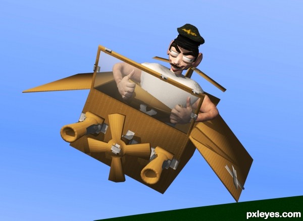
He's the top gun ace of the card board wars! (5 years and 3040 days ago)

The windows in the cockpit is actually stickers. I'll post a render of it, but later since it takes 30 minutes to render this one.
The textures on the box is all made in photoshop.
It was done with 3ds Max. Hope you like it:) (5 years and 3451 days ago)
I'll make a SBS as soon as possible. No time for it right now
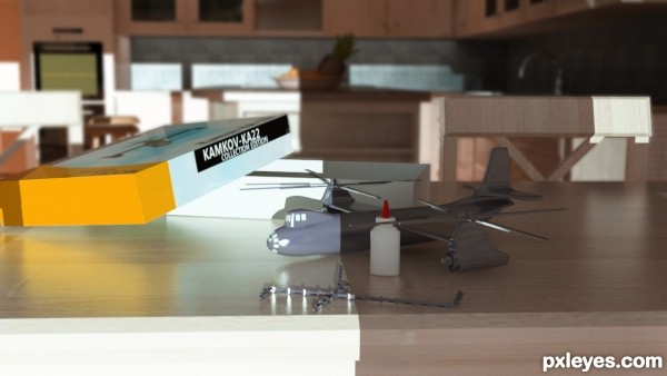
The light delineation on the table and the helicopter aren't quite right. If the light is that strong coming through the window, the shadows need to be deeper. Mainly it's the front edge of the table that visually bothers me the most, it looks brown rather than shadow gray...Being white, it shouldn't have any tint in shadow.
Example photos :
http://everystockphoto.s3.amazonaws.com/globes_light_shows_326304_o.jpg
http://www.everystockphoto.com/photo.php?imageId=2102479
http://www.everystockphoto.com/photo.php?imageId=226347
http://www.everystockphoto.com/photo.php?imageId=4598972
very nice work author and great idea...extra points for that...best of luck
Great idea.
Made a SBS
MossyB, I understand what you mean, but the table is not all white. its wood, but appear white as the sunlight hits it. The shadow have no tint at all, so the true color of the table is revealed in the shadow.
I do have tint in the daylight light source though. White with about 5% blue in it.
Ty for constructive comments!
Fantastic! Overall looks great, but the simulation of a large f-stop is throwing everything off. The blur almost looks like it was added in after the render, rather than being part of it. I only say this because the face of the chair is sharp, while the edge is blurry. Also the edge of the box seems to blend into the background, as if it were masked then blurred. Oh, and you forgot to blur the cabinets behind the chair 
Secretsather, I made the blur in photoshop since I not yet handle perspective blur in 3Ds max yet. Ive been working on it, but it takes very very long time to render. I updated the picture, but hopefully with 3D render blur.
btw, simulation of a large f-stop? explain
The aperture on a camera is what determines the amount of blur and depth of field (the area in which an object is in focus) and is measured in f-stops. A good understanding of depth of field (Google it) will allow you to better understand what should be blurred, how much blur, and when to blur. I don't know anything about 3ds, so someone else would have to confirm, but you should have a setting on the camera that allows you to adjust the f-stop; a close up model with an f-stop of 2.8 would produce the effect that looks ultra real, and may even reduce your rendering times as well.
Alternatively, if 3ds does not have such settings, you may render the background, blur it in photoshop, then render the foreground with a transparent background and overlay it on top of the image you just blurred.
Howdie stranger!
If you want to rate this picture or participate in this contest, just:
LOGIN HERE or REGISTER FOR FREE
Nice Congrats
Howdie stranger!
If you want to rate this picture or participate in this contest, just:
LOGIN HERE or REGISTER FOR FREE