3D Pictures: Planet (page 2)


results 6 - 8 of 8

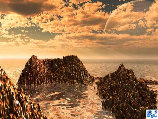
Watery Planet - created by wlado


Watery Planet
Favs: 0SBS: 5Hi-resRank: 10/13Score: 56.1% (0)8636 views

3ds Max, Photoshop, Vue 7 xStream.

OK, the final render took me like 2 hours, and I forgot to add bumpmaps to the islands/mountain's textures! O.O DOH!! Well, I didn't have the nerves to wait more, so that's why it looks a bit plastic-ish. But anyway.... Hope you like it =)
(5 years and 3639 days ago)

1 Source:

avatar Sander
Sander says:

The fainted planet looks as if it stands in front of the clouds.

author says:

read the sbs and you'll se why If you know how to help me with this, please say. =)

avatar CMYK46
CMYK46 says:

Planet has to be behind the clouds! Also, scale of the background & forground water is incompatible.

author says:

I know the planet has to be behind, but I did this in 3ds Max using Vue plugin, and I can't figure out how to put it behind... And the water is one part, one big plane, so I'm pretty much sure the size is OK =P

no avatar

I dont know much about 3d construct but i like the overall image. GL

Howdie stranger!
If you want to rate this picture or participate in this contest, just:

LOGIN HERE or REGISTER FOR FREE


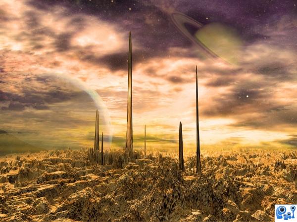
Nice view of a boring planet - created by wlado


Nice view of a boring planet
Favs: 1SBS: 4Hi-resRank: 2/13Score: 63.4% (30)30989 views

Well, technically, it's been more photoshopping here than modeling, since there was a lot to combine and texture, but the model is crucial. ;) Hope you like it!

Thanks to:
Markus Spring from flcikr,
Hypergenesb from flickr,
Ethan Allen from flickr and
Grant MacDonald from flickr for their marvelous images. =) (5 years and 3641 days ago)

5 Sources:

no avatar

Fantastic!

author says:

Tnx! =D

avatar dka120
dka120 says:

I do like it, it looks good in LO-res, but it's impossible to review any details.. so, please render a bigger HI-res version!

author says:

PLEEEEASE don't make me do it, there are millions of polygons there! =(( To be more precise 3927095. So you can be sure there's a lot of detail =D This took me like an hour to render 800x600.... Imagine how much would 1280 x 1024 take me. Do I REALLY have to do it?

avatar dka120
dka120 says:

Are you kidding me - an hour?! That's nothing when it comes to one frame 3D rendering! My late test render usually takes about an hour and my final at least 4H!

C'mon now, crank up the details and let the CPU burn over night. There's plenty of time until deadline. I'm sure I'm not the only one who's curious about the details.


(About the poly-count, I know the feeling. I'm sure 3DSMax has some sort of polygon reducing function)

avatar billyboy
billyboy says:

I saw your little problem, if you dont mind..1. you have Optimize modifier, this can reduce 20-30 % poly whitout visibile quality loose 2. according SBS you made„few planes”. why ?can make a single plane, convert to Edit Poly or Mesh, apply displacement map and then,for adjusment, select one or more poly (see also Soft selection) and move on Yaxis with Move tool. This will take few minutes more than displacement but will reduce dramatically poly number and render time. And you will have a full control of how your planet will look.

author says:

OK, OK. Actually, it didn't take me an hour more like 20 minutes Anyway, I'm rendering it now, it'll be done in a few minutes. =) @your comments, well, I don't want to reduce polycount because of the details, and I'm just to lazy (read: have no idea how) to make normal maps =P I made a few planes because I have had several displacement maps, I didn't mix them all in PS. And I could never manage to do something this detailed with Edit Poly. Well, maybe with Edit Poly and some Normal/Bumps and Displacements, but nothing with edit poly onnly =) Thanks anyway! Here comes high-res!

author says:

Here! It's finished! =D Satisfied? But really, what's there to see? Nothing so important that it has to be high res... =) =P

avatar dka120
dka120 says:

I'm glad you spent the enormous amount of time to re-render it! By doing that the great ground texture is visible.
The only flaw I can see is that you've applied it planar - stretching it when it gets steep. You could fix this by making UV-textures, adding a displacing texture on steep parts, or simply reproduce a similar effect with procedural bump and color textures. But don't get me wrong, I still like it.

author says:

Hmmmmm, yeah, it does get stretched... Tho I must say I kinda like the effect.... =P Especially at these high.... whatever they are? =D But OK, I'll bother with UV mapping a bit, and see what I get. Thanks! =)

author says:

Tnx Missy. =)

avatar dka120
dka120 says:

Author: nooo, don't change to UV if you like the present result. If that's the result you wanted to achieve then that's what it is. In that case you could enchance the melted effect by adding an adjusted version of the ground texture image to fit as a bump and/or diffuse map.

author says:

Already did that Bump map is the same texture with a little higher contrast. But thanks for the constructive comment! =)

avatar sebykxxx
sebykxxx says:

nice image,gl

avatar jaskier
jaskier says:

Good work.

no avatar

boring hU? not boring to the eye...

avatar Lelaina
Lelaina says:

Congrats for your second place, Wlado!

avatar RichieMB
RichieMB says:

Congratulations for 2nd

author says:

Tnx everyone =)

no avatar
marina08 says:

Congatulations!

Howdie stranger!
If you want to rate this picture or participate in this contest, just:

LOGIN HERE or REGISTER FOR FREE


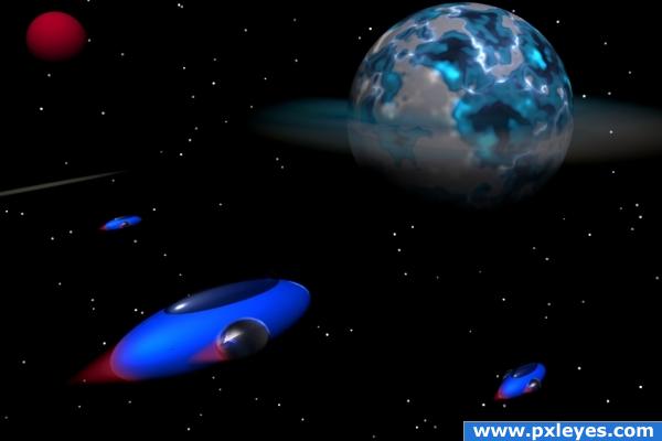
Travel To The Electric Planet - created by k5683


Travel To The Electric Planet
Favs: 0SBS: 12Hi-resRank: 8/13Score: 54.9% (0)14240 views

This is made all in Bryce 3D. I did not use preset materials (except sky).
(5 years and 3730 days ago)

avatar GolemAura
GolemAura says:

I do want more.... great job

author says:

more what? lol Thanks

avatar nishagandhi

nice

no avatar

Kinda nice. I think what GolemAura is saying is that there are five very distinct objects in the image and a very masic background. It almost looks cut and paste. I can see that you worked hard on it. But there could be more detail in the sky, maybe a nebula or two. Some colors in the sky. This is deep space and it looks like the sky when I look out my window. I think that's what he meant. I don't know. But that's how I feel. But really nice job. I just want more.

avatar visba
visba says:

The planet and ships are cool, but more could be done with the stars.

avatar devangel
devangel says:

avatar ponti55
ponti55 says:

Nice idea, very creative spacecraft.

Howdie stranger!
If you want to rate this picture or participate in this contest, just:

LOGIN HERE or REGISTER FOR FREE