(5 years and 3263 days ago)
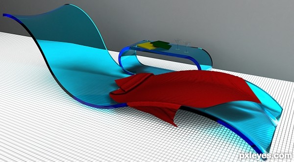
modelled in Maya, rendered in Mental Ray (5 years and 3325 days ago)
instant fave..this is gorgeous
Great work author...u used fantastic color for the chair and material look very fancy and comfortable....best of luck
in this picture, the proportions completely missing , which makes the picture just be nice colorful.....and just that!....for this picture I would score with the big big ZERO....enjoy! because i don't do this! ...IMHO sorry!....

This is really nicely done. This looks a bit more futuristic from today rather than art deco though. 
Nice job with the shaping of the lounger. Maybe you could have done something with the caustics of the plastic though. This would have made it more realistic. The grey wall is a bit of a let down too, if you had added a tiled wall or some other texture it would have been nice. Is it an indoor pool? If it's outside where's the direct light, this would surely have cast some nice shadows, even inside this should have more than just the flat lighting there is now. The glasses are maybe just a tad too small as well, not quite in proportion to the lounger, considering an adult male would almost certainly nearly fill the lounger. The towel should be a little more flexible or creased, this would increase the shadow amount and added more realism, a nice toweling texture would have looked nice too. But overall a nice job, just little more attention to detail would have nailed this. 
Howdie stranger!
If you want to rate this picture or participate in this contest, just:
LOGIN HERE or REGISTER FOR FREE
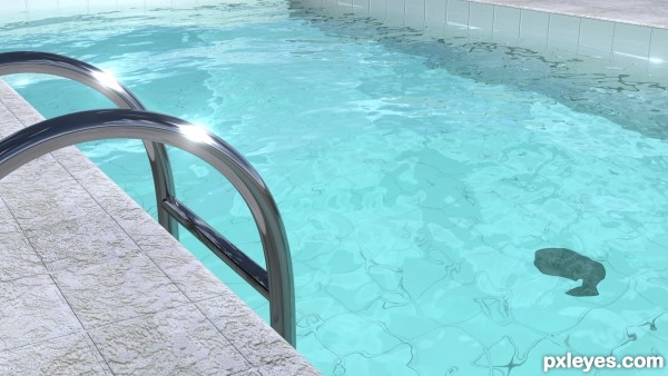
Created this image in 3ds max with mental ray as renderer. (5 years and 3547 days ago)
really cool
great job, very real
nice
I was almost blinded by the reflection from the ladders.. very nice and clean work, looks very realistic.
i know its about the water but the concrete could look better or highlight on bump maps
nice texture on the water
Nice job looks great
Simply amazing and 110% realistic...well done author
its gud but the black spot is creating problem.
Congrats for 3rd, great job, looks most realistic of all.
Congrats for your third place, Palaekman!
Howdie stranger!
If you want to rate this picture or participate in this contest, just:
LOGIN HERE or REGISTER FOR FREE
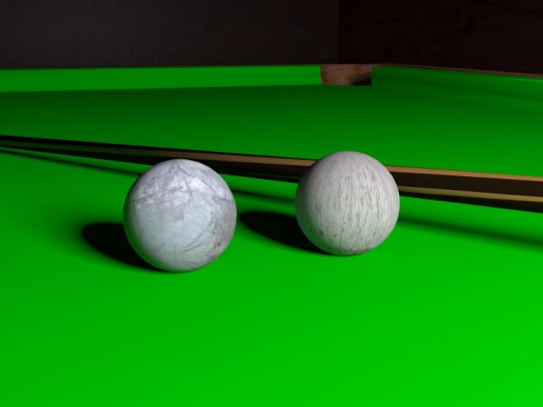
Made in 3d studio max.
Metal textures from cgtextures.com
(fixed textures) (5 years and 3737 days ago)
Very nice. As a simple suggestion copy the same maps on Bump and play with Bump values. Render again and results could be spectacular. Good luck.
nice work! I agree with billyboy ,copy the diffuse map on Bump
Nice idea!
Nice work ! I'm no good with working with 3D, but i think that the rusted metal should be slightly reflective, and it would;ve really added a touch ofm realism here. Still, very good work.
very nice 
Congratulations for 3rd
Congrats for your third place, Palaekman!
Congrats on 3rd 
Howdie stranger!
If you want to rate this picture or participate in this contest, just:
LOGIN HERE or REGISTER FOR FREE
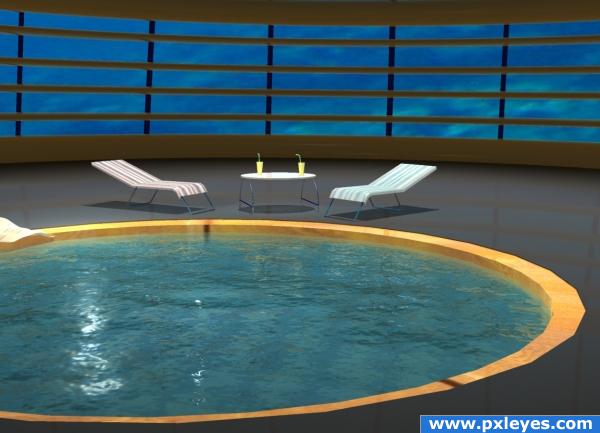
Why should somebody need an under water swimming pool ?
3 DS Max
Render with Mental Ray
Background picture from SCX, thanks to Konrad Mostert.
Chaise longue textures from CG Textures. (5 years and 3821 days ago)
nice
good jpb, gl
Water usually has some transparency at that angle. The water would have looked good on an outside scene, but not in a pool. Good bumping anyway.
great
Thanks, dka, you really like to make me work...and i like too. Add a checker map on pool bottom and raise water transparency. If people will not like that you are no. 1 guilty, LOL
Sorry author, I usually cast my vote after the deadline (in case of changes), so I don't know who you are... yet! But you can blame me anyway. 
Nicely Done!
i want to jump in
great job 
Howdie stranger!
If you want to rate this picture or participate in this contest, just:
LOGIN HERE or REGISTER FOR FREE
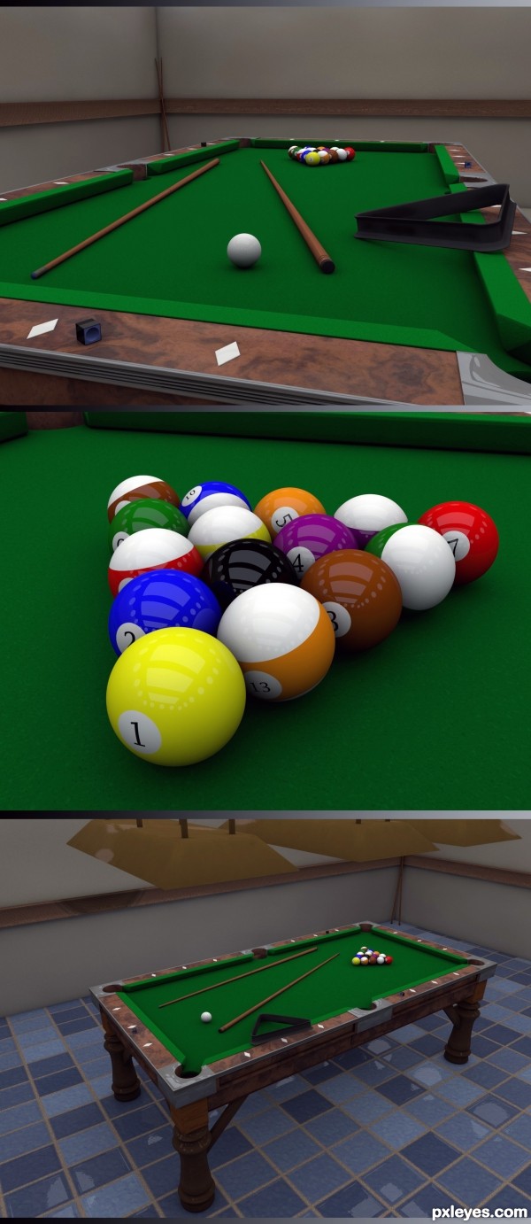
Great model, fab job.
The closeup shows a distinctive RH tilt on the table...Even allowing for "camera distortion, the slate will still be level with the back of the image. Anyone who's ever bent down to line up a shot will testify to that...
The texturing and color around the table edges is exquisite. Just level the slate.
Great job..attention to detail has really paid off. GL
Thanks for the comments guys. MossyB I assure you it is all level. Must just be a trick of the eye.
this is really good work, but I think the hightlights on the balls need work.... Have you ever been to a place where the balls have beaten up? by that I mean, a lot of people hit the all the balls with overly welll chalked cues, which leaves marks on the balls. If you could add those and work a little bit with the highlights - This would be Awesome, not just really good!
pm if you would like some more info on what I'm talking about
The pool table is nice. The balls are simply fantastic, very realistic! Nice texture and reflections!
A beaut.
Very very nice work author...GL
Congrats for your third place!
Congratulations for 3rd great job
Congrats
Howdie stranger!
If you want to rate this picture or participate in this contest, just:
LOGIN HERE or REGISTER FOR FREE