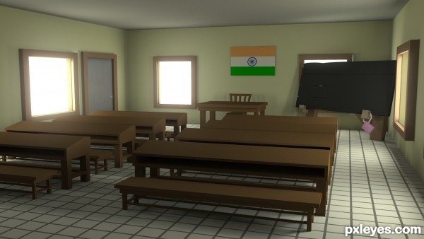
used default maya meterial, flag was painted in photoshop my self. its Indian flag. (5 years and 2603 days ago)
- 1: door

Modelled and rendered with 3ds Studio Max Design.
Modelling: 25 minutes
Texture & render setup: 4 hour
Rendertime: 11.457 seconds (5 years and 2605 days ago)
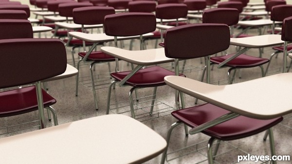
Nice concept and design, the render quality is good too. I suggest less desks and more details (books and pens on the tables).
and the DOF is nice too, Good luck Author.
Thanks for the advices, but this was just an exercise, I don't want to spend more time on it. I will create something different.
very good render, i like the high quality of the render and especially the DOF is nice.
maybe take away some desks and show more of the room and add details.
good luck!
The rendertime was quite long, so the minimum is that the quality is high, but i dont really wanted to play with the stuff on the desks, this was just a warm up exercise before the more complex one. It will be published soon.
ok, but about the render time you wrote that it took you 11 seconds so...
Howdie stranger!
If you want to rate this picture or participate in this contest, just:
LOGIN HERE or REGISTER FOR FREE

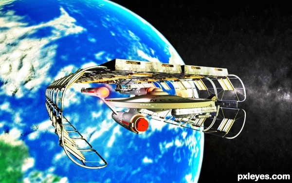
Credit to David Metlesits author of the U.S.S. Enterprise NCC-1701 and to Nico Weigland author of the space dock. (5 years and 2985 days ago)
Very cool scene. 
Very well done author!
Howdie stranger!
If you want to rate this picture or participate in this contest, just:
LOGIN HERE or REGISTER FOR FREE

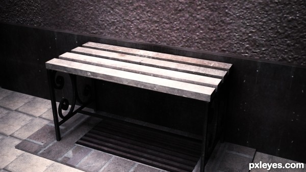
This is my school's bench all the textures used are mine.
Modeled: 3DS Max
Rendered: Vray
SBS will Be added soon
Any feedbacks are welcome (5 years and 3581 days ago)
Howdie stranger!
If you want to rate this picture or participate in this contest, just:
LOGIN HERE or REGISTER FOR FREE
Nice job
thank you very much
Good One..
thank you very much
Nice!
thank you
I don't really think that your class is thick like this. In my opinion, if I explain your problems, and give some advices how to make better, you learn more, as if I make a comment like above, about how good is.
So I explain why isn't correct this scene, and you should remember my advises in the future.
The main problem is that everything is thick, this could be adjusted easily, just have to notice it.
The second problem is the sharp of the edges, use chamfer tool on every edges that are too close to camera.
Use texture on models, CGTtextures is full of textures of all the genres, and it's free. Nearly every texture has at least a minimal reflection, don't forget this, your floor will be much more realistic with a blurry reflection, under the right window.
Best wishes.
thank you very much. i will keep this in mind . but i didnt understand what you said about thikness!
Howdie stranger!
If you want to rate this picture or participate in this contest, just:
LOGIN HERE or REGISTER FOR FREE