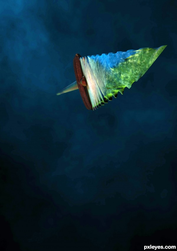
Thrown through the shadows (5 years and 3425 days ago)
Photography and photoshop contests
We are a community of people with
a passion for photography, graphics and art in general.
Every day new photoshop
and photography contests are posted to compete in. We also have one weekly drawing contest
and one weekly 3D contest!
Participation is 100% free!
Just
register and get
started!
Good luck!
© 2015 Pxleyes.com. All rights reserved.

Great job of foreshortening, but the colors detract from the concept of "spear." It looks like a really warped landscape image of a pier with lots of foliage on one side, made into a sideways sailboat.
If you make the spearhead look more stone or metal, I think it will help the overall cohesion of the concept.
You might want to also crop the excessive dead space at the bottom of your image. It adds nothing to your composition.
The dead space is intentional, its the rule of thirds, the composition means the spear is one of the eyes natural focus points, I didn't include it for no reason. The colors are also representative, the green for a poison tip and the red for the blood stains and the blue mist for the night. This is metaphorical of course, I have no actually added poison or blood its about the feel and the atmosphere. I had a render of plain stone and it just did not pop out as much, it was too bland.
IMO the render would really benefit from altering the camera. So that camera is just about touching the spear tip then loads of perspective and maybe a depth of field. Also rotate it so more handle is in shot.
I think your model is good but its a little hard to tell what it is without the title.
Howdie stranger!
If you want to rate this picture or participate in this contest, just:
LOGIN HERE or REGISTER FOR FREE