(5 years and 2760 days ago)

(5 years and 3187 days ago)
Great ambient, very nice composition, GL!
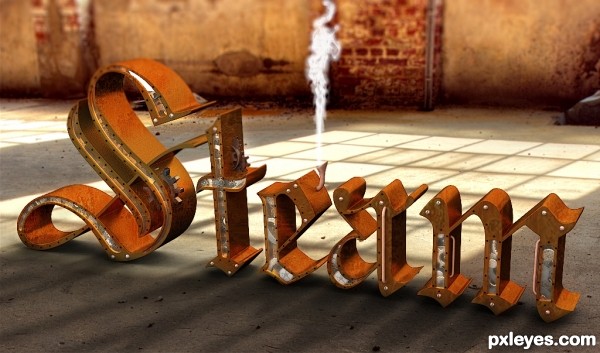
I think you should check your shadows. The light from the window in particular.
No difference in the high res.There are shadows cast by the Muntins in the window. These are not showing on your text model.
You know, I love a good steampunk anything - but by using an external image for your light source instead of the lighting abilities of a 3D program, you have negated the correctness of the shadows. Even close to the edge, some of the shadows SHOULD be falling across the letters. AND, you can see this all the better in hi-res. As much trouble as I have had learning shadows, even I can tell that this is way off. 
Really nice work...But the surrounding picture & the text lightening is not matching at all.
I love how you made the letters, with the cutouts in the side and the gears in there, however, IMHO, the gears should be brass, or in this case, old tarnished brass, not silver (look up brass goggles, steampunk, etc.). Also, the 'steam' coming out of the pipe looks too heavy for real steam, try lightening it a bit, and maybe lenghening it also.
Author you still have time, may I suggest that you create your own window to mimic the one in the image - and to take its place - and then put the light through that one - let the program make it right. There are still incorrect shadows right under the letters, and none crossing over them.There's one spot where it's very obvious they should be crossing over.
This has real potential with some tweaks. 
http://www.pxleyes.com/forum/viewtopic.php?f=4&t=3702&p=46683#p46683


Howdie stranger!
If you want to rate this picture or participate in this contest, just:
LOGIN HERE or REGISTER FOR FREE

3ds max 2009 for modelling, photoshop for light and steam effects (rendered with vray) (5 years and 3447 days ago)
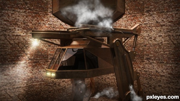
Whoa, baby - totally steampunk!  Love your choice of the body texture. I see you're really into the heavy machinery, and tho I wish those gauges were larger, you've made a wonderful construction with the hydraulics and other textures. Great job!
great job author...great example of steampunk machine...well done
Howdie stranger!
If you want to rate this picture or participate in this contest, just:
LOGIN HERE or REGISTER FOR FREE

Hey guys, I hope you like my new entry.
Please Check out the higher resolution image, a lot of detail as this is a large picture. (5 years and 3455 days ago)
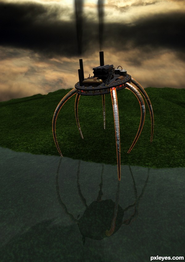
not bad work at all...modeling is fantastic...but hard to fit with this background
This is pretty cool, author, and I'm thrilled to see those gears, tho I wish they had slightly more light on them. The brass parts are good, as are the hoses and spiral tubes. One nitpick is the bright edges of the 'legs', I think it's much too bright. Not sure what the disk material is, but that would look great as a nice finished wood. Overall, very good work, good design. 
Howdie stranger!
If you want to rate this picture or participate in this contest, just:
LOGIN HERE or REGISTER FOR FREE
Howdie stranger!
If you want to rate this picture or participate in this contest, just:
LOGIN HERE or REGISTER FOR FREE