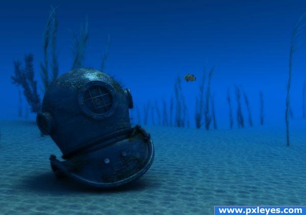
Done using MAYA with PS used to comp
Please view hi res to see (5 years and 3842 days ago)
1 Source:
- 1: fish
Photography and photoshop contests
We are a community of people with
a passion for photography, graphics and art in general.
Every day new photoshop
and photography contests are posted to compete in. We also have one weekly drawing contest
and one weekly 3D contest!
Participation is 100% free!
Just
register and get
started!
Good luck!
© 2015 Pxleyes.com. All rights reserved.

SBS and Improvements to follow tommorow
Excellent render!! Wow!!!
Great render!(Maybe you could add a bit more bumps on the sand;just a thought though)
Really like this
Really nice work, here.
LOVE this entry............really beautifully done!
As usual great, good, best in this contest IMO, bla-bla... Lets get to work
1. I love the old aspect of the helmet. Is easy to make a new, perfect object in 3D but is difficult to make it look old. Maybe some redish color for a rusty look.
2. This was a just a detail. Sorry to tell that ( I tell you cause I appriciate your work ), the sand and water are disasters. So monotonous, so uniform. I know, is hard to work a 3D underwater landscape in 2 weeks but better you used a photoshop background than that. Good luck and congrats.
as I said SBS and hopefully some improvements. Thanks for all the comments.
Also as billy boy says I could have used a backplate image and got a better image, but we nead to clarify if that is allowed, I think we should, but am never good at following rules, so for this one I went simple.
Looks good! I like the fact that you dared to texture the helmets old and worn. I'm glad you didn't go the safe way, with the much too overrated simple reflections (= high votes), and went for realism instead.
Anyway, the only constructive things I can come up with is about the surrounding. I think the seabed looks to uniform (like Billyboy said), smooth and empty. More bump should do it. Also, the textured simulation of light projecting the waves on the seabed (caustic) doesn't seem to affect the helmet. I know Maya has possibilities for this though. Really good job anyway!
(I'll vote later in case of improvements)
EDIT: ...I forgot one thing. Great SBS!
nice!
Excellent work here.
very nice look here
Congrats for your second place, Dante
congrat Dante...
Congratulations!
congrats
Hey Congrats on your win
Howdie stranger!
If you want to rate this picture or participate in this contest, just:
LOGIN HERE or REGISTER FOR FREE