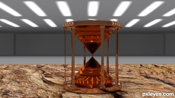
The Time is Up Hour Glass was made using Blender 3D application. I used the Cycles render it. Some free textures were applyed for HDR effect and base. (5 years and 2846 days ago)
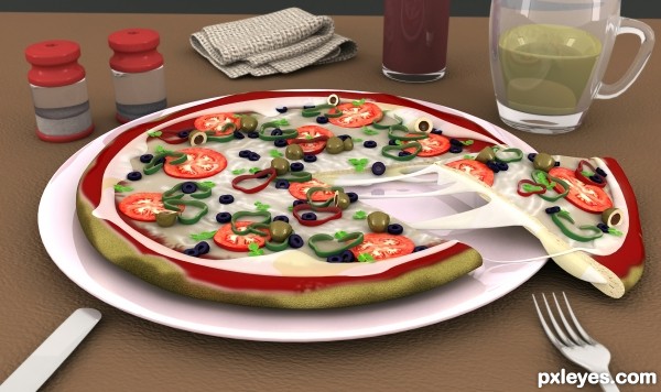
i used 3ds max and lighting is v-rey,this texture are paint in photoshop. (5 years and 3050 days ago)
nice work,good luck.......
1. very nice impressive composition
2. texturing is good but it is week to make it realistic, do more work on it....
3. glass is looking like Fiber Glass (front one)
4. What is there in Back one Glass is not recognizable.
5. nice use of Probs.
and best is..... this is really looking Yummy..... please do send me..... i am getting Hungry.
tomato texture are impressive.... but the pizza base from outside is something different.
I agree. The innards of the pizza are fantastic, as is most of the rest of the scene. It kind of gets lost though on the crust and especially the cheese part on the left where it dimples out. Fix those and you'll have a serious contender!
very good detailed job, wish u could put some sss in the cheese tex and made it a little yellow and bread is a little too green. gl
congrats !
Congrats 
Nice Job Congrats on First Place Win 
congrats and nice work...but need to work more.. gud try
Howdie stranger!
If you want to rate this picture or participate in this contest, just:
LOGIN HERE or REGISTER FOR FREE
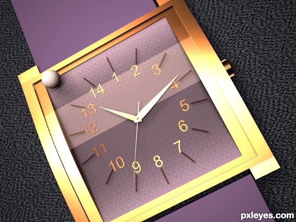
3ds Max (5 years and 3182 days ago)
Nice...
I think you have to compare the watch with something else ... I didn't like the golf ball..
GL Author ...... 
Ok, time is an abstraction, it's not an object, I've overdimensioned time with a watch of 14 hours, then I thought that maybe moderators could reject my entry so I've rendered it with a golf ball in "real" size (I've placed it on an evironment)
without a golfer, the golf ball has no value... and it doesn't show the contrast enough
suggest
1) add golfer
2) surrounding grey, change to grass on a golf-course

Nice image and the idea is very creative. But the camera angle lets it down. Maybe more of a 45 degree angle with the watch laying on a table top with the golf ball beside the watch instead of on it would have given you a more believable and pleasing size comparison
Howdie stranger!
If you want to rate this picture or participate in this contest, just:
LOGIN HERE or REGISTER FOR FREE
(5 years and 3329 days ago)
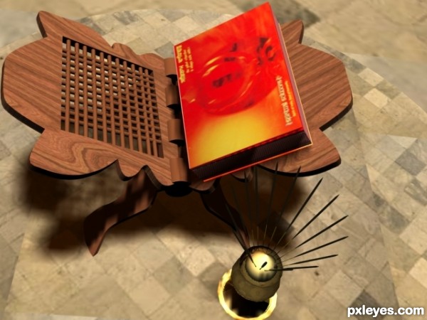
Great touch with the incense sticks and religious book holder. The one thing that I feel is odd is that shouldn't the book's spine have been on the inside, along the spine of your wooden book holder? It seems to be on the wrong side for opening. I also think the shadow density is somewhat strong and less toppish camera angle might have looked better.
thanx for ur advice
very interesting work author...gl
I wish the book cover was more in focus, but the work on the stand and incense holder is wonderful, they're great additions.
Howdie stranger!
If you want to rate this picture or participate in this contest, just:
LOGIN HERE or REGISTER FOR FREE
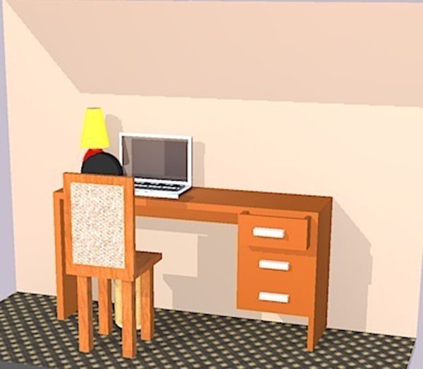
modelled in sketchup. rendered in kerkythea. omni light and spotlight used (5 years and 3567 days ago)

Howdie stranger!
If you want to rate this picture or participate in this contest, just:
LOGIN HERE or REGISTER FOR FREE
long time no see !!good job author
nice work
Howdie stranger!
If you want to rate this picture or participate in this contest, just:
LOGIN HERE or REGISTER FOR FREE